Question
Explain time-based line $($curve$)$ diagram along with data and brief analysis.
| Price $($In $Rs.)$ | Demand $($in units Frequency$)$ |
| $1$ | $100$ |
| $2$ | $80$ |
| $5$ | $70$ |
| $7$ | $20$ |
| $10$ | $10$ |
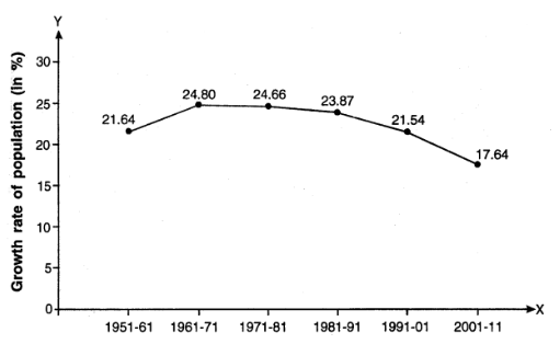
| Decade | Decadal Growth Rate of Population in $\%$ |
| $1951-61$ | $21.64$ |
| $1961-71$ | $24.80$ |
| $1971-81$ | $24.66$ |
| $1981-91$ | $23.87$ |
| $1991-2001$ | $21.54$ |
| $2001-2011$ | $17.64$ |
Generate a complete, print-ready paper with questions like this in minutes — across 16+ boards, with answer keys.
| Year | Birth-Rate (Per 1000 persons) | Death-Rate (Per 1000 persons) |
| 1951 | 39.9 | 27.4 |
| 2011 | 21.8 | 7.1 |
| Year | Male population $($in crores$)$ | Female population $($in crores$)$ |
| $1951$ | $18.55$ | $17.56$ |
| $1991$ | $43.92$ | $40.71$ |
| $2011$ | $62.37$ | $58.65$ |