Questions · Page 1 of 3

M.C.Q (1 Marks)

Take a timed test

50 questions · auto-graded multiple-choice test.

MCQ 11 Mark
If you are interested in how the government expenditure have fluctuated over time, it would be best to use:
  • A
    Pie graph.
  • B
    Histogram.
  • Time series graph.
  • D
    Frequency Curves.
Answer
Correct option: C.
Time series graph.
Time series graph.
View full question & answer
MCQ 21 Mark
Bar diagram is a:
  • One-dimensional diagram.
  • B
    Two-dimensional diagram.
  • C
    Diagram with no dimension.
  • D
    None of the above.
Answer
Correct option: A.
One-dimensional diagram.
View full question & answer
MCQ 31 Mark
Answer the following questions, choosing the correct answer:
Ogives can be helpful in locating graphically the:
  • A
    Mode.
  • B
    Mean.
  • Median.
  • D
    None of the above.
Answer
Correct option: C.
Median.
Ogive or cumulative frequency curve are constructed by plotting cumulative frequency data on the graph paper, in the form of a smooth curve. The intersection point of two ogive curves i.e. ‘less than’ and ‘more than’ ogive curves is called median.
View full question & answer
MCQ 41 Mark
Where should the source' be mentioned in the table?
  • A
    At the beginning of the table.
  • At the end of the table.
  • C
    Both (a) and (b).
  • D
    None of the above.
Answer
Correct option: B.
At the end of the table.
View full question & answer
MCQ 51 Mark
While preparing time series graph, we show ______ on the X-axis:
  • Time.
  • B
    Expense.
  • C
    Income.
  • D
    All of above.
Answer
Correct option: A.
Time.
Time.
View full question & answer
MCQ 61 Mark
A simple frequency distribution of a discrete variable is represented by:
  • A
    Ogive.
  • Line Graph.
  • C
    Frequency polygon.
  • D
    None of these.
Answer
Correct option: B.
Line Graph.
Line Graph.
View full question & answer
MCQ 71 Mark
In tabulation source of the data, if any, is shown in the:
  • Note.
  • B
    Body of the table.
  • C
    Stub.
  • D
    Caption.
Answer
Correct option: A.
Note.
Note.
View full question & answer
MCQ 81 Mark
Ogives can be helpful in locating graphically the __________.
  • A
    Mode.
  • B
    Mean.
  • Median.
  • D
    None of these.
Answer
Correct option: C.
Median.
Median.
View full question & answer
MCQ 91 Mark
__________ tables are also called reference tables:
  • General Purpose Table.
  • B
    Special Purpose Table.
  • C
    Original table.
  • D
    Derivative table.
Answer
Correct option: A.
General Purpose Table.
View full question & answer
MCQ 101 Mark
A comparison among the class frequencies is possible only in:
  • A
    Ogive.
  • B
    Frequency polygon.
  • C
    Either (a) or (b).
  • Histogram.
Answer
Correct option: D.
Histogram.
Histogram.
View full question & answer
MCQ 111 Mark
The diagram usually not drawn with the absolute values of a category is called:
  • Pie Diagram.
  • B
    Frequency Diagram.
  • C
    Multiple Bar Diagram.
  • D
    Simple Bar Diagram.
Answer
Correct option: A.
Pie Diagram.
Pie Diagram.
View full question & answer
MCQ 121 Mark
The column headings of a table are known as:
  • A
    Reference notes.
  • B
    Sub-titles.
  • C
    Stubs.
  • Captions.
Answer
Correct option: D.
Captions.
Captions.
View full question & answer
MCQ 131 Mark
Which of the following statements is untrue for tabulation?
  • A
    Statistical analysis of data requires tabulation.
  • It facilitates comparison between rows and not columns.
  • C
    Complicated data can be presented.
  • D
    Diagrammatic representation of data requires tabulation.
Answer
Correct option: B.
It facilitates comparison between rows and not columns.
View full question & answer
MCQ 141 Mark
Answer the following questions, choosing the correct answer:
Data represented through arithmetic line graph help in understanding:
  • Long term trend.
  • B
    Cyclicity in data.
  • C
    Seasonality in data.
  • D
    All the above.
Answer
Correct option: A.
Long term trend.
An arithmetic line represents time which is plotted along the X-axis and the corresponding value of the variable along the Y-axis. This helps in understanding the trend and periodicity in long-term time series data.
View full question & answer
MCQ 151 Mark
Median of a distribution can be obtained from:
  • A
    Frequency polygon.
  • B
    Histogram.
  • Less than type ogive.
  • D
    None of these.
Answer
Correct option: C.
Less than type ogive.
View full question & answer
MCQ 161 Mark
An interesting feature of the two ogives together is that their intersection point gives the ______.
  • A
    Mean.
  • Median.
  • C
    Mode.
  • D
    Range.
Answer
Correct option: B.
Median.
Median.
View full question & answer
MCQ 171 Mark
__________ is the process of presenting the data in the form of columns and rows:
  • A
    Presentation.
  • B
    Classification.
  • C
    Organisation.
  • Tabulation.
Answer
Correct option: D.
Tabulation.
Tabulation.
View full question & answer
MCQ 181 Mark
The headings of the rows given in the first column of a table are called:
  • A
    Titles.
  • B
    Prefatory notes.
  • Stubs.
  • D
    Captions.
Answer
Correct option: C.
Stubs.
Stubs.
View full question & answer
MCQ 191 Mark
Heading of columns in a table is called:
  • A
    Stub.
  • Caption.
  • C
    Title.
  • D
    None of these.
Answer
Correct option: B.
Caption.
Caption.
View full question & answer
MCQ 201 Mark
Median of a distribution can be obtained from:
  • A
    Histogram.
  • B
    Frequency polygon.
  • Less than type ogive beya.
  • D
    None of these.
Answer
Correct option: C.
Less than type ogive beya.
View full question & answer
MCQ 211 Mark
When data includes both positive and negative values, it is preferred to construct:
  • Deviation bar diagram.
  • B
    Duo-directional bar diagram.
  • C
    Broken-scale bar diagram.
  • D
    Any of the above.
Answer
Correct option: A.
Deviation bar diagram.
View full question & answer
MCQ 221 Mark
It is always possible to construct a histogram from the:
  • A
    Data.
  • B
    Frequency polygon.
  • Both from the data and frequency polygon.
  • D
    None of these.
Answer
Correct option: C.
Both from the data and frequency polygon.
View full question & answer
MCQ 231 Mark
The total expenditure incurred by an industry under different heads is best presented by:
  • A
    Bar diagram.
  • Pie diagram.
  • C
    Histogram.
  • D
    Frequency polygon.
Answer
Correct option: B.
Pie diagram.
Pie diagram.
View full question & answer
MCQ 241 Mark
Whether classification is done first or tabulation?
  • A
    Classification follows tabulation.
  • B
    Both are done simultaneously.
  • Classification precedes tabulation.
  • D
    No criterion.
Answer
Correct option: C.
Classification precedes tabulation.
View full question & answer
MCQ 251 Mark
___________ bar diagrams present simultaneously, total values, as well as part values of a set of data:
  • A
    Simple.
  • B
    Multiple.
  • Component.
  • D
    Percentage.
Answer
Correct option: C.
Component.
Component.
View full question & answer
MCQ 261 Mark
In tabulation, source of the data is shown in the:
  • A
    Caption.
  • Source note.
  • C
    Stub.
  • D
    Body.
Answer
Correct option: B.
Source note.
Source note.
View full question & answer
MCQ 271 Mark
Which of the following statements is incorrect?
  • Head note is not required in a table.
  • B
    A table should be simple and compact.
  • C
    A table should be complete and self-explanatory.
  • D
    Both (b) and (c).
Answer
Correct option: A.
Head note is not required in a table.
View full question & answer
MCQ 281 Mark
In _________ presentation, data is presented with the help of graphs:
  • A
    Textual.
  • B
    Tabular.
  • C
    Diagrammatic.
  • Graphical.
Answer
Correct option: D.
Graphical.
Graphical.
View full question & answer
MCQ 291 Mark
Data represented through arithmetic line graph help in understanding:
  • A
    Long term trend.
  • B
    Cyclicity in data.
  • Seasonality.
  • D
    All the above.
Answer
Correct option: C.
Seasonality.
Seasonality.
View full question & answer
MCQ 301 Mark
In the graph shown below, the frequency of the interval 40-50 is:
  • 40
  • B
    110
  • C
    70
  • D
    120
Answer
Correct option: A.
40
40
View full question & answer
MCQ 311 Mark
To find the number of observations less than any given value, we use:
  • A
    Grouped frequency distribution.
  • B
    Single frequency distribution.
  • Cumulative frequency distribution.
  • D
    None of these.
Answer
Correct option: C.
Cumulative frequency distribution.
View full question & answer
MCQ 321 Mark
A table should be:
  • A
    Attractive.
  • B
    Comparable.
  • C
    As per Objective.
  • All of the above.
Answer
Correct option: D.
All of the above.
All of the above.
View full question & answer
MCQ 331 Mark
35% of students in a college enrolled in Business Administration, 35% in Management and 30% in Accounting. This information can be presented with the help of:
  • A
    A line graph.
  • B
    Only a bar graph.
  • C
    Only a pie chart.
  • Both, a bar graph and a pie chart.
Answer
Correct option: D.
Both, a bar graph and a pie chart.
View full question & answer
MCQ 341 Mark
The breath of a rectangle is equal to the length of the class-interval in:
  • A
    Ogive.
  • B
    Histogram.
  • Both (a) and (b).
  • D
    None of these.
Answer
Correct option: C.
Both (a) and (b).
Both (a) and (b).
View full question & answer
MCQ 351 Mark
Frequency polygon is an alternative to ________ and it is also derived from ____________.
  • A
    Bar diagram, histogram.
  • B
    Histogram, bar diagram.
  • Histogram, histogram.
  • D
    Ogive, histogram.
Answer
Correct option: C.
Histogram, histogram.
View full question & answer
MCQ 361 Mark
Data represented through a histogram can help in finding graphically the:
  • A
    Mean.
  • Mode.
  • C
    Median.
  • D
    All the above.
Answer
Correct option: B.
Mode.
Mode.
View full question & answer
MCQ 371 Mark
Answer the following questions, choosing the correct answer:
Data represented through a histogram can help in finding graphically the:
  • A
    Mean.
  • Mode.
  • C
    Median.
  • D
    All the above.
Answer
Correct option: B.
Mode.
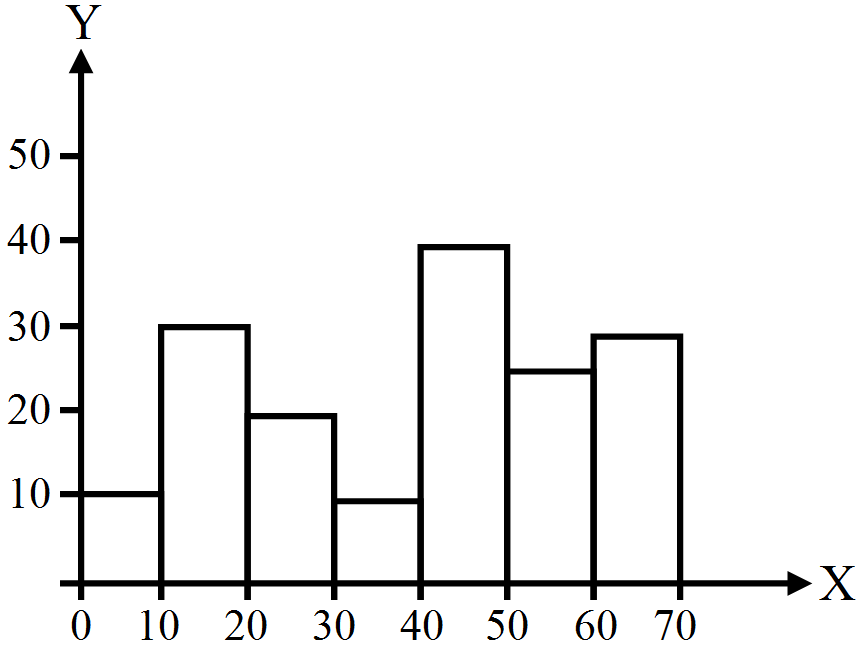
Graphically, the histogram provides the value of the mode of the frequency distribution. The rectangle with the greatest height will be the modal class. If we draw a line joining the top right of the rectangle of the modal class with the top right point of the rectangle of the class preceding the modal class and the other line joining the top left point of the rectangle of the modal class with the top left point of the rectangle of the class succeeding the modal class, then the line drawn from the point of intersection of the two diagonal lines will be perpendicular to the X-axis. Thus, the point at which the perpendicular touches the X-axis gives the required modal value.
View full question & answer
MCQ 381 Mark
The graph of the successive points of a distribution joined by straight lines in statistical terminology is known as:
  • A
    Trend.
  • B
    Frequency polygon.
  • C
    Frequency distribution.
  • Cumulative distribution curve.
Answer
Correct option: D.
Cumulative distribution curve.
View full question & answer
MCQ 391 Mark
The titles given to specific rows of a table are called:
  • A
    Stubs.
  • B
    Row headings.
  • C
    Captions.
  • Both (a) and (c).
Answer
Correct option: D.
Both (a) and (c).
Both (a) and (c).
View full question & answer
MCQ 401 Mark
__________ is the most common method of presenting grouped frequency distribution.
  • A
    Histogram.
  • Frequency polygon.
  • C
    Frequency curve.
  • D
    Ogive.
Answer
Correct option: B.
Frequency polygon.
Frequency polygon.
View full question & answer
MCQ 411 Mark
_________ gives information about secondary data used in a table:
  • A
    Head note.
  • B
    Footnote.
  • Source note.
  • D
    Title.
Answer
Correct option: C.
Source note.
Source note.
View full question & answer
MCQ 421 Mark
Tabulation helps in:
  • A
    Bringing out figures clearly.
  • B
    Bringing out layouts nicely.
  • Making comparisons easier.
  • D
    Bringing out trends.
Answer
Correct option: C.
Making comparisons easier.
View full question & answer
MCQ 431 Mark
Mode can be graphically located through:
  • Histogram.
  • B
    Ogive.
  • C
    Both (a) and (b).
  • D
    Neither (a) nor (b).
Answer
Correct option: A.
Histogram.
Histogram.
View full question & answer
MCQ 441 Mark
Which of the following statements is true when applied to a less-than cumulative frequency curve (ogive)?
  • A
    Mid-points are plotted against cumulative frequencies.
  • Upper-class boundaries are plotted against cumulative frequencies.
  • C
    Lower-class boundaries are plotted against cumulative frequencies.
  • D
    Mid-points are plotted against frequency.
Answer
Correct option: B.
Upper-class boundaries are plotted against cumulative frequencies.
View full question & answer
MCQ 451 Mark
Diagrammatic representation of the cumulative frequency distribution is called ________.
  • A
    Frequency Polygon.
  • Ogive.
  • C
    Histogram.
  • D
    None of these.
Answer
Correct option: B.
Ogive.
Ogive.
View full question & answer
MCQ 461 Mark
When tables are based on __________ data, source of data is to be given as footnote:
  • A
    Primary.
  • Secondary.
  • C
    Either (a) or (b).
  • D
    None of these.
Answer
Correct option: B.
Secondary.
Secondary.
View full question & answer
MCQ 471 Mark
The most accurate mode of data presentation is:
  • A
    Diagrammatic method.
  • Tabulation.
  • C
    Textual presentation.
  • D
    None of these.
Answer
Correct option: B.
Tabulation.
Tabulation.
View full question & answer
MCQ 481 Mark
Which part of a table gives us the numerical information?
  • A
    Title.
  • B
    Caption.
  • C
    Stub.
  • Body.
Answer
Correct option: D.
Body.
Body.
View full question & answer
MCQ 491 Mark
Textual method of presentation of data is suitable when the quantity of data is:
  • A
    Large.
  • Small.
  • C
    Both (a) and (b).
  • D
    None of the above.
Answer
Correct option: B.
Small.
Small.
View full question & answer
MCQ 501 Mark
A ____________ table gives information on a large number of inter-related characteristics of a given phenomenon:
  • A
    Derived.
  • B
    Simple.
  • Manifold.
  • D
    None of these.
Answer
Correct option: C.
Manifold.
Manifold.
View full question & answer
M.C.Q (1 Marks) - Economics STD 11 Commerce Questions - Vidyadip