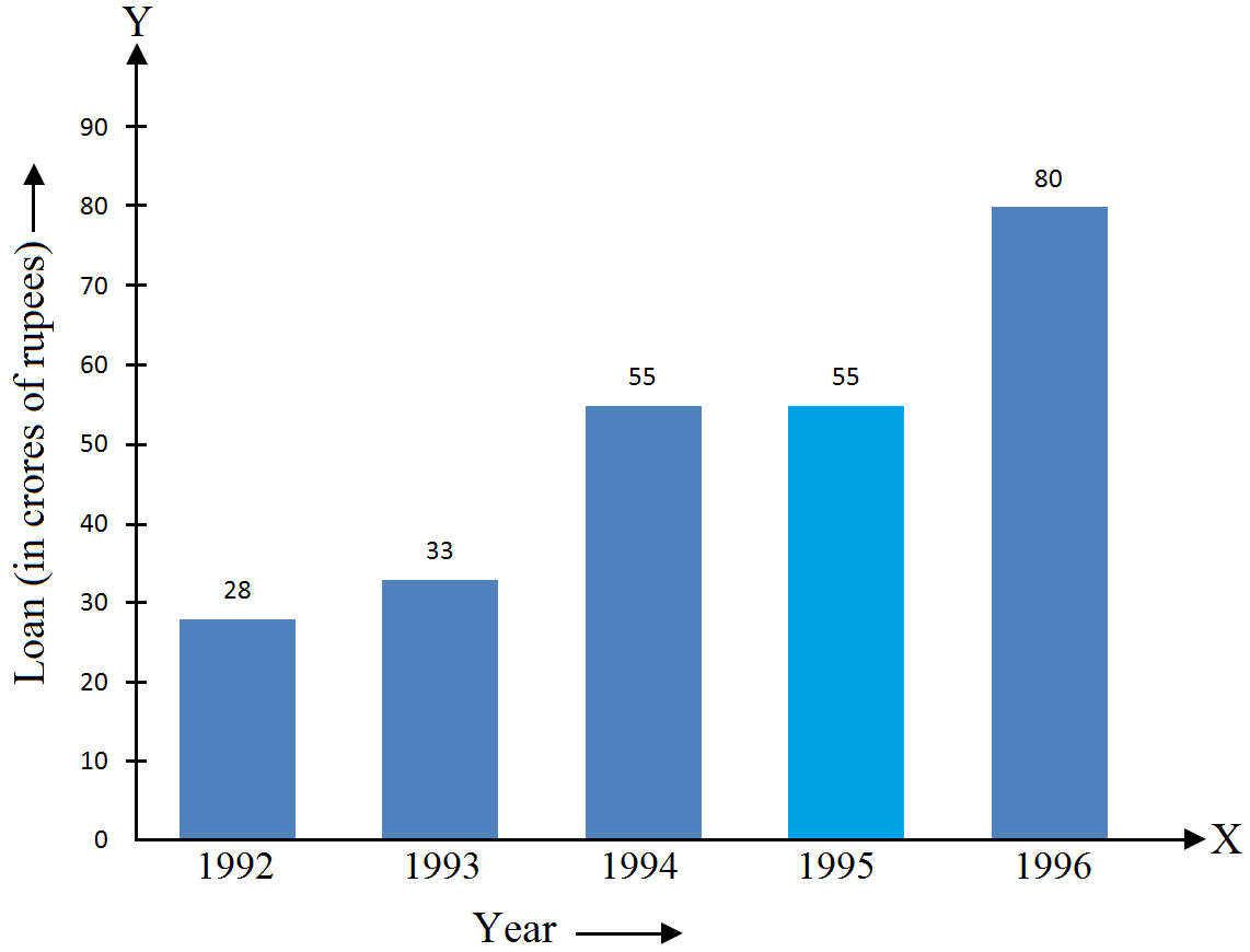
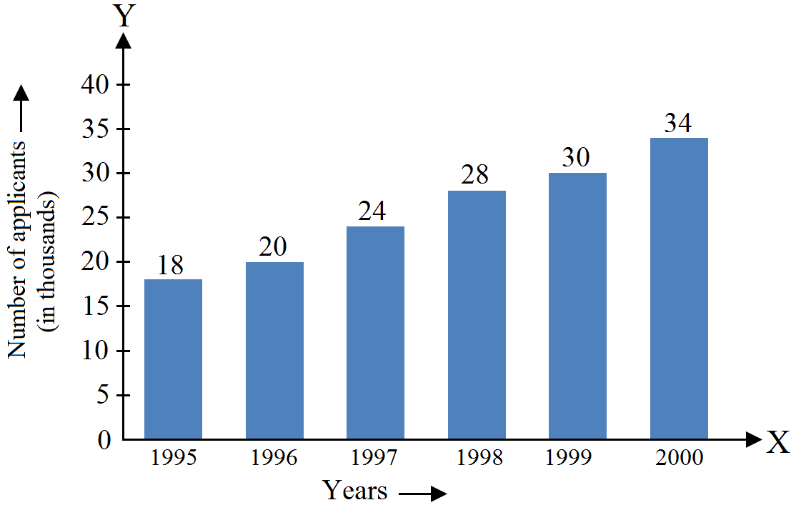
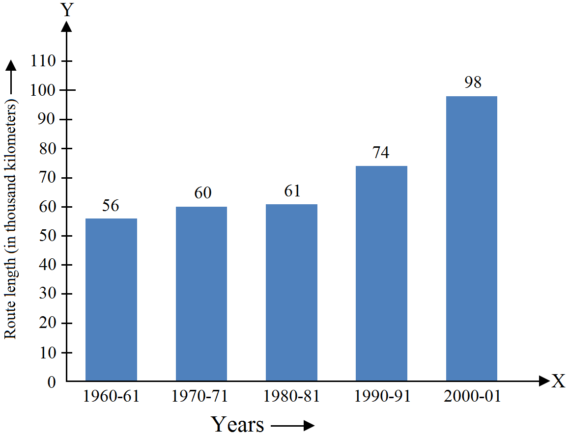
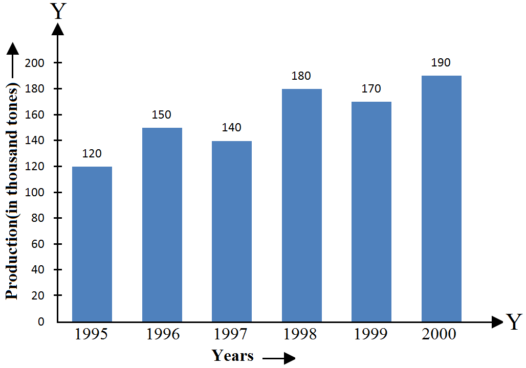
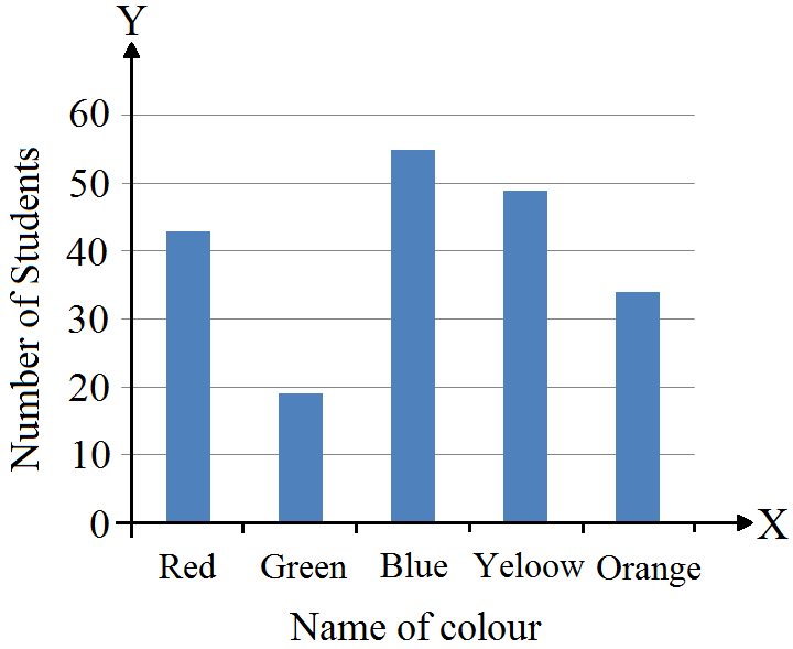
Questions

5 Marks Questions

🎯

Test yourself on this topic

26 questions · timed · auto-graded

Question 15 Marks
Following data gives total marks (out of $600$) obtained by six children of a particular class.
Students:
Ajay
Bali
Dipti
Faiyaz
Gotika
Hari
Marks Obtained:
$450$
$500$
$300$
$360$
$400$
$540$
Represent the data by a bar graph.
Answer

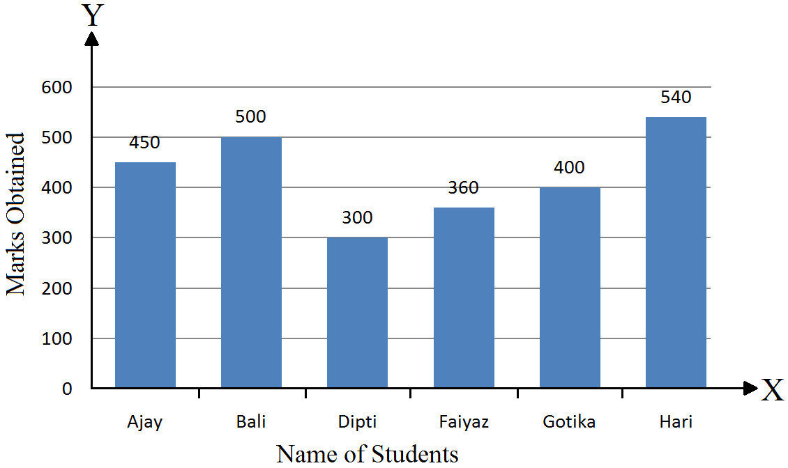
Mark the horizontal axis $OX$ as “Name of the Students” and the vertical axis $OY$ as “Marks Obtained”. Along the horizontal axis $OX$, choose bars of uniform (equal) width, with a uniform gap between them. Choose a suitable scale to determine the heights of the bars, according to the space available for the graph. Here, we choose $1$ small division to represent 100 marks.
View full question & answer
Question 25 Marks
The following data gives the amount of loans $($in crores of rupees$)$ disbursed by a bank during some years:
Year
$1992$ $1993$ $1994$ $1995$ $1996$
Loan $($in crores of rupees$)$
$28$
$33$
$55$
$55$
$80$
$i.$ Represent the above data with the help of a bar graph.
$ii.$ With the help of the bar graph, indicate the year in which amount of loan is not increased Over that of the preceding year.
Answer

Mark the horizontal axis $OX$ as “Years” and the vertical axis $OY$ as $“$Loan $($in crores of rupees$)”.$
Along the horizontal axis $OX$, choose bars of uniform $($equal$)$ width, with a uniform gap between them.
Choose a suitable scale to determine the heights of the bars, according to the space available for the graph. Here, we choose $1$ big division to represent $10$ crores of rupees.
In $1995,$ the loan amount was not increased over that of the preceding year.
View full question & answer
Question 35 Marks
The production of saleable steel in some of the steel plants of our country during $1999$ is given below:
Plant
Bhilai
Durgapur
Rourkela
Bokaro
Production(in thousand tonnes)
$160$
$80$
$200$
$150$
Construct a bar graph to represent the above data on a graph paper by using the scale $1$ big division$=20$ thousand tonnes.
Answer


Mark the horizontal axis $OX$ as “Name of the Steel Plant” and the vertical axis $OY$ as Production (in thousand tonnes)”.
Along the horizontal axis $OX,$ choose bars of uniform (equal) width, with a uniform gap between them.
Choose a suitable scale to determine the heights of the bars, according to the space available for the graph. Here, we choose $1$ big division to represent $20$ thousand tonnes.
View full question & answer
Question 45 Marks
The following data shows the average age of men in various countries in a certain year:
Country
India
Nepal
China
Pakistan
U.K
U.S.A
Average age(in years)
$55$
$52$
$60$
$50$
$70$
$75$
Represent the above information by a bar graph.
Answer


Mark the horizontal axis $OX$ as “Countries” and the vertical axis $OY$ as “Average Age of men (in years)”.
Along the horizontal axis $OX$, choose bars of uniform (equal) width, with a uniform gap between them.
Choose a suitable scale to determine the heights of the bars, according to the space available for the graph. Here, we choose $1$ big division to represent $10$ year.
View full question & answer
Question 55 Marks
The following table shows the interest paid by a company (in lakhs):
Year
1995-96
1996-97
1997-98
1998-99
1999-2000
Interest (in lakhs of rupees)
$20$
$25$
$15$
$18$
$30$
Draw the bar graph to represent the above information.
Answer


Mark the horizontal axis $OX$ as “Years” and the vertical axis $OY$ as “Interest (in lakhs of rupees)”.
Along the horizontal axis $OX$, choose bars of uniform (equal) width, with a uniform gap between them.
Choose a suitable scale to determine the heights of the bars, according to the space available for the graph. Here, we choose $1$ big divisions to represent $5$ lakhs rupees.
View full question & answer
Question 65 Marks
The following data gives the number (in thousands) of applicants registered with an Employment Exchange during, $1995-2000:$
Year 1995 1996 1997 1998 1999 2000
Number of applicants(in thousands) $18$ $20$ $24$ $28$ $30$ $34$
Construct a bar graph to represent the above data.
Answer


Mark the horizontal axis $OX$ as “Years” and the vertical axis $OY$ as “Number of Applicants Registered (in thousands)”.
Along the horizontal axis $OX$, choose bars of uniform (equal) width, with a uniform gap between them.
Choose a suitable scale to determine the heights of the bars, according to the space available for the graph. Here, we choose $1$ big division to represent $4$ thousand applicants.
View full question & answer
Question 75 Marks
The following table gives the route length (in thousand kilometres) of the Indian Railways in some of the years:
Year
1960-61
1970-71
1980-81
1990-91
2000-2001
Route length (in thousand kilometers)
$56$
$60$
$61$
$74$
$98$
Represent the above data with the help of a bar graph.
Answer


Mark the horizontal axis $OX$ as “Years” and the vertical axis $OY$ as “Route Length (in thousand kilometres)”.
Along the horizontal axis $OX$, choose bars of uniform (equal) width, with a uniform gap between them.
Choose a suitable scale to determine the heights of the bars, according to the space available for the graph. Here, we choose $1$ big division to represent $1000Km.$
View full question & answer
Question 85 Marks
The following data gives the production of food grains (in thousand tonnes) for some years:
Year
1995
1996
1997
1998
1999
2000
Production(in thousand tones)
$120$
$150$
$140$
$180$
$170$
$190$
Represent the above data with the help of a bar graph.
Answer


Mark the horizontal axis $OX$ as “Years” and the vertical axis $OY$ as “Production of food grains (in thousand tonnes)”.
Along the horizontal axis $OX$, choose bars of uniform (equal) width, with a uniform gap between them.
Choose a suitable scale to determine the heights of the bars, according to the space available for the graph. Here, we choose $1$ big division to represent $20$ thousand tonnes.
View full question & answer
Question 95 Marks
Two hundred students of class $VI$ and $VII$ were asked to name their favourite colours so as to decide upon what should be the colour of their school house. The results are shown in the following table.
Colour:
Red
Green
Blue
Yellow
Orange
Number of students:
$43$
$19$
$55$
$49$
$34$
Represent the given data on a bar graph.
$i.$ Which is the most preferred colour and which is the least?
$ii.$ How many colours are there in all?
Answer

Mark the horizontal axis $OX$ as “Name of the Colour” and the vertical axis $OY$ as “Number Of Students”.
Along the horizontal axis $OX$, choose bars of uniform $($equal$)$ width, with a uniform gap between them.
Choose a suitable scale to determine the heights of the bars, according to the space available for the graph. Here, we choose $1$ small division to represent $10$ students.
$i.$ The most preferred colour is blue and the least preferred is green.
$ii.$ In all, there are $5$ colours.
View full question & answer
Question 105 Marks
Consider the following data gathered from a survey of a colony:
Favorite Sport
Cricket
Basket ball
Swimming
Hockey
Athletics
Watching
$1240$
$470$
$510$
$423$
$250$
Participating
$620$
$320$
$320$
$250$
$105$
Draw a double bar graph choosing an appropriate scale. What do you infer from the bar graph?
$i.$ Which sport is most popular?
$ii.$ What is more preferred watching or participating in sports?
Answer

Mark the horizontal axis $OX$ as “Favourite Sports” and the vertical axis $OY$ as “Number of People”.
Along the horizontal axis $OX$, choose bars of uniform $($equal$)$ width, with a uniform gap between them.
Choose a suitable scale to determine the heights of the bars, according to the space available for the graph. Here, we choose $2$ big divisions to represent $400$ people.
$i.$ Cricket is the most popular sport.
$ii.$ Watching is preferred over participation.
View full question & answer
Question 115 Marks
Number of children in six different classes are given below. Represent the data on a bar graph.
Class
$V $ $VI $ $VII $ $VIII $ $IX$ $X$
Number of children
$135$
$120$
$95$
$100$
$90$
$80$
$i.$ Which class has the maximum number of children?
$ii.$ Which class has the minimum number of children?
How do you choose the scale?
Answer

Mark the horizontal axis $OX$ as “Class” and the vertical axis $OY$ as “Number of Children”.
Along the horizontal axis $OX$, choose bars of uniform $($equal$)$ width, with a uniform gap between them.
Choose a suitable scale to determine the heights of the bars, according to the space available for the graph. Here, we choose $1$ big division to represent $40$ children.
$i.$ We choose $1$ big to represent $40$ children.
$ii.$ The maximum numbers of students are in class $V$.
$iii.$ The minimum number of students are in class $X$.
View full question & answer
Question 125 Marks
The performance of students in $1^{st}$ term and $2^{nd}$ term is as given below. Draw a double bar graph choosing appropriate scale and answer the following:
Subject
English
Hindi
Maths
Science
Social Science
$1^{st}$ term
$67$
$72$
$88$
$81$
$73$
$2^{nd}$ term
$70$
$65$
$95$
$85$
$75$
$i.$ In which subject, has the children improved their performance the most?
$ii.$ Has the performance gone down in any subject?
Answer

We choose $1$ small division to represent $1$ child in the graph.
Mark the horizontal axis $OX$ as “Subject” and the vertical axis $OY$ as “Marks”.
Along the horizontal axis $OX$, choose bars of uniform $($equal$)$ width, with a uniform gap between them.
Choose a suitable scale to determine the heights of the bars, according to the space available for the graph. Here, we choose $1$ big division to represent $10$ marks.
$i.$ In Maths, the students showed their greatest improvement.
$ii.$ The students performed worst in Hindi.
View full question & answer
MCQ 135 Marks
The following data gives the amount of manure $($in thousand tonnes$)$ manufactured by a company during some years:
Year $1992$ $1993$ $1994$ $1995$ $1996$ $1997$
Manure $($in thousand tonnes$)$ $15$ $35$ $45$ $30$ $40$ $20$
Represent the above data with the help of a bar graph.
$1.$ Indicate with the help of the bar graph the year in which the amount of manure manufactured by the company was maximum.
$2.$ Choose the correct alternative:
The consecutive years during which there was maximum decrease in manure production are:
  • A
    $1994$ and $1995$
  • $1996$ and $1997$
  • C
    $1992$ and $1993$
  • D
    $1995$ and $1996$
Answer
Correct option: B.
$1996$ and $1997$
$1996$ and $1997$
View full question & answer
Question 145 Marks
The following data gives the amount of loans (in crores of rupees) disbursed by a bank during some years:
Year19921993199419951996
Loan (in crores of rupees)2833555580
(i) Represent the above data with the help of a bar graph.
(ii) With the help of the bar graph, indicate the year in which amount of loan is not increased over that of the preceding year.
Answer
1995
View full question & answer
Question 155 Marks
The following table gives the route length (in thousand kilometres) of the Indian Railways in some of the years:
Year1960-611970-711980-811990-912000-2001
Route length (in thousand kilometres)5660617498
Represent the above data with the help of a bar graph.
Answer
self
View full question & answer
Question 165 Marks
The following data gives the number (in thousands) of applicants registered with an Employment Exchange during, 1995-2000:
Year199519961997199819992000
Number of applicants registered (in thousands)182024283034
Construct a bar graph to represent the above data.
Answer
self
View full question & answer
Question 175 Marks
The production of saleable steel in some of the steel plants of our country during 1999 is given below:
PlantBhilaiDurgapurRourkelaBokaro
Production (In thousand tonnes)16080200150
Construct a bar graph to represent the above data on a graph paper by using the scale 1 big division = 20 thousand tonnes.
Answer
self
View full question & answer
Question 185 Marks
Consider the following data gathered from a survey of a colony:
Favourate Sport:CricketBasket-BallSwimmingHockeyAthletics
Watching1240470510423250
Participating620320320250105
Draw a double bar graph choosing an appropriate scale. What do you infer from the bar graph?
(i) Which sport is most popular?
(ii) What is more preferred watching or participating in sports?
Answer
(i) Cricket $\quad$ (ii) Watching
View full question & answer
Question 195 Marks
The performance of students in 1st term and 2nd term is as given below. Draw a double bar graph choosing appropriate scale and answer the following:
Subject:EnglishHindiMathsScienceS. Science
1st term:6772888173
2nd term:7065958575
(i) In which subject, has the children improved their performance the most?
(ii) Has the performance gone down in any subject?
Answer
(i) Maths $\quad$ (ii) Hindi
View full question & answer
Question 205 Marks
Number of children in six different classes are given below. Represent the data on a bar graph.
Class:VVIVIIVIIIIXX
Number of children:135120951009080
(i) How do you choose the scale.
(ii) Which class has the maximum number of children?
(iii) Which class has the minimum number of children?
Answer
(ii) V $\quad$ (iii) X
View full question & answer
Question 215 Marks
Following data gives total marks (out of 600) obtained by six children of a particular class.
Student:AjayBaliDiptiFaiyazGotikaHari
Marks obtained:450500300360400540
Represent the data by a bar graph.
Answer
self
View full question & answer
Question 225 Marks
The following data gives the amount of manure (in thousand tonnes) manufactured by a company during some years:
Year199219931994199519961997
Manure (in thousand tonnes)153545304020
(i) Represent the above data with the help of a bar graph.
(ii) Indicate with the help of the bar graph the year in which the amount of manure manufactured by the company was maximum.
(iii) Choose the correct alternative:
The consecutive years during which there was maximum decrease in manure production are:
(a) 1994 and 1995 $\quad$ (b) 1992 and 1993 $\quad$ (c) 1996 and 1997 $\quad$ (d) 1995 and 1996
Answer
(ii) 1994 $\quad$ (iii) 1996 and 1997.
View full question & answer
Question 235 Marks
The following data gives the production of foodgrains (in thousand tonnes) for some years:
Year199519961997199819992000
Production (in thousand tonnes)120150140180170190
Represent the above data with the help of a bar graph.
Answer
self
View full question & answer
Question 245 Marks
The following data shows the average age of men in various countries in a certain year:
CountryIndiaNepalChinaPakistanU.K.U.S.A.
Average age (in years)555260507075
Represent the above information by a bar graph.
Answer
self
View full question & answer
Question 255 Marks
The following table shows the interest paid by a company (in lakhs):

Year 1995-96 1996-97 1997-98 1998-99 1999-2000
Interest (in lakhs of rupees) 20 25 15 18 30

Draw the bar graph to represent the above information.

Answer
self
View full question & answer
Question 265 Marks
Two hundred students of class VI and VII were asked to name their favourite colours so as to decide upon what should be the colour of their school house. The results are shown in the following table.
Colour:RedGreenBlueYellowOrange
Number of students:4319554934
Represent the given data on a bar graph.
(i) Which is the most preferred colour and which is the least?
(ii) How many colours are there in all?
Answer
(i) Blue, Green $\quad$ (ii) 5
View full question & answer
5 Marks Questions - Maths STD 7 Questions - Vidyadip