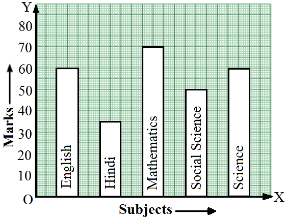
Look at the bar graph given below.
28 questions across 4 question groups — pick any mix to generate a Maths paper with step-by-step answer keys.
One sample from each question group in this chapter. Select any group above to see the full set with answer keys.
| Country | Japan | India | Britain | Ethiopia | Cambodia | UK |
| Life expectancy | 84 | 68 | 80 | 68 | 62 | 73 |
| Political party | A | B | C | D | E | F |
| Seats won | 65 | 52 | 34 | 28 | 10 | 31 |
| School bus | Private | Bicycle | Rickshaw | By foot |
| 640 | 360 | 490 | 210 | 150 |
| Time | 5 a.m. | 8 a.m. | 11 a.m. | 3 p.m. | 6 p.m. |
| Temperature (in °C) | 20 | 24 | 26 | 22 | 18 |
| Year | 2011 | 2012 | 2013 | 2014 | 2015 | 2016 |
| Number of scooters sold (in thousands) | 16 | 20 | 32 | 36 | 40 | 48 |
| Year | 2012-13 | 2013-14 | 2014-15 | 2015-16 | 2016-17 |
| Number of students | 800 | 975 | 1100 | 1400 | 1625 |
| City | Kolkata | Mumbai | Chennai | Hyderabad |
| Distance from Delhi (in km) | 1340 | 1100 | 1700 | 1210 |
| Sports | Cricket | Football | Tennis | Badminton | Swimming |
| Number of students | 75 | 35 | 50 | 25 | 65 |
| Country | China | India | Germany | UK | Sweden |
| Birth rate per thousand | 42 | 35 | 14 | 28 | 21 |
Represent the above data by a bar graph.
| Age in years | 10-20 | 20-30 | 30-40 | 40-50 | 50-60 | 60-70 |
| Number of patients | 90 | 40 | 60 | 20 | 120 | 30 |
| Class interval | 20-25 | 25-30 | 30-35 | 35-40 | 40-45 | 45-50 |
| Frequency | 30 | 24 | 52 | 28 | 46 | 10 |
| Daily wages (in Rs.) | 340-380 | 380-420 | 420-460 | 460-500 | 500-540 | 540-580 |
| Number of workers | 16 | 9 | 12 | 2 | 7 | 4 |
| Class interval | 10-14 | 14-20 | 20-32 | 32-52 | 52-80 |
| Frequency | 5 | 6 | 9 | 25 | 21 |
| Class intervals | 600-640 | 640-680 | 680-720 | 720-760 | 760-800 | 800-840 |
| Frequency | 18 | 45 | 153 | 288 | 171 | 63 |
Pick question groups from the list above, set marks and difficulty, and export a branded PDF with step-by-step answer keys. First 3 chapters free — no signup.