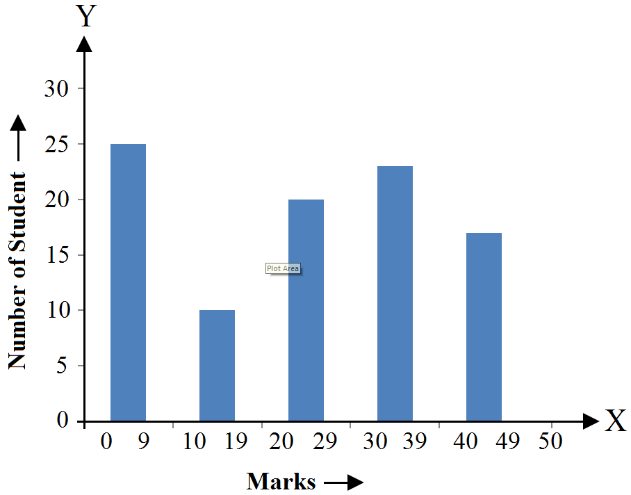
Questions

5 Mark Question

Take a timed test

19 questions · self-marked practice — reveal the answer and mark yourself.

Question 15 Marks
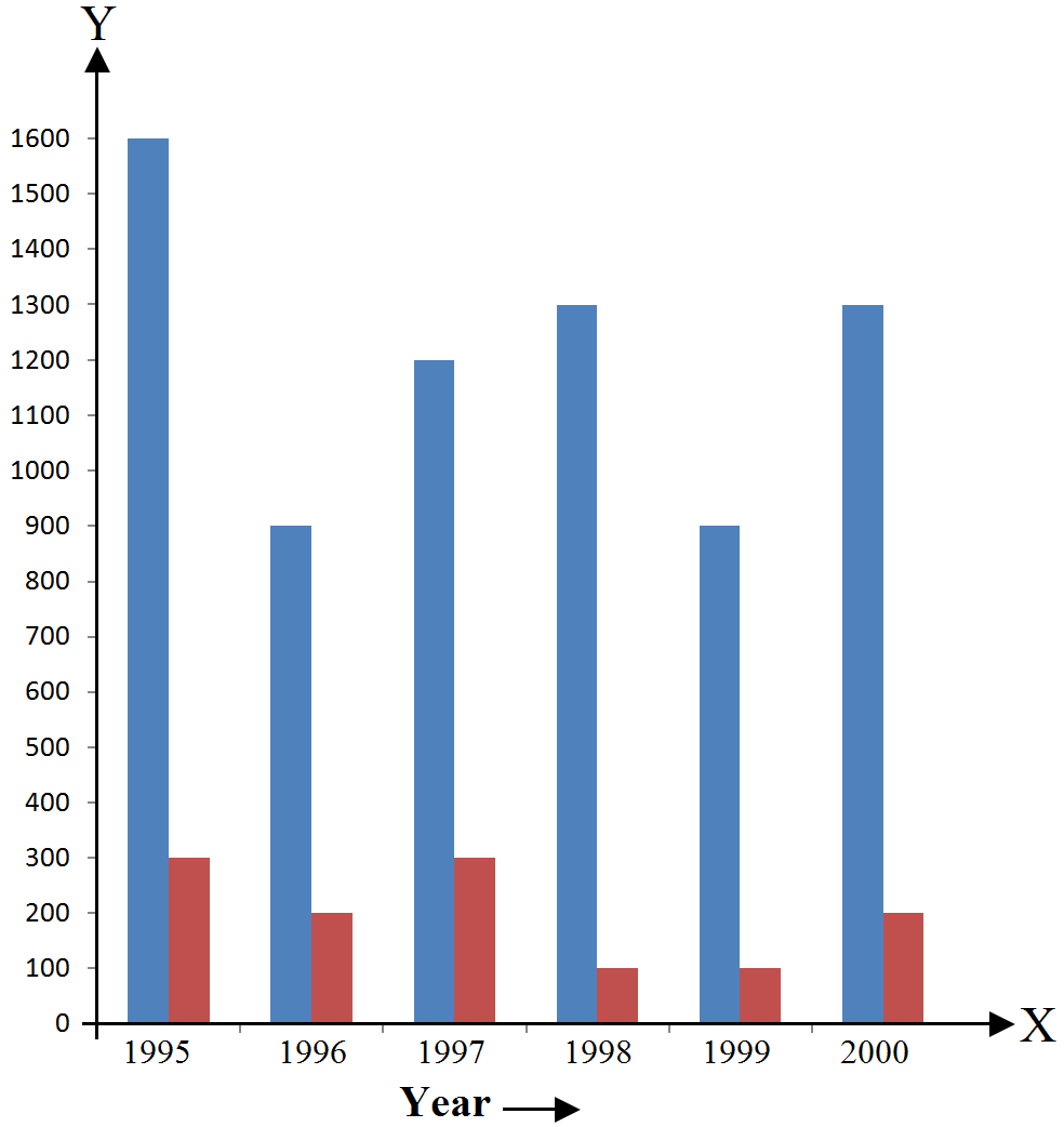
Read the following bar group and answer the following questions:
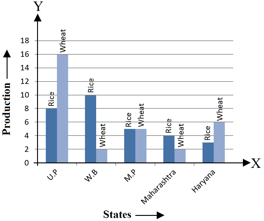
  1. What information is given by the bar group?
  2. Which state is the largest producer of rice?
  3. What state is the largest producer of wheat?
  4. Which state has total production of rice and wheat as its maximum?
  5. Which state has the total production of wheat and eice minimum?
Answer
Let’s draw a chart using the data from the above bar graph:
States
Rice Production
Wheat Production
Total Production
U.P
8
16
24
W.B
10
2
12
M.P
5
5
10
Maharashtra
4
2
6
Haryana
3
6
9
  1. The above bar graph provides information on the production of rice and wheat in various states of India.
  2. W.B. is the largest producer of rice.
Explanation:

The height of the rectangle representing rice production in W.B. is up to 10 units, i.e., the highest compared to those in the other states.
  1. U.P. is the largest producer of wheat.
Explanation:

The height of the rectangle representing wheat production in U.P. is up to 16 units, i.e., the highest compared to those in the other states.
  1. U.P. has the total production of rice and wheat as its maximum.
Explanation:

From the bar graph we can say that U.P. exceeds the other states in the total production of rice and wheat, i.e., 16 units wheat + 8 units of rice = 24 units.
  1. Maharashtra has the total production of rice and wheat as its minimum.
Explanation:

From the bar graph we can say that the total production of rice and wheat in Maharashtra is the minimum, i.e., 4 units rice + 2 units of wheat = 6 units.
View full question & answer
Question 25 Marks
The following table shows the number of maruti cars sold by five dealers in a particular month:
Dealer
Saya
Bagga Links
D.D Motors
Bhasin Motor
Competent Motors
Cars Sold
60
40
20
15
10
Represent the above information by a pictograph.
Answer
Let one car icon represent 5 Maruti cars. Then, the numbers of icons sold by the five dealers in a particular month are as follows:
Dealer Number of icons
Saya $\frac{60}{5}=12$
Bagga links $\frac{40}{5}=18$
D.D Motors $\frac{20}{5}=4$
Bhasin Motor $\frac{15}{5}=3$
Competent motor $\frac{10}{5}=3$
The pictograph representing the above data is as follows:
View full question & answer
Question 35 Marks
Read the bar graph shown in Fig and answer the following questions:
  1. What is the information given by the bar graph?
  2. How many tickets of Assam State Lottery were sold by the agent?
  3. Of which state, were the maximum number of tickets sold?
  4. State whether true or false.
The maximum number of tickets sold is threetimes the mlnimum number of tickets sold.
  1. Of which state were the minimum number of tickets sold?
Answer
  1. The bar graph represents the number of tickets of different states lotteries sold by an agent on a single day.
  2. The agent sold $40$ tickets of Assam state lottery.
Explanation:

The vertical height of the rectangle against Assam, on the bar graph, has ended on the $40^{th}$ mark against the vertical axis.
  1. Haryana
Explanation:

The vertical height of the rectangle against Haryana. I the maximum compared to those against the other states.
  1. False.
Explanation:

Maximum vertical length (against the state of Haryana) = $100$ units

Minimum vertical length (against the state of Rajasthan) = $20$ units

Therefore, Maximum number of lottery sold for one state = $100$ tickets

Minimum number of lottery tickets sold for one state = $20$ tickets
  1. Rajasthan.
Explanation:

From the bar graph we can say that the Rajasthan State Lottery tickets were sold the minimum i.e. only $20$ tickets.
View full question & answer
Question 45 Marks
The production of saleable steel in some of the steel plants of our country during 1999 is given below:
Plant
Bhilai
Durgapur
Rourkela
Bokaro
Production (in thousand tonnes)
160
80
200
150
Construct a bar graph to represent the above data on a graph paper by using the scale 1 big divisions = 20 thousand tonnes.
Answer
Let’s draw two mutually perpendicular lines OX and OY.
Along the horizontal line OX, let’s mark plants, and along the vertical line OY, let’s mark the production.
Along the axis OX, let’s measure an equal width for each bar, the gap between the bars being the same.
We will now choose a suitable scale to determine the heights of the bar.
Here, let’s choose 1 big division = 20 thousand tons
Therefore, the heights of the bars as follows:
Height of the bar against Bhilai $=\frac{160}{20}=8\text{units}$
Height of the bar against Durgapur $=\frac{80}{20}=4\text{units}$
Height of the bar against Rourkela $=\frac{200}{20}=10\text{units}$
Height of the bar against Bokaro $=\frac{150}{20}=7.5\text{units}$
Now, based on the above calculation the graph is as follows:
View full question & answer
Question 55 Marks
The following table shows the daily production of T.V. sets in an industry for 7 days of a week:
Day
Mon
Tue
Wed
Thurs
Fri
Sat
Sun
Number of T.V. Sets
300
400
150
250
100
350
200
Represent the above information by a pictograph.
Answer
Let an icon of a T.V represent 50 T.Vs. Then, the number of icons produced by the industry on different days of a week is as follows:
Days Number of icons
Mon $\frac{300}{50}=6$
Tue $\frac{400}{50}=8$
Wed $\frac{150}{50}=3$
Thurs $\frac{250}{50}=5$
Fri $\frac{100}{50}=5$
Sat $\frac{350}{50}=7$
Sun $\frac{200}{50}=4$
The pictograph representing the above data is as follows:
View full question & answer
Question 65 Marks
The following table gives the route length (in thousand kilometers) of the Indian Railways in some of the years:
Year
1960-61
1970-71
1980-81
1990-91
2000-01
Route length (in thousand kilometres)
56
60
61
74
98
Represent the above data with the help of a bar graph.
Answer
Let’s draw two mutually perpendicular lines OX and OY. Along the horizontal line OX, let’s mark years; and along the vertical line OY, let’s mark the route length. Along the axis OX, let’s choose a suitable width for each bar, the gap between the bars is the same. We will now choose a suitable scale to determine the heights of the bars. Here, let’s take 1 big division = 10 thousand kilometres Therefore, heights of the various bar are as follows: Height of the bar against 1960-61 $=\frac{56}{10}=5.6\text{ units}$ Height of the bar against 1970-71 $=\frac{60}{10}=6.0\text{ units}$ Height of the bar against 1980-81 $=\frac{61}{10}=6.1\text{ units}$ Height of the bar against 1990-91 $=\frac{74}{10}=7.4\text{ units}$ Height of the bar against 2000-2001 $=9810=9.8\text{ units}$ Based on the above calculation, the bar graph is as follows:
View full question & answer
Question 75 Marks
The following bar graph represent the heights (in cm) of 50 students of Class XI of a particular school. Study the graph and answer the following questions:
  1. What percentage of the total number of students have their heights more than 149cm?
  2. How many students in the class are in the range of maximum height of the class?
  3. The school wants to provide a particular type of tonic to each student below the height of 150cm to improve his height. If the cost of the tonic for each student comes out to be ₛ 55, how much amount of money is required?
  4. How many students are in the range of shortest height of the class?
  5. State whether true or false:
  1. There are 9 students in the class whose heights are in the range of 155-159cm.
  2. Maximum height (in cm) of a student in the class is 17.
  3. There are 29 students in the class whose heights are in the range of 145-154cm.
  4. Minimum height (in cm) of a student is the class is in the range of 140-144cm.
  5. The number of students in the class having their heights less than150cm is 12.
  6. There are 14 students each of whom has height more than 154cm.
Answer
Let’s draw a chart based on the above bar graph:
Heights (in cm)
Number of students
140-144
7
145-149
12
150-154
17
155-159
9
160-164
5
  1. Number of students whose height is more than 149cm = 17 + 9 + 5 = 31
Total number of students = 50
Percentage of students whose height is more than $149\text{cm}=\frac{31}{50\%}=31\times2\%=62\%$
  1. The maximum height-range of the class is 160-164. Number of students in this range = 5
  2. Number of students measuring less than 150 cm = 7 + 12 = 19
Required amount of money to be spent for the tonic = 19 × ₹ 55 = ₹ 1045
  1. The minimum height-range of the class is 140-144 Number of students in this range = 7
  2.  
  1. True.
Explanation:
From the above chart we can say that the number of students in the height-range 155-159 is 9
  1. False.
Explanation:
17 is the number of students found in the maximum height-range, i.e., 160-164
  1. True.
Explanation:
Number of students in the class whose heights are in the range of 145-154cm = Number of students in the class whose heights are in the range of 145-149 + Number of students in the class whose heights are in the range of 150-154 = 12 + 17 = 29
  1. True.
Explanation:
The minimum height-range of the students in the class is 140-144cm
  1. False.
Explanation:
Number of students measuring less than 150cm = 7 + 12 = 19
  1. True.
Explanation:
Number of students measuring more than 154cm = 9 + 5 = 14
View full question & answer
Question 85 Marks
The following data gives the number (in thousands) of applicants registered with a divisions = 20 thousand tonnes.
Year
1995
1996
1997
1998
1999
2000
Number of applicants registered (in thousands)
18
20
24
28
30
34
Construct a bar graph to represent the above data.
Answer
Let’s draw two mutually perpendicular lines OX and OY. Along the horizontal line OX, let’s mark years; and along the vertical line OY, let’s mark the number of applicants registered. Along the axis OX, let’s choose a suitable width for each bar, the gap between the bars is the same. We will now choose a suitable scale to determine the heights of the bars. Here, let’s choose 1 big division = 4 thousand, applicants Therefore, the heights of the bars are as follow: Height of the bar against the year 1995 $=\frac{18}{4}=4.5\text{units}$ Height of the bar against the year 1996 $=\frac{20}{4}=5\text{units}$ Height of the bar against the year 1997 $=\frac{24}{4}=6\text{units}$ Height of the bar against the year 1998 $=\frac{28}{4}=7\text{units}$ Height of the bar against the year 1999 $=\frac{30}{4}=7.5\text{units}$ Height of the bar against the year 2000 $=\frac{34}{4}=8.5\text{units}$ Based on the above calculation, the bar graph is as follows:
View full question & answer
Question 95 Marks
The following data gives the production of food grains (in thousand tones) for some years:
Years
1995
1996
1997
1998
1999
2000
Production (in thousand tonnes)
120
150
140
180
170
190
Represent the above data with the help of a bar graph.
Answer
Let’s draw two mutually perpendicular lines OX and OY. Along the horizontal line OX, let’s mark the years, and along the vertical line OY, let’s mark the production of food grains in tons. Along the axis OX, let’s choose an equal width for each bar, keeping the gap between the bars the same. We will now choose a suitable scale to determine the heights of the bar Here, let’s consider 1 big division = 20 thousand tons. Therefore, the heights of the various bars are as follows: Height of the bar against the year 1995 $=\frac{120}{20}=6\text{ units}$ Height of the bar against the year 1996 $=\frac{150}{20}=7.5\text{ units}$ Height of the bar against the year 1997 $=\frac{140}{20}=7\text{ units}$ Height of the bar against the year 1998 $=\frac{180}{20}=9\text{ units}$ Height of the bar against the year 1999 $=\frac{170}{20}=8.5\text{ units}$ Height of the bar against the year 2000 $=\frac{190}{20}=9.5\text{ units}$ Based on the above calculations, the bar graph is as follows:
View full question & answer
Question 105 Marks
The following data gives the amount of mature (in thousand tones) manufactured by a company during some years:
Year
1992
1993
1994
1995
1996
1997
Manure (in thousand tonnes)
15
35
45
30
40
20
  1. Represent the above data with the help of a bar graph.
  2. Indicate will the help of the bar graph the year in which the amount of manure manufactured by the company was maximum.
  3. Choose the correct alternative.
The consecutive years during which there was a maximum decrease in manure production are:
  1. 1994 and 1995
  2. 1992 and 1993
  3. 1996 and 1997
  4. 1995 and 1996
Answer
  1. Let’s draw two mutually perpendicular lines OX and OY.
Along the horizontal line OX, let’s mark the years, and along the vertical line OY, let’s mark the amount of manure in tons.
Along the axis OX, let’s choose an equal width of each bar, keeping the gap between the bars the same.
We will now choose a suitable scale to determine the heights of the bars.
Here, let’s consider 1 big division = 5 thousand tons of manure
Therefore, the heights of the various bars are as follows:
Height of the bar against the year 1992 $=\frac{15}{5}=3\text{ units}$
Height of the bar against the year 1993 $=\frac{35}{5}=7\text{ units}$
Height of the bar against the year 1994 $=\frac{45}{5}=9\text{ units}$
Height of the bar against the year 1995 $=\frac{30}{5}=6\text{ units}$
Height of the bar against the year 1996 $=\frac{40}{5}=8\text{ units}$
Height of the bar against the year 1997 $=\frac{20}{5}=4\text{ units}$
Based on the above calculation, the bar graph is as follows:
  1. The amount of manure manufactured in the year 1994 was the maximum.
  2. (C) 1996 and 1997
Explanation:
The production decreased by 15 thousand tons from the year 1994 to 1995, and from 1996 and 1997 the production of manure decreased by 20 thousand tons.
View full question & answer
Question 115 Marks
The following data shows the average age of men in various countries in a certain year.
Country
India
Nepal
China
Pakistan
U.K
U.S.A
Average age (in years)
55
52
60
50
70
75
Represent the above information by a bar graph.
Answer
Let’s draw two mutually perpendicular lines OX and OY.
Along the horizontal line OX, let’s mark the countries; and along the vertical line OY, let’s mark the average age for men.
Along the axis OX, we will choose a suitable width for each bar, keeping the gap between the bars the same.
We will now choose a suitable scale to determine the heights of the bars.
Here, let’s consider 1 big division = 10 years
Therefore, the heights of the various bars are as follows:
Height of the bar against India $=\frac{55}{10}=5.5\text{ units}$
Height of the bar against Nepal $=\frac{52}{10}=5.2\text{ units}$
Height of the bar against China $=\frac{60}{10}=6.0\text{ units}$
Height of the bar against Pakistan $=\frac{50}{10}=5.0\text{ units}$
Height of the bar against U.K. $=\frac{70}{10}=7.0\text{ units}$
Height of the bar against U.S.A. $=\frac{75}{10}=7.5\text{ units}$
Based on the above calculation, the bar graph is as follows:
View full question & answer
Question 125 Marks
The following data gives the amount of loans (in crores of rupees) disbursed by a bank during some years:
Year
1992
1993
1994
1995
1996
Loan (in crores of rupees)
28
33
55
55
80
  1. Represent the above data with the help of a bar graph.
  2. With the help of the bar graph, indicate the year in which amount of loan is not increased over that of the preceding year.
Answer
  1. Let’s draw two mutually perpendicular lines OX and OY.
Along the horizontal line OX, let’s mark years; and along the vertical line OY, let’s mark loans in crores.
Along the axis OX, let’s choose a suitable width for each bar, keeping the gap between the bars the same.
We will now choose a suitable scale to determine the heights of the bars.
Here, let’s consider 1 big division = 10 crores of loan
Therefore, the heights of the various bars are as follows:
Height of the bar against the year 1992 $=\frac{28}{10}=2.8\text{ units}$
Heights of the bar against the year 1993 $=\frac{33}{10}=3.3\text{ units}$
Heights of the bar against the year 1994 $=\frac{55}{10}=5.5\text{ units}$
Heights of the bar against the year 1995 $=\frac{55}{10}=5.5\text{ units}$
Heights of the bar against the year 1996 $=\frac{80}{10}=8.0\text{ units}$
Based on the above calculation, the bar graph is as follows:
  1. The year in which the loan amount has not increased than its previous year is 1995.
Explanation:
In the year 1994, 55 crore rupees of loan was disbursed by the bank. Also, in the year 1995, 55 crore rupees of loan was disbursed by the bank.
View full question & answer
Question 135 Marks
Read the following bar graph and answer the following questions:
  1. What information is given by the bar graph?
  2. In which year the export is minimum?
  3. In which year the import is maximum?
  4. In which year the difference of the value of export and import is maximum?
Answer
Let’s draw a chart using the information from the above bar graph:
Years
Export (in 100 crores of ₛ)
Imports (in 100 crores of ₛ)
Difference of import and export (in 100 crores of ₛ)
1982-83
8
14
6
1983-84
10
18
8
1984-85
12
19
7
1985-86
11
20
9
1986-87
12
22
10
  1. It provides us the information on the total amount of imports and exports in different years between 1982 and 1987.
  2. In the year 1982-83, the export is at its lowest.
Explanation:

In the year 1982-83, exports amounted to 800 crores rupees, i.e., the lowest from all other years.
  1. In the year 1986-87, the import is at its maximum.
Explanation:

In the year 1986-87, imports amounted to 22,000 crores rupees, i.e., the highest from all other years.
  1. In the year 1986-87, the difference in the amount of exports and imports is the maximum.
Explanation:

In the year 1986-87, the difference in the values of export and import is 1000 corers rupees.
View full question & answer
Question 145 Marks
The following table shows the interest paid by a company (in lakhs):
Year
1995-96
1996-97
1997-98
1998-99
1999-2000
Interest (in lakhs of rupees)
20
25
15
18
30
Draw the bar graph to represent the above information.
Answer
Let’s draw two mutually perpendicular lines OX and OY.
Along the horizontal line OX, let’s mark years, and along the vertical line OY, let’s mark the amount of interest paid by the company.
Along the axis OX, let’s choose a suitable with for each bar, keeping the gap between the bars the same.
We will now choose a suitable scale to determine the heights of the bars.
Here, let’s consider 1 big division = 5 lakhs of rupees paid as interest by the company
Therefore, the heights of the various bars are as follows:
Height of the bar against the year 1995-96 $=\frac{20}{5}=4\text{ units}$
Height of the bar against the year 1996-97 $=\frac{25}{5}=5\text{ units}$
Height of the bar against the year 1997-98 $=\frac{15}{5}=3\text{ units}$
Height of the bar against the year 1998-99 $=\frac{18}{5}=3.6\text{ units}$
Height of the bar against the year 1999-2000 $=\frac{30}{5}=6\text{ units}$
Based on the above calculation, the bar graph is as follows:
View full question & answer
Question 155 Marks
The bar graph shown in represents the circulation of newspapers in 10 languages. Study the graph and answer the following questions:
  1. What is the total number of newspapers published in Hindi, English, Urdu, Punjabi, and Bengali?
  2. What percent is the number of newspapers published in Hindi of the total number of newspapers?
  3. Find the excess of the number of newspapers published in English over those published in Urdu.
  4. Name two pairs of languages which publish the same number of newspapers.
  5. State the language, in which the smallest number of newspapers is published,
  6. State the language in which the largest number of newspapers is published.
  7. State the language in which the number of newspapers published is between 2500 and 3500.
  8. State whether true or false:
  1. The number of newspapers published in Malayalam and Marathi together is less than those published in English.
  2. The number of newspapers published in Telugu is more than those published in Tamil.
Answer
Let’s draw a chart using the information from the above bar graph:
Language
Number of newspapers published
Urdu
700
Telugu
400
Tamil
1000
Punjabi
200
Marathi
1400
Malayalam
1400
Hindi
3700
Gujarati
1100
English
3400
Bengali
1100
  1. Total number of newspapers published in Hindi, English, Urdu, Punjabi and Bengali = 3700 + 3400 + 700 + 200 + 1100 = 9100
  2. Number of newspaper published in Hindi = 3700
Total number of newspapers published = 700 + 400 + 1000 + 200 + 1400 + 1400 + 3700 + 1100 + 3400 + 1100 = 14400

Therefore, Percentage of Hindi newspaper published $=\frac{3700}{14400\times100\%}$

= 25.69%

= 25.7%
  1. Number of newspapers published in English = 3400
Number of newspapers published in Urdu = 700

Therefore, Excess number of the newspapers published in English over Urdu = 3400-700 = 2700
  1. “Marathi” & "Malayalam” and “Gujarati & Bengali" are the two pairs of languages in which same number of newspapers are published.
Explanation:

Newspapers published in Marathi = Newspapers published in Malayalam = 1400

Newspapers published in Gujarati = Newspapers published in Bengali = 1100
  1. Punjabi is the language in which the least number of newspapers are published.
Explanation:

In Punjabi, only 200 newspapers are published.
  1. Hindi is the language in which the maximum numbers of newspapers are published.
Explanation:

In Hindi, 3700 newspapers are published.
  1. The number of English newspapers published is between 2500 and 3500.
Explanation:

In English, 3400 newspapers are published.
  1.  
  1. True.
Explanation:

Total number of newspapers published in Malayalam and Marathi = 1400 + 1400 = 2800

The number of newspapers published in English are 3400, which is more than the total numbers of Malayalam and Marathi newspapers.
  1. False.
Explanation: Number of newspapers published in Telugu = 400

Number of newspapers published in Tamil = 1000
View full question & answer
Question 165 Marks
The following bar graph shows the results of an annual examination in a secondary school.
Read the bar graph and choose the correct option in each of the following.
  1. The pair of classes in which the results of boys and girls are inversely proportional are:
  1. VI, VIII
  2. VI, IX
  3. VIII, IX
  4. VIII, X
  1. The class having the lowest faliure rate of girls is:
  1. VII
  2. X
  3. IX
  4. VIII
  1. The class having the lowest pass rate of student is:
  1. VI
  2. VII
  3. VIII
  4. IX
Answer
Let’s draw a chart using the information from the above bar graph.
Class
Percentage of boys
Percentage of girls
VI
80
70
VII
40
100
VIII
90
50
IX
70
80
X
70
90
  1. (b) VI, IX
Explanation:

In Class VI, the percentage of boys = 80

In Class IX, the percentage of girls = 80

In Class VI, the percentage of girls = 70

In class IX, the percentage of boys = 70
  1. (a) VII
Explanation:

In class VII, the passing percentage of girls is at its peak i.e. 100%.

In this class, 0% of girls failed.
  1. (b) VII and (c) VIII
Explanation:

In class VII and VIII, the sum of vertical heights of the percentage of boys and girls in the given bar graph is same and that is 140 units. And this sum of heights is the least compared to all other classes.
View full question & answer
Question 175 Marks
The following bar graph shows the number of persons killed in industrial accidents in a country for some years.

Read the bar graph and choose the correct alternative in each of the following:
  1. The year which shows the maximum percentage increase in the number of persons killed in coal mines over the precending year is:
  1. 1996
  2. 1997
  3. 1999
  4. 2000
  1. The year which shows the maximum decrease in the number of persons killed in industrial accidents over the precending year is:
  1. 1996
  2. 1997
  3. 1998
  4. 1999
  1. The year in which the maximum number of persons were killed in industrial accidents other than those killed in coal mines is:
  1. 1995
  2. 1997
  3. 1998
  4. 1999
Answer
Let’s draw a chart using the information from the above bar graph.
Year
Persons killed in industries accidents
Persons killed in coal mines
1995
1600
300
1996
900
200
1997
1200
300
1998
1300
100
1999
900
100
2000
1300
200
  1. (d) 2000
Explanation:

In 1997, the death increased to 300 from 200, and in 2000, the death increased to 200 from 100.

Therefore, percentage increase in the amount of death in coal mines in the year 1997

⇒ From 200 to 300

⇒ 50% increase

Therefore, percentage increase in the amount of death in coal mines in the year 2000

⇒ From 100 to 200

⇒ 100% increase
  1. (a) 1996
Explanation:

Both the years, 1996 and in 1999, show a decrease in the amount of persons killed by industrial accidents.

Therefore, percentage decrease in the amount of death due to industrial accidents in the year 1996

⇒ From 1600 to 900 = 43.75%

Therefore, percentage decrease in the amount of death due to industrial accidents in the year 1999

⇒ From 1300 to 1900 = 30.77%
  1. (a) 1995
Explanation:

In the year 1995, 1600 persons were killed by industrial accidents, which is the highest compared to the other years.
View full question & answer
Question 185 Marks
Study the bar graph representing the number of persons in various age groups in a town shown in Observe the bar graph and answer the following questions:
  1. What if the percentage of the youngest age-group persons over those in the oldest age group?
  2. What is the total population of the town?
  3. What is the number of persons in the age-group 60-65?
  4. How many persons are more in the age-group 10-15 than in the age group 30-35?
  5. What is the age-group of exactiy 1200 persons living in the town?
  6. What is the total number of persons living in the town in the age-group 50-55?
  7. What is the total muner of persons living in the town in the age-groups 10-15 and 60-65?
  8. Whether the population in general increases, decreases or remains constant with the increase in the age-group.
Answer
  1. The youngest age group is 10-15 years.
Number of persons in the youngest age group = 1400

The oldest age group is 70-75 years.

Number of persons in the oldest age group = 300

Difference in the number of people in the youngest age oldest age group = 1400-300 = 1100

Therefore, The youngest group has 1100 more people than the oldest group.

Therefore, % of the youngest group over oldest group.

$=\frac{1100}{300}\times100\%$

$=\frac{1100}{3}\%=366\frac{2}{3}\%$
  1. Total population of the town.
= Total number of people from all age groups.

= 1400 + 1200 + 1100 + 1000 + 900 + 800 + 300 = 6700.
  1. There are 800 persons in the age group 60-65 years.
Explanation:

The vertical length of the rectangle against the age group 60-65 is up to 800 units.
  1. Number of persons in the age group 10-15 = 1400
Number of persons in the age group 30-35 = 1100

Therefore, number of more persons in the age group 10-15 as compared to that in the age group 30-35 = 1400 - 1100 = 300.
  1. The age-group of exactly 1200 people living in the town is 20-25 years.
Explanation:

Looking at the bar graph we can say that the vertical length of the rectangle against the age group 20-25 is up to 1200 units.
  1. The number of people of the age group 50-55 years is 900.
Explanation:

The vertical length of the rectangle against the age group 50-55 years is up to 900 units.
  1. The number of persons in the age group 10-15 years is 1400, and that in the age group 60-65 years is 800.
Therefore, Total number of persons in the age group 10-15 years and 60-65 years

= 1400 + 800 = 2200
  1. With the increase in the age group, the population decreases.
Explanation:

As the age group increases, the heights of the rectangle start falling.
View full question & answer
Question 195 Marks
Given below is the bar graph indicating the marks obtained out of 50 in mathematics paper by 100 students. Read the bar graph and answer the following questions:
  1. It is decidec to distribute work books on mathematics to the students obtaining less than 20 marks, giving one workbook to each of such students. If a work book costs ₹ 5, what sum is required to buy the work books?
  2. Every student belonging to the highest mark group is entitled to get a prize of ₹ 10. How much amount of money is required for distributing the prize money?
  3. Every student belonging to the lowest mark-group has to solve 5 problems per day. How many problems, in all, will be solved by the students of this group per day?
  4. State whether true or false.
  1. 17% students have obtained marks ranging from 40 to 49.
  2. 59 students have obtained marks ranging from 10 to 29.
  1. What is the number of students getting less than 20 marks?
  2. What is the number of students getting more than 29 marks?
  3. What is the number of students getting marks between 9 and 40?
  4. What is the number, of students belonging to the highest mark group?
  5. What is the number of students obtaining more than 19 marks?
Answer
Let us prepare a chart of the 100 students using the data from the bar graph.
Marks
Number of students
0-9
27
10-19
12
20-29
20
30-39
24
40-49
17
  1. Number of students with less than 20 marks = 27 + 12 = 39
Therefore, Required sum to buy the workbooks = ₹ 5 × 39 = ₹ 195.
  1. Highest marks group = 40-49
Number of students in this marks group = 17

Therefore, Required money to distribute the prize = ₹ 10 × 17 = ₹ 170.
  1. Lowest marks group = 0-9
Number of students in this marks group = 27

Therefore, Number of problems that will be solved by the students per day = 5 x 27 = 135.
  1. (a) True, (b) False
  2. Number of students scoring less than 20 marks.
= Number of students in the marks group 0-9 + Number of students in the marks group 10-19 = 27 + 12 = 39
  1. Number of students scoring more than 29 marks
= Number of students in the marks group 30-39 + number of students in the marks group 40-49 = 24 + 17 = 41
  1. Number of students scoring between 9 and 40
= Number of students in the marks group 10-19 + Number of students in the marks group 20-29 + Number of students in the marks group 30-39

= 12 + 30 + 24 = 56
  1. The highest marks group is 40-49.
Number of students in this marks group = 17
  1. Number of students scoring more than 19 marks
Number of students in the marks group 20-29 + Number of students in the marks group 30-39 + Number of students in the marks group 40-49

= 20 + 24 + 17 = 61
View full question & answer