Questions

5 Mark Question

Take a timed test

12 questions · self-marked practice — reveal the answer and mark yourself.

Question 15 Marks
Read the following bar graph and answer the following questions:
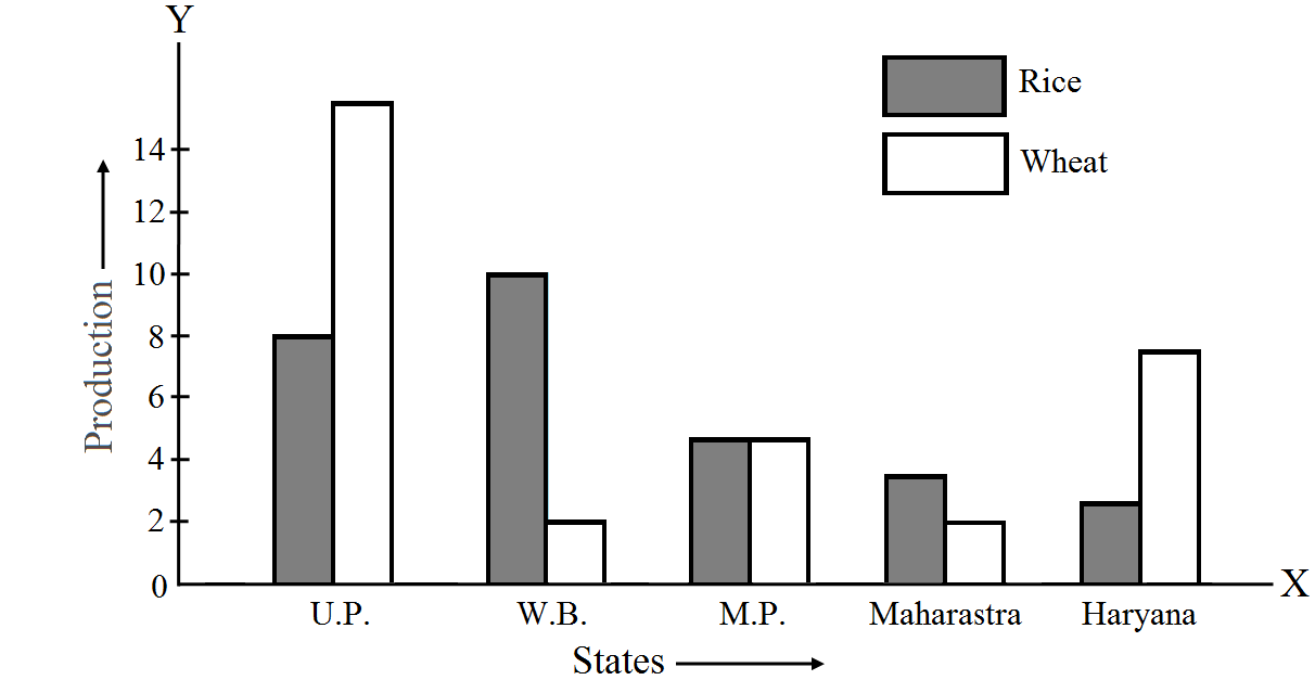
  1. What information is given by the bar graph?
  2. Which state is the largest producer of rice?
  3. Which state is the largest producer of wheat?
  4. Which state has total production of rice and wheat at its maximum?
  5. Which state has total production of wheat and rice at its minimum?
Answer
  1. The bar graph represents the production of rice and wheat in different states of India.
  2. According to the height of the bars corresponding to rice, W.B. is the largest producer of rice.
  3. According to the height of the bars corresponding to wheat. U.P. is the largest producer of wheat.
  4. U.P. has the maximum total production of rice and wheat, which is 8 + 16 = 24 units
  5. Maharashtra has the minimum total production of rice and wheat, which are exactly 2 + 4 = 6 units.
View full question & answer
Question 25 Marks
The investments (in ten crores of rupees) of Life Insurance Corporation of India in different sectors is given below:
Sectors
Investment (in ten crores of rupess)
Central government securities
45
State government securities
11
Securities guaranteed by the government
23
Private sectors
18
Socially oriented sectors (plan)
46
Socially oriented sectors (Non–plan)
11
Represent the above data with the help of a bar graph.
Answer
To represent the given data by a vertical bar graph, we first draw horizontal and vertical axes. Let us consider that the horizontal and vertical axes represent the sectors and the investment in ten Crores of rupees respectively. We have to draw 6 bars of different lengths given in the table. At first, we mark 6 points in the horizontal axis at equal distances and erect rectangles of the same width at these points. The heights of the rectangles are proportional to the investments of Life Insurance Corporation of India. The vertical bar graph of the given data is following:
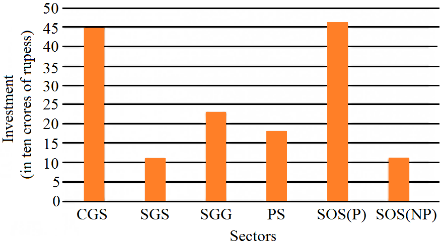
The short forms used in the graph are:
  1. C.G.S.: Central Government Securities.
  2. S.G.S.: State Government Securities.
  3. S.G.G.: Securities Guaranteed by Government.
  4. R.S.: Private Sectors.
  5. S.O.S.(P): Socially Oriented Sectors (Plan).
  6. S.O.S.(NP): Socially Oriented Sectors (Non-Plan).
View full question & answer
Question 35 Marks
The population of Delhi State in different census years is as given below:
Census year
1961
1971
1981
1991
2001
Population in Lakhs
30
55
70
110
150
Represent the above information with the help of a bar graph.
Answer
While drawing a bar graph, we keep in mind that:
The width of the bars should be uniform throughout.
The gap between any two bars should be uniform throughout.
Bars may be either horizontal or vertical.
To represent the given data by a vertical bar graph, we first draw horizontal and vertical axes.
Let us consider that the horizontal and vertical axes represent the years and the population in lakhs respectively. We have to draw 5 bars of different heights given in the table. At first, we mark 5 points in the horizontal axis at equal distances and erect rectangles of the same width at these points. The heights of the rectangles are proportional to the population in lakhs. The vertical bar graph of the given data is following:

Note that each bar is of the same width and the gap between them is uniform. Make sure that the width of the bars and the gap between them should not be necessarily same.
View full question & answer
Question 45 Marks
The following data gives the demand estimates of the Government of India, Department of Electronics for the personnel in the Computer sector during the Eighth Plan period (1990–95):
Qualifications
MCA (Masters in Computer Applications)
DCA (Diploma in Computer Applications
DCE (Diploma in Computer Engineering)
CL (Certificate Level Course)
ST (Short Term Course)
Personnel required
40600
181600
18600
670600
1802900
Represent the data with the help of a bar graph. Indicate with the help of the bar graph the course where the estimated requirement is least.
Answer
To represent the given data by a vertical bar graph, we first draw horizontal and vertical axes. Let us consider that the horizontal and vertical axes represent the qualifications and the personnel required in hundreds respectively. We have to draw 5 bars of different lengths given in the table. At first, we mark 5 points in the horizontal axis at equal distances and erect rectangles of the same width at these points. The heights of the rectangles are proportional to the number of personnel required.The vertical bar graph of the given data is following:
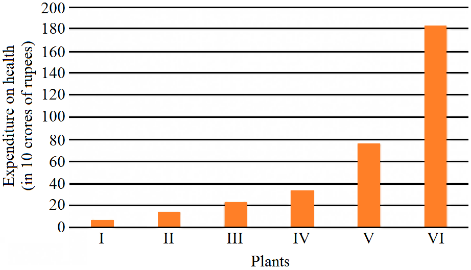
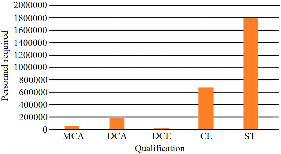
It is seen from the bar graph that the height of the 3ffl bar from the left is least, which is corresponding to DCE. Hence, the requirement is least in DCE.
View full question & answer
Question 55 Marks
The following bar graph represents the heights (in cm) of 50 students of Class XI of a particular school. Study the graph and answer the following questions:
  1. What percentage of the total number of students have their heights more than 149cm?
  2. How many students in the class are in the range of maximum height of the class?
  3. The school wants to provide a particular type of tonic to each student below the height of 150cm to improve his height. If the cost of the tonic for each student comes out to be Rs. 55, how much amount of money is required?
  4. How many students are in the range of shortest height of the class?
  5. State whether true or false:
  1. There are 9 students in the class whose heights are in the range of 155-159cm.
  2. Maximum height (in cm) of a student in the class is 17.
  3. There are 29 students in the class whose heights are in the range of 145-154cm.
  4. Minimum height (in cm) of a student is the class is in the range of 140-144cms.
  5. The number of students in the class having their heights less than 150cm is 12.
  6. There are 14 students each of whom has height more than 154cm.
Answer
  1. The total number of students is 50. The number of students having heights more than 149cm i.e desired percentage is:
$\Rightarrow\frac{(17+9+5)}{50\times100}$

$\Rightarrow62\%$
  1. The maximum range of height is 164-165cm. The number of students belonging to this group is 5.
  2. The number of students whose heights are less than 150cm is 7 + 12 = 19. Hence, the total cost is 19 × 55 = Rs. 1045/-
  3. The minimum range of height is 140–144cm. The number of students belonging to this group is 7.
  4.  
  1. The number of students whose heights are in the range 155–159cm is 9. Hence, the statement is true.
  2. The maximum possible height (in cm) of a student in the class can be 164cm. Hence the statement is false.
  3. The number of students whose heights are in the range 145-154cm is 12 + 17 = 29. Hence, the statement is true.
  4. The minimum range of heights of students in the class is 140-144cm. Hence, the statement is true.
  5. The number of students having heights less than 150cm is 7 + 12 = 19. Hence, the statement is false.
  6. The number of students having heights more than 154cm is 9 + 5 = 14. Hence, the statement is true.
View full question & answer
Question 65 Marks
The expenditure (in 10 crores of rupees) on health by the Government of India during the various five-year plans is shown below:
Plans
I
II
III
IV
V
VI
Expenditure on health(in 10 crores of rupees)
7
14
23
34
76
182
Construct a bar graph to represent the above data.
Answer
To represent the given data by a vertical bar graph, we first draw horizontal and vertical axes. Let us consider that the horizontal and vertical axes represent the years and the expenditures on health in 10 Crores rupees respectively. We have to draw 6 bars of different lengths given in the table. At first, we mark 6 points in the horizontal axis at equal distances and erect rectangles of the same width at these points. The heights of the rectangles are proportional to the expenditures on health by the government of India in different years.The vertical bar graph of the given data is following:
View full question & answer
Question 75 Marks
The following data gives the value (in crores of rupees) of the Indian export of cotton textiles for different years:
Years
1982–83
1983–84
1984–85
1985–86
1986–87
Value of exports of cotton textiles (in crores of rupees)
300
325
475
450
550
Represent the above data with the help of a bar graph. Indicate with the help of a bar graph the year in which the rate of increase in exports is maximum over the preceding year.
Answer
To represent the given data by a vertical bar graph, we first draw horizontal and vertical axes. Let us consider that the horizontal and vertical axes represent the years and the value of Indian export of cotton textiles in Crores of rupees respectively. We have to draw 5 bars of different lengths given in the table. At first, we mark 5 points in the horizontal axis at equal distances and erect rectangles of the same width at these points. The heights of the rectangles are proportional to the values of Indian export of cotton textiles in different years.The vertical bar graph of the given data is following:
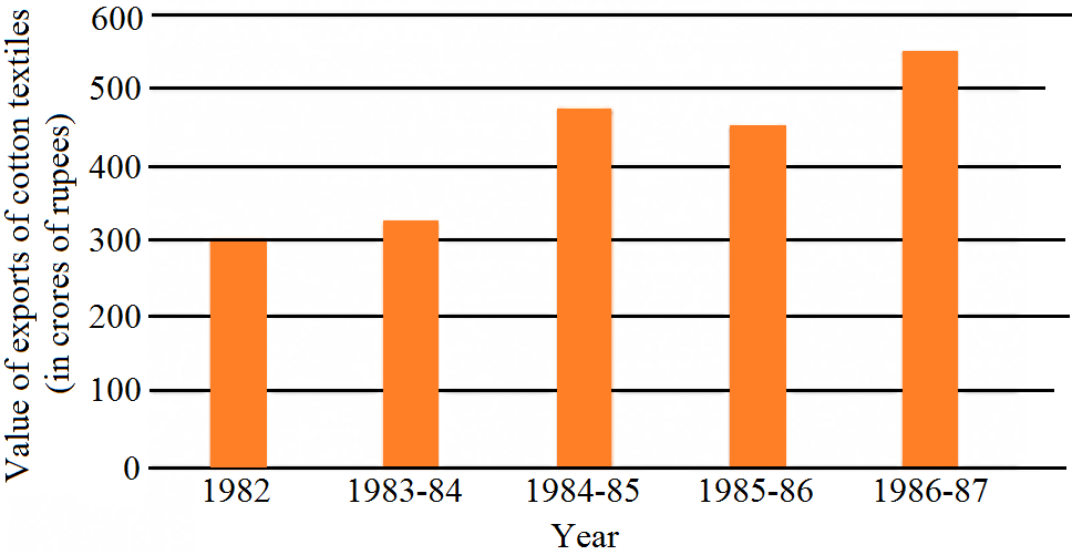
The export increases in the years 1983–84, 1984–85 and 1986–87. Now,
  1. The rate of increase in the year 1983–84 is:
$\Rightarrow\frac{325-300}{300}\times100$
$\Rightarrow\frac{25}{3}$
$=8.33\%$
  1. The rate of increase in the year 1984–85 is:
$\Rightarrow\frac{475-325}{325}\times100$
$\Rightarrow\frac{15000}{325}$
$\Rightarrow\frac{600}{13}$
$\Rightarrow46.15\%$
  1. The rate of increase in the year 1986–87 is:
$\Rightarrow\frac{550-450}{450}\times100$
$\Rightarrow\frac{10000}{450}$
$\Rightarrow22.22\%$
View full question & answer
Question 85 Marks
Read the bar graph shown in the figure and answer the following questions:
  1. What is the information given by the bar graph?
  1. What was the number of commercial banks in 1977?
  2. What is the ratio of the number of commercial banks in 1969 to that in 1980?
  3. State whether true or false:
The number of commercial banks in 1983 is less than double the number of commercial banks in 1969.
Answer
  1. The bar graph represents the number of commercial banks in India during some particular years.
  2. The number of commercial banks in 1977 was:
$120+\frac{(140-120)}{2}$

$\Rightarrow120+\frac{20}{2}$

$\Rightarrow120+10$

$\Rightarrow130$
  1. The number of commercial banks in 1969 was:
$80+\frac{(100-80)}{2}$

$\Rightarrow80+\frac{20}{2}$

$\Rightarrow80+10$

$\Rightarrow90$

The number of commercial banks in 1980 was:

$140+\frac{(160-140)}{2}$

$\Rightarrow140+\frac{20}{2}$

$\Rightarrow140+10$

$\Rightarrow150$

Hence, the required ratio is $\frac{90}{150}$

$\Rightarrow\frac{3}5{}$

$\Rightarrow3:5$
  1. The number of commercial banks in 1983 was:
$220+\frac{(240-220)}{2}$

$\Rightarrow220+\frac{20}{2}$

$\Rightarrow220+10$

$\Rightarrow230$

The number of commercial banks in 1969 was 90.

When we multiply this number by 2, it becomes 2 × 90 = 180

Clearly, 230 is not less than 180. Hence the statement is false.
View full question & answer
Question 95 Marks
The following table gives the quantity of goods (in crores of rupees)
Year
1950–51
1960–61
1965–66
1970–71
1980–81
1982–83
Quantity of goods (in crore tonnes)
9
16
20
20
22
26
Represent this information with the help of a bar graph.
Answer
To represent the given data by a vertical bar graph, we first draw horizontal and vertical axes. Let us consider that the horizontal and vertical axes represent the years and the quantity of goods in Crores tonnes respectively. We have to draw 6 bars of different lengths given in the table. At first, we mark 6 points in the horizontal axis at equal distances and erect rectangles of the same width at these points. The heights of the rectangles are proportional to the quantity of goods carried by Indian railways in different years.The vertical bar graph of the given data is following:
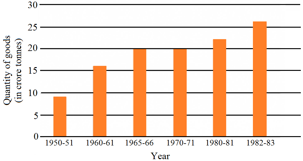
It is seen from the bar graph that the quantity of goods carried in the years 1950–51 and 1965–66 are 20 Crores tonnes and 9 Crores tonnes. Clearly 20 is more than 2 multiplied by 9. Hence, the statement is true.
View full question & answer
Question 105 Marks
The following data gives the amount of manure (in thousand tonnes) manufactured by a company during some years:
Year
1992
1993
1994
1995
1996
1997
Manure (in thousand tonnes)
15
35
45
30
40
20
  1. Represent the above data with the help of a bar graph.
  2. Indicate with the help of the bar graph the year in which the amount of manufactured by the company was maximum.
  3. Choose the correct alternative:
The consecutive years during which there was the maximum decrease in manure production are:
  1. 1994 and 1995
  2. 1992 and 1993
  3. 1996 and 1997
  4. 1995 and 1996
Answer
To represent the given data by a vertical bar graph, we first draw horizontal and vertical axes. Let us consider that the horizontal and vertical axes represent the years and the amount of manure in thousand 9 ones respectively. We have to draw 6 bars of different lengths given in the table. At first, we mark 6 points in the horizontal axis at equal distances and erect rectangles of the same width at these points. The heights of the rectangles are proportional to the amount of manures manufactured by the company.
  1. The vertical bar graph of the given data is following:
  1. It is seen from the bar graph that the height of the 3s bar from the left is maximum, which is corresponding to the year 1994. So in 1994, the quantity manufactured by the company was maximum.
  2. It is seen from the bar graph that the manure production is decreased in the years 1995 (1.5 scale divisions) and 1997 (2 full-scale divisions). So, the maximum decrease is in the year 1997. Hence, the correct choice is (c).
View full question & answer
Question 115 Marks
Given below is the bar graph indicating the marks obtained out of 50 in mathematics paper by 100 students. Read the bar graph and answer the following questions:
  1. It is decided to distribute workbooks on mathematics to the students obtaining less than 20 marks, giving one workbook to each of such students. If a workbook costs Rs. 5, what sum is required to buy the workbooks?
  2. Every student belonging to the highest mark group is entitled to get a prize of Rs. 10. How much amount of money is required for distributing the prize money?
  3. Every student belonging to the lowest mark-group has to solve 5 problems per day. How many problems, in all, will be solved by the students of this group per day?
  4. State whether true or false:
  1. 17% students have obtained marks ranging from 40 to 49.
  2. 59 students have obtained marks ranging from 10 to 29.
  1. What is the number of students getting less than 20 marks?
  2. What is the number of students getting more than 29 marks?
  3. What is the number of students getting marks between 9 and 40?
  4. What is the number of students belonging to the highest mark group?
  5. What is the number of students obtaining more than 19 marks?
Answer
  1. The number of students obtaining less than 20 marks is 27 + 12 = 39
  2. Hence, the total cost to buy the work books is 5 × 39 = Rs. 195.
  3. The highest mark group is 40–49. The number of students belonging to this group is 17. Hence, the total amount of money required to distribute the prize money is 10 × 17 = Rs. 170
  4. The lowest mark group is 0-9. The number of students belonging to this group is 27. Hence, the total number of problems will be solved by the students of this group is 5 × 27 = 135
The total number of students is 100 (given in the question)
  1. The number of students obtaining marks ranging from 40–49 is 17.
The percentage of students belonging to this group is $\Big(\frac{17}{100}\Big)\times100=17\%$

Hence, the statement is true.
  1. The number of students obtaining marks ranging from 10 to 29 is 12 + 20 = 32
Hence, the statement is false.
  1. The number of students getting less than 20 marks is 27 + 12 = 39
  2. The number of students getting more than 29 marks is 24 + 17 = 41
  3. The number of students getting marks between 9 to 40 is 12 + 20 + 24 = 56
  4. The number of students belonging to the highest mark group 40–49 is 17.
  5. The number of students obtaining more than 19 marks is 20 + 24 + 17 = 61
View full question & answer
Question 125 Marks
The bar graph shown in figure represents the circulation of newspapers in 10 languages.
Study the bar graph and answer the following questions:
  1. What is the total number of newspapers published in Hindi, English, Urdu, Punjabi, and Bengali?
  2. What percent is the number of newspapers published in Hindi of the total number of newspapers?
  3. Find the excess of the number of newspapers published in English over those published in Urdu.
  4. Name two pairs of languages which publish the same number of newspapers.
  5. State the language in which the smallest number of newspapers are published.
  6. State the language in which the largest number of newspapers are published.
  7. State the language in which the number of newspapers published is between 2500 and 3500.
  8. State whether true or false:
  1. The number of newspapers published in Malayalam and Marathi together is less than those published in English.
  2. The number of newspapers published in Telugu is more than those published in Tamil.
Answer
i. The total number of news papers published in Hindi, English, Urdu, Punjabi and Bengali is $=3700+3400+$ $700+200+1100=9100$.
ii. The total number of news papers published is $=1100+3400+1100+3700+1400+1400+200+1000+$ $400+700=14400$.
The number of news papers published in Hindi is 3700 . The percentage of published Hindi news papers is $\left(\frac{3700}{14400}\right) \times 100=\frac{3700}{144}=25.7 \%$
iii. The number of news papers published in English and Urdu are 3400 and 700 respectively. Hence, the excess of the number of news papers published in English over those published in Urdu is
$=3400-700=2700$
iv. According to the length of the $5^{\text {th }}$ and $6^{\text {th }}$ bars from the top, the number of news papers published in Marathi and Malayalam are same. According to the length of the $1^{\text {st }}$ and $3^{\text {rd }}$ bars from the bottom, the number of news papers published in Bengali and Gujrati are same.
v. According to the length of the 4th bar from the top, the smallest number of news papers published in the language Punjabi.
vi. According to the length of the 4th bar from the bottom, the largest number of news papers published in the language Hindi.
vii. The languages in which the number of published news papers is greater than or equal to 2500 are English and Hindi. Among the languages Hindi and English, the language in which the number of published news papers is less than or equal to 3500 is English. Hence, the language is English.
viii.
a. The number of news papers published in Malayalam and Marathi together is $1400+1400=2800$ The number of news papers published in English is 3400. Clearly, 2800 is less than 3400 . Hence, the statement is true.
b. The number of news papers published in Telugu and Tamil are 400 and 1000 respectively. Clearly 400 is not greater than 1000 . Hence, the statement is false.
View full question & answer