Question
Explain Market Demand schedule with a suitable diagram.
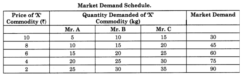
The above market demand schedule shows an inverse relationship between price and market demanded of commodity ‘X’. At a high price of ₹10 per kg of commodity ‘X’, the market demand is only 30 kg and at a lower price of market demand rises to 90 kg of commodity ‘X’.
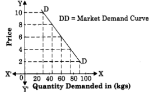
Market Demand Curve.
It is a graphical representation of market demand schedule X-axis represents quantity demanded (Market Demand) and Y-axis represents the price of the commodity. When the above market demand schedule is plotted on the graph, we derive the market demand curve ‘DD’, which slopes downward from left to right indicating inverse relationship between price and quantity demanded.
Generate a complete, print-ready paper with questions like this in minutes — across 16+ boards, with answer keys.
2. Top 10 Economies in the world in terms of GDP at current US $ trillion.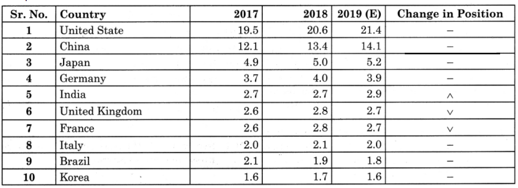
Data Source : World Economic Outlook, October 2019 database
QU.1. Which country has highest GDP in the world?
QU.2. Which country has the least GDP in the world?
QU.3. At what position does India stand with respect to GDP rates?
QU.4. Find out the difference in China’s GDP in the year 2017 and 2018.
QU.5. By how much India’s GDP has increased in the year 2017-2018.
QU.6. Given your opinion on India’s GDP.