Question
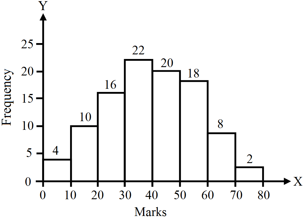
Present the data given in the table below with the help of a histogram.
Marks
Frequency
0-10
4
10-20
10
20-30
14
30-40
22
40-50
20
50-60
18
60-70
8
70-80
2

Answer

A histogram showing given data is given below:

Need a full question paper?

Generate a complete, print-ready paper with questions like this in minutes — across 16+ boards, with answer keys.

Start Generating Free

Similar questions

Prepare a bivariate frequency distribution for the marks by 24 examinees in Statistics and Accountancy.
Marks Marks
Statistics
Accountancy
Statistics
Accountancy
22
16
23
16
23
16
25
17
23
18
23
17
23
16
22
17
23
16
27
16
24
17
27
18
23
16
25
19
25
19
28
19
22
16
25
19
23
18
24
16
24
18
23
17
24
17
24
19
Subsidies on food, fertilisers, export promotion and others given by the government are shown in the table below (in crores). Represent the data diagrammatically.
Year
Food
Fertilsers
Export Promotion
Others
Total
2006-07
2000
1897
788
891
5576
2007-08
2200
2210
960
909
6279
2008-09
2300
3000
1091
925
7316
Discuss some of the uses of diagrams.
What is a false base line? How is it different from a kinked line?
Differentiate between frequency polygon and frequency curve.
The following table shows the total cost schedule for a competitive firm. It is given that the price of the good is ₹ 10. Calculate the profit at each output level. Find the profit-maximizing level of output.
OutputTC (₹)
05
115
222
327
431
538
649
763
881
9101
10123
Given the following schedule, state at which level of output, will the firm be at equilibrium and why.
Quantity (in units)Price (in ₹)Total Cost (in ₹)
0105
11025
21035
31040
41050
51070
610100
Construct a frequency polygon with histogram for the following data.
Class Inrercal
Frequency
0-10
4
10-20
6
20-30
7
30-40
14
40-50
16
50-60
14
60-70
8
70-80
6
80-90
5
Why does demand curve of a normal good slope downward from left to right?
What kind of indices NIFTY, SENSEX, HDI and Producer Price Index?