Question
This bar graph shows the maximum temperatures in degrees Celsius in different cities on a certain day in February. Observe the graph and answer the questions:

Image

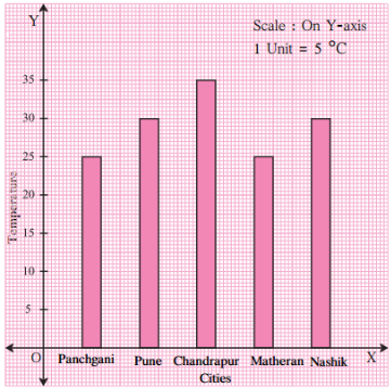
  1. What data is shown on the vertical and the horizontal lines?
  2. Which city had the highest temperature?
  3. Which cities had equal maximum temperatures?
  4. Which cities had a maximum temperature of 30 °C?
  5. What is the difference between the maximum temperatures of Panchgani and Chandrapur?

Answer

  1. Temperature is shown on the vertical line and cities are shown on the horizontal line.
  2. The city Chandrapur had the highest temperature.
  3. Pune and Nashik had the equal maximum temperature of 30°C and Panchgani and Matheran had the equal maximum temperature of 25°C.
  4. Pune and Nashik had a maximum temperature of 30 °C.
  5. The difference between the maximum temperatures of Panchgani and Chandrapur can be calculated as Difference in temperature = Temperature of Chandrapur – Temperature of Panchgani
    = 35°C – 25°C
    = 10°C

Need a full question paper?

Generate a complete, print-ready paper with questions like this in minutes — across 16+ boards, with answer keys.

Start Generating Free

Similar questions

For the cuboid shown:
  1. What is the base of this cuboid?
  2. What are the lateral faces of this cuboid?
  3. Name one pair of opposite faces. How many pairs of opposite faces are there. Name them.
  4. Name all the faces of this cuboid which have X as a vertex. Also, name those which have VW as a side.
  5. Name the edges of this cuboid which meet at the vertex P. Also name those faces which meet at this vertex.
Two ropes, one 8 metres long and the other 12 metres long are to be cut into pieces of the same length. What will the maximum possible length of each piece be?
The following data gives the amount of mature (in thousand tones) manufactured by a company during some years:
Year
1992
1993
1994
1995
1996
1997
Manure (in thousand tonnes)
15
35
45
30
40
20
  1. Represent the above data with the help of a bar graph.
  2. Indicate will the help of the bar graph the year in which the amount of manure manufactured by the company was maximum.
  3. Choose the correct alternative.
The consecutive years during which there was a maximum decrease in manure production are:
  1. 1994 and 1995
  2. 1992 and 1993
  3. 1996 and 1997
  4. 1995 and 1996
Using ruler and compasses only, draw an angle of measure 135°.
Yashwant gives different amounts of time as shown below, to different exercises he does during the week. Draw a bar graph to show the details of his schedule using an appropriate scale.
Type of exercise Running Yogasanas Cycling Mountaineering Badminton
Time 35 minutes 50 minutes 1 hr 10 min 1(1)/(2) hours 45 minutes
Find the greatest number of five digits exactly divisble by $9, 12, 15, 18$ and $24$.
Draw a line l. Take a point A, not lying on l. Draw a line m such that $\text{m}\perp\text{l}$ and passing through A. Using ruler and a set-square.
The following data gives the amount of loans (in crores of rupees) disbursed by a bank during some years:
Year
1992
1993
1994
1995
1996
Loan (in crores of rupees)
28
33
55
55
80
  1. Represent the above data with the help of a bar graph.
  2. With the help of the bar graph, indicate the year in which amount of loan is not increased over that of the preceding year.
$3 \frac{1}{5}+2 \frac{1}{3}$
Write each of the following as a Hindu-Arabic numeral:
S.No.
Roman numeral
i
XXVII
ii
XXXIV
iii
XLV
iv
LIV
v
LXXIV
vi
XCI
vii
XCVI
viii
CXI
ix
CLIV
x
CCXXIV
xi
CCCLXV
xii
CDXIV
xiii
CDLXIV
xiv
DVI
xv
DCCLXVI