Question
Write a python program using function to print the table of the number. The function should take a numbers as parameter.
Get the step-by-step solution for this question inside the Vidyadip app.
Get the answer in the appGenerate a complete, print-ready paper with questions like this in minutes — across 16+ boards, with answer keys.

Table: HOSPITAL
| PNo | Name | Age | Department | DateofAdm | Charges | Sex |
| 1 | Mayank | 65 | Surgery | 23/02/2018 | 600 | M |
| 2 | Babita | 24 | ENT | 01/01/2019 | 400 | F |
| 3 | Kashish | 45 | Orthopaedic | 19/12/2018 | 400 | M |
| 4 | Tarun | 12 | Surgery | 01/10/2018 | 600 | M |
| 5 | Manisha | 36 | ENT | 12/01/2018 | 400 | F |
| 6 | Imran | 16 | ENT | 24/02/2018 | 400 | M |
| 7 | Ankita | NULL | Cardiology | 20/08/2018 | 800 | F |
| 8 | Zoya | 45 | Gynecology | 22/02/2018 | 500 | F |
| 9 | Kush | 19 | Cardiology | 13/01/2019 | 800 | M |
| 10 | Shalini | 31 | Medicine | 19/02/2018 | 300 | F |
Note: PNo is the primary key in the above table.
Write SQL commands for the statements (a) to (g) on the table HOSPITAL.
(a) To show all the information about the patients of the cardiology department.
(b) To list the names of female patients who are either in the orthopaedic or surgery department.
(c) To list the name of all the patients with their date of admission in ascending order.
(d) To display the patient’s name, charges, the age for female patients only.
(e) To count the number of patients with age > 30.
(f) To display various departments.
(g) To display the number of patients in each department.
![]()
data name : Percentage of Schools with Computers from 2013-14 to 2015-16
Screen shot of the data:
Assuming that we have saved the file with name: "computer_data" in python default folder.
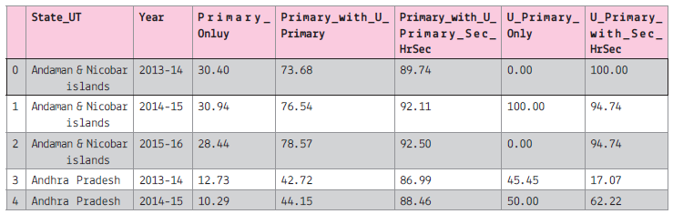
Assuming that all the required libraries are imported once:
![]()
(i) To create the data frame of the above file.
(ii) To display all the column names of the data frame.
(iii) To plot the line graph for the first 5 record of the Primary Only column on y-axis and 'State_UT' on x-axis.
The line colour should be red and marker as 'x'. The graph will display only 2013-14
(iv) To display the histogram of the 2013-14, primary_only column.
(v) To display bar graph of the last 7 record of the year 2013-14 use the title and required label. Also write the statement to create the data frame.
(vi) To display the pie chart of the first 10 records of the 2013-14. Also create the data frame.
(vii) To display the boxplot for the Sec with higher secondary and All India data.
(viii) To display the scatter diagram of the 2014-15

Write a script to create a list of 10 random integers and display it. Then input an integer from the user and check whether it is present in the list (use in operator). If it is present in the list, then remove it from the list. If the element is present in the list multiple times then all its occurrences should be removed. (use remove() method). If the element is not present, then display an appropriate message.