Questions

2 Marks Questions

Take a timed test

6 questions · self-marked practice — reveal the answer and mark yourself.

Question 12 Marks
Draw a graph for the following
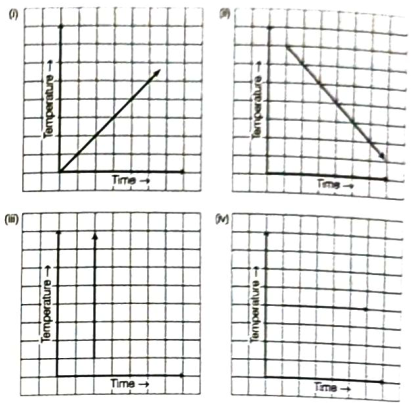
(i)
Size of Square (in cm ) 231554
Perimeter (in cm)812142024
Is it a linear graph?
(ii)
Size of Square (in cm ) 23456
Area (in cm2)49162536
Is it a linear graph?
Answer
(i) To draw a graph of given table of values, we get the following steps:
Step I Firstly, draw X-axis and Y-axis and take scale on horizontal axis 2 units = 1 cm (side of square) on vertical axis I unit = 2 cm (perimeter)
Step II Mark side of square (in cm) on horizontal axis and perimeter (in cm) on vertical axis.
Step III Now, plot the points (2, 8), (3, 12), (3.5, 14). (5, 20) and (6, 24) on the graph paper.
Step IV Join these points. Then, we get a linear graph which is shown below:
Image
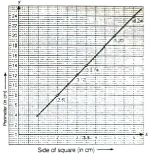
Yes, it is a linear graph.
(ii) Do same as part (i)
The line joining the points is not a straight line. So. the graph is not linear.
View full question & answer
Question 22 Marks
Can there be a time-temperature graph as follows? Justify your answer.
Image
Answer
We know that if time is increasing, then temperature will either be increase or decrease or constant.
(i) Yes, it is the time-temperature graph, because it shows increase in temperature with increase in time.
(ii) Yes, it is the time-temperature graph, because it shows decrease in temperature with increase in time.
(iii) No, it is not the time-temperature graph, because it shows that at a particular time temperature increase (i.e. different temperature) which is not possible.
(iv) Yes, it is the time-temperature graph, because it shows that at different time (or increasing time) temperature is constant (or same).
View full question & answer
Question 32 Marks
A courier-person cycles from a town to a neighbouring Suburban area to deliver a parcel to a merchant. His distance from the town at different times is shown by the following graph
(i) What is the scale taken for the time axis?
(ii) How much time did the person take for the travel?
(iii) How far is the place of the merchant from the town?
(iv) Did the person stop on his way? Explain.
(v) During which period did he ride fastest?
Image
Answer
(i) In the given graph, the scale is taken for the time axis (i.e. along $X$-axis) is 4 units $=1 h$.
(ii) The person start travel at 8 am and end at 11:30 am.
So, total travelling time
$=$ Difference between 8 am to $11: 30 am$
$=3 \frac{1}{2} h$ or 3 h 30 min
(iii) From the given graph, it is clear that the distance of the place of the merchant from the town is 22 km.
(iv) Yes, from the given graph, it is clear that the person was 16 km away from town when the time was 10 am to 10:30 am. This shows that the person did not travel during the interval 10 am to 10:30 am. The horizontal line segment representing travel during this period is illustration of this fact.
(v) Distance covered by person between 8 am to 9 am
$= 10 km$
Distance covered by person between 9 am to 10 am
$=(16-10)=6 km$
Distance covered by person between 10 am to 10: 30 am
$=(16-16)=0 km$
Distance covered by person between $10: 30 am$ to $11: 30 am$
$=(22-16)=6 km$
Hence, we can say that the courier person ride fastest in between 8 am to 9 am .
View full question & answer
Question 42 Marks
Use the tables below to draw linear graphs.
(i) The number of days a hill side city received snow in different years.
Years2003200420052006
Days810512
(ii) Population (in thousands) of men and women in a village in different years.
Years20032004200520062007
Number of men1212.51313.213.5
Number of women11.311.91313.612.8
Answer
(i) Firstly, draw two perpendicular lines on the graph paper and then take yeas along $X$-axis and days along $Y$-axis,
Image
Now, mark the points $(2003,8),(2004,10),(2005,5)$ and $(2006,12)$ on the graph paper and join them. Thus, we get a linear graph which show snow fall in different years.
(ii) Firstly, draw two perpendicular lines on the graph paper and then take year along $X$-axis (horizontal line) and population (in thousand) along $Y$-axis (vertical line).
Now, mark the points $(2003,12),(2004,12.5),(2005$, $13),(2006,13.2)$ and $(2007,13.5)$ on the graph paper and join them by dark line.
Thus, we get linear graph for men. Again, mark the points $(2003, 11.3)$, $(2004, 11.9)$, $(2005, 13)$, $(2006,13.6)$ and $(2007,12.8)$ on the graph paper and join them by dotted lines. Thus, we get line graph for women.
Hence, the required linear graph for population (in thousand) of men and women in a village in different years is given below
Image
View full question & answer
Question 52 Marks
The following line graph shows the yearly sales figures for a manufacturing company.
(i) What were the sales in (a) 2002 (b) 2006?
(ii) What were the sales in (a) 2003 (b) 2005?
(iii) Compute the difference between the sales in 2002 and 2006.
(iv) In which year was there the greatest difference between the sales as compared to its previous year?
Image
Answer
(i) (a) From given graph, it is clear that the sales in the year 2002 was ₹ 4 crore.
(b) From given graph, it is clear that the sales in the year 2006 was ₹ 8 crore.
(ii) (a) The sales in the year 2003 was ₹ 7 crore.
(b) The sales in the year 2005 was ₹ 10 crore.
(iii) From the given graph,
The sales in the year 2002 = ₹ 4 crore.
The sales in the year 2006 = ₹ 8 crore.
$\therefore$ Required difference = Sales in (2006-2002)
$=$ ₹ $(8-4)$
$= $ ₹ $4 crorer$
(iv) From the given graph, difference between the sales is in 2003 from the previous year 2002
$=$ ₹ $(7-4)$
$=$ ₹ $ 3$ crore
and in 2005 from the previous year $2004=$ ₹ $(10-6)$ =  ₹ 4 crore
So, in 2005 there was the greatest difference between the sales as compared to its previous year.
View full question & answer
Question 62 Marks
The following graph shows the temperature of a patient in a hospital, recorded every hour.
(i) What was the patient's temperature at 1 pm ?
(ii) When was the patient's temperature $38.5^{\circ} C$ ?
Image
(iii) The patient's temperature was the same two times during the period given. What were these two times?
(iv) What was the temperature at 1:30 pm? How did you arrive at your answer?
(v) During which periods did the patients temperature showed an upward trend?
Answer
(i) From the given graph, it is clear that the patient's temperature at 1 pm was $36.5^{\circ} C$.
(ii) From the given graph, it is clear that the patient's temperature was $38.5^{\circ} C$ at 12 noon.
(iii) From the given graph, it is clear that the patient's temperature was same i.e. $36.5^{\circ} C$ at 1 pm and 2 pm .
(iv) From the given graph, it is clear that the patient's temperature at 1 pm and 2 pm was same which is $36.5^{\circ} C$. This shows that temperature did not change during the interval 1 pm to 2 pm . Also, 1: 30 pm is between 1 pm and 2 pm , so the temperature at 1: 30 pm was $36.5^{\circ} C$.
(v) From the given graph, it is clear that the patient's temperature showed an upward trend during the periods 9 am to 10 am , 10 am to 11 am and 2 pm to 3 pm , because temperature is increasing in these intervals.
View full question & answer
2 Marks Questions - MATHS STD 8 Questions - Vidyadip