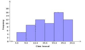
Question 15 Marks
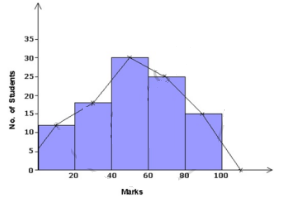
Draw a histogram for the following cumulative frequency table:
| Marks | Less than $10$ |
Less than $20$ |
Less than $30$ |
Less than $40$ |
Less than $50$ |
Less than $60$ |
| Number of student |
$7$ | $18$ | $30$ | $45$ | $55$ | $60$ |
Answer
The histogram is as follows:
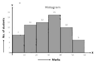
View full question & answer→| Marks | $0 - 10$ | $10 - 20$ | $20 - 30$ | $30 - 40$ | $40 - 50$ | $50 - 60$ |
| Number of students | $7$ | $11$ | $12$ | $15$ | $10$ | $5$ |