Question
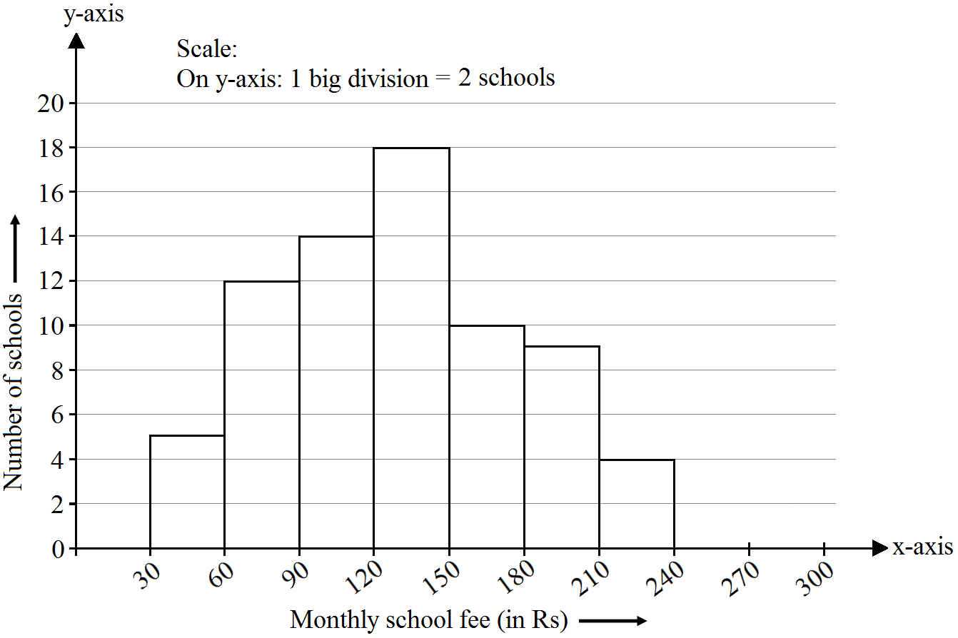
Construct a histogram for the following data:
Monthly school fee (in Rs.)
30-60
60-90
90-120
120-150
150-180
180-210
210-240
Number of schools
5
12
14
18
10
9
4

Answer

The class limits are represented along the x-axis and the frequencies along the y-axis on a suitable scale. Taking class intervals as bases and corresponding frequencies as heights of the rectangles, the histogram of the given data can be obtained as shown in the figure below:

Need a full question paper?

Generate a complete, print-ready paper with questions like this in minutes — across 16+ boards, with answer keys.

Start Generating Free