Question
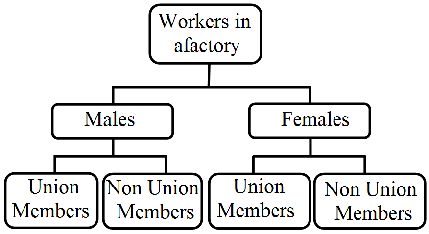
Explain different ways of classifying data.
|
States of India
|
Punjab
|
Haryana
|
J & k
|
Bihar
|
Orissa
|
M.P.
|
|
Poverty (%)
|
12
|
10
|
3.5
|
39
|
38
|
34
|
|
Year
|
1951
|
1961
|
1971
|
1981
|
1991
|
2001
|
|
Poverty (%)
|
52
|
50
|
47
|
38
|
36
|
26
|
|
Month
|
Family expenditure per member
|
|
January
|
2000
|
|
February
|
3000
|
|
March
|
1000
|
|
April
|
1200
|
|
May
|
2300
|
|
June
|
1400
|
|
July
|
1100
|
|
August
|
4300
|
|
September
|
900
|
|
October
|
1900
|
|
November
|
2100
|
|
December
|
3100
|
|
Salary Per Month
|
No. of workers
|
|
0-10000
|
40
|
|
10,000-20,000
|
10
|
|
20000-30000
|
13
|
|
30000-40000
|
8
|
|
40,000-50,000
|
12
|
|
50,000 and above
|
7
|
Generate a complete, print-ready paper with questions like this in minutes — across 16+ boards, with answer keys.
| Price (₹) | Demand (Units) |
| 5 | 10 |
| 5 | 8 |
| 5 | 12 |
1. On the basis of the data given above when demand changes from 10 units to 8 units, that situation will be called
(a) increase in demand
(b) decrease in demand
(c) extension of demand
(d) contraction of demand
2. On the basis of your answer of the above question, what will be the shape of new demand curve?
(a) Demand curve shifts to the left
(b) Demand curve shifts to the right
(c) There is downward movement along the demand curve
(d) There is upward movement along the demand curve
3. On the basis of the data given above when demand changes from 10 units to 12 units, that situation will be called __________ .
(a) increase in demand
(b) decrease in demand
(c) extension of demand
(d) contraction of demand
4. On the basis of your answer of the above question, what will be the shape of new demand curve?
(a) Demand curve shifts to the left
(b) Demand curve shifts to the right
(c) There is downward movement along the demand curve
(d) There is upward movement along the demand curve
5. Read the following statements carefully and choose the correct alternative among those given below:
Statement 1 : Shift in demand curve shows extension or contraction of demand.
Statement 2 : Movement along the demand curve is indicated by upward or downward movement along the same demand curve.
(a) Both the statements are true
(b) Both the statements are false
(c) Statement 1 is true and Statement 2 is false
(d) Statement 2 is true and Statement 1 is false
6. On the basis of the data given above when demand changes from 10 units to 8 units, we assume that ______________ .
(a) own price of the commodity is constant
(b) other determinants of demand (other than own price of the commodity) are constant
(c) other determinants of demand (including own price of the commodity) are constant
(d) none of these
|
Itens
|
Expenditure (in %)
|
|
Labour
|
25
|
|
Bricks
|
15
|
|
Cement
|
20
|
|
Steel
|
15
|
|
Timber
|
10
|
|
Supervision
|
15
|
|
Production yield (kg. per hectare)
|
||||||||
|
50-53
|
53-56
|
56-59
|
59-62
|
62-65
|
65-68
|
68-71
|
71-74
|
74-77
|
|
Number of farms
|
||||||||
|
3
|
8
|
14
|
30
|
36
|
28
|
16
|
10
|
5
|
|
Cuntry
|
Export (in %)
|
|
USA
|
25
|
|
Japan
|
15
|
|
UK
|
30
|
|
China
|
20
|
|
Others
|
10
|
|
X
|
2
|
3
|
5
|
6
|
8
|
9
|
|
Y
|
6
|
5
|
7
|
8
|
12
|
11
|
|
Age
|
0-10
|
10-20
|
20-30
|
30-40
|
40-50
|
50-60
|
60-70
|
70-80
|
|
No. of persons
|
12
|
18
|
35
|
42
|
50
|
45
|
20
|
8
|