Questions

3 Marks Question

🎯

Test yourself on this topic

41 questions · timed · auto-graded

Question 13 Marks
Prepare a blank table to show distribution of population according to age, sex and literacy for a particular year.
Answer
Distribution of population on the basis of age, sex and literacy in the year 2015 is tabulated below:
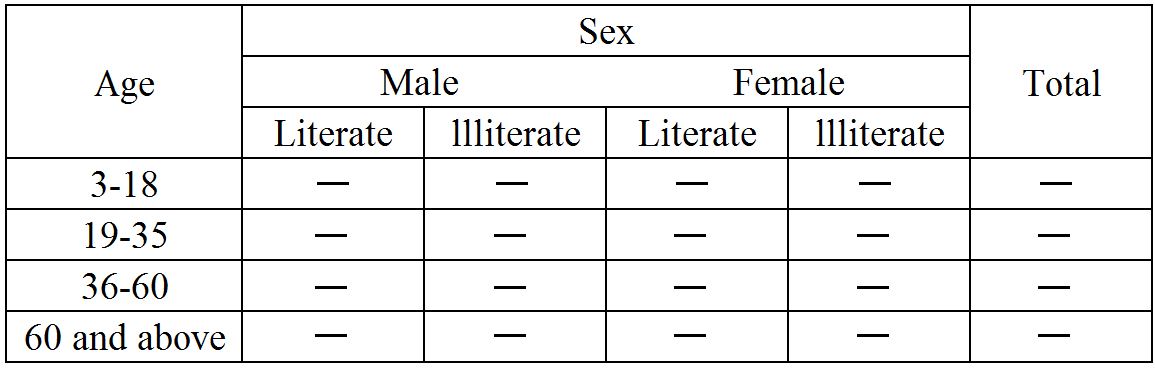
View full question & answer
Question 23 Marks
Explain any four features of a good statistical table.
Answer
The main features of a good statistical table are:
  1. It should be clear and brief.
  2. It should suit the purpose.
  3. It should be represented in a systematic manner.
  4. It should be easily understood.
  5. It should be self-explanatory.
  6. It should avoid abbreviations.
View full question & answer
Question 33 Marks
Write short note on broken bar diagram.
Answer
Sometimes we have such a series in which all values except one are approximate to each other. One value is exceptionally high. In order to provide proper shape, the larger bar is broken at the top and the value of each bar is written on the top. Its purpose is to:
  1. Save time.
  2. Save space.
  3. To give a proper shape to the diagram.
View full question & answer
Question 43 Marks
Show the annual profit figures of a firm with the help of a time series graph.
Year
Profit (in ₹ '000)
2006
60
2007
72
2008
75
2009
65
2010
80
2011
95
 
Answer
As per the question, year 2006 to 2011 and their respective profits are given. Before plotting the graph, a false base line should be prepared in order to make profit scale equal.
A time series graph of given annual profit figures is shown below:
View full question & answer
Question 53 Marks
How is a histogram constructed when class intervals are equal? How does it differ from a frequency polygon?
Answer
While constructing a histogram which is based on a continuous frequency distribution with equal class-intervals, the following steps should be followed:
Step 1: On the X-axis, the class intervals are specified. The magnitude of class intervals will determine the width of the rectangle.
Step 2: On the Y-axis, the frequencies are plotted, which determine the height of the rectangle.
Histogram presents a frequency distribution arranged in the form of adjacent rectangles, while frequency polygon is a graphical representation of a line joining the mid-values of the top of the frequency rectangles of histogram.
View full question & answer
Question 63 Marks
Present the data given by means of a percentage bar diagram:
Gender Enrolled (%) Out of school (%)
Boys 91.5 8.5
Girls 58.6 41.4
All 78.0 22.0
Answer
Percentage Bar Diagram.
View full question & answer
Question 73 Marks
Differentiate between one dimensional and two dimensional diagrams.
Answer
In one-dimensional diagrams or charts, only the length of the bar is taken into consideration. But in two dimensional diagrams, both its height and width are taken into account for presenting the data. These diagrams, also known as surface diagrams or area diagrams.
View full question & answer
Question 83 Marks
What is a false base line? What is its purpose? Give an example.
Answer
Usually, when we draw any graph, the scale on which the graph is measured starts from zero on the y-axis. However, under the situations when the data to be plotted on graph starts from a value which is far above zero, results in the problem of shortage of space on graph. To overcome this problem of shortage of space, a false base line is plotted. False base line is a line which is drawn to grasp the attention of the reader on the fluctuations which usually remains unnoticed.
View full question & answer
Question 93 Marks
Differentiate between Sub Divided and Multiple Bar Diagram.
Answer
S. No.
Sub divided Bar Diagram
Multiple Bar Diagram
1.
In Sub divided bar diagram, different components are shown in single bar with divisions.
In multiple bar diagram, different components are shown in different bars.
2.
In Sub divided bar diagrams, 4-5 variables can be shown.
In multiple bar diagram not more than three items can be shown comfortably.
3.
It cannot be used to compare relative importance of different components.
It can be used to compare relative importance of different components.
View full question & answer
Question 103 Marks
What kind of diagrams are more effective in representing the following?
  1. Components of cost in a factory.
  2. Composition of population of Mumbai by religion.
  3. Agriculture output of six states of India.
Answer
  1. Components of cost in a factory can be effectively presented with the help of 'Component Bar Diagram'.
  2. Composition of population of Mumbai by religion can be effectively presented with the help of 'Percentage Bar Diagram'.
  3. Agriculture output of six states can be effectively presented with the help of 'Simple Bar Diagram'.
View full question & answer
Question 113 Marks
What are uses of graphs?
Answer
Graphic Presentation gives a visual effect. It is widely used in researches and analysis of data. It is accurate and precise method of presenting data. It works not only as a tool of presenting data but also as a tool of analysis of data. There can be many types of graphs.
View full question & answer
Question 123 Marks
Name the different attributes according to which data in a table can be classified.
Answer
The different attributes according to which data in a table can be classified are:
  1. Qualitative classification.
  2. Quantitative classification.
  3. Temporal classification.
  4. Spatial classification.
View full question & answer
Question 133 Marks
What kind of diagrams are more effective in representing the following?
Composition of the population of Delhi by religion.
Answer
Composition of the population of Delhi by religion: Composition of the population of Delhi by religion can be diagrammatically presented in a simple bar diagram. This diagram is based on a single set of data of numerical data. Here, the X-axis represents different religion and the Y-axis represents the composition of the population of Delhi. According to the composition of the population of Delhi of different religions, the corresponding bars are made of the respective heights to construct a simple bar diagram. This helps compare and analyse the composition of the population of Delhi by religion.
View full question & answer
Question 143 Marks
Explain the following objectives of tabulation of data.
  1. To simplify complex data.
  2. To compute statistical averages.
Answer
  1. To Simplify Complex Data: The basic objective of tabulation is to simplify complex data by presenting it in rows and columns so that it is easily understood.
  2. To Compute Statistical Averages: Various statistical averages such as mean, median, mode, etc can be easily computed with the help of tabulated data.
View full question & answer
Question 153 Marks
Mention three advantages of diagrammatic presentation.
Answer
The three advantages of diagrammatic presentation are:
  1. Diagrams are attractive and impressive and leave a lasting impression on the mind.
  2. They can be used for making quick comparisons.
  3. Some frequency diagrams help in determining median, quartiles and mode.
  4. They are used in exhibitions, fairs etc. to give information to the common man.
  5. They are easy to understand.
View full question & answer
Question 163 Marks
Prepare a suitable table from the following information:
In Mumbai, 80% of the total population were tea drinkers. Out of which 62% are males and 18% are females. Rest are non-tea drinkers, out of which 12% are females. Give suitable title.
Answer
Tea Drinking Habits in Mumbai
Habits Male Female Total
Tea Drinkers 62 18 80
Non-Tea Drinkers 8 12 20
Total 70 30 100
View full question & answer
Question 173 Marks
What are the disadvantages of diagrammatic presentation of data?
Answer
The disadvantages of diagrammatic presentation of data are:
  1. Through diagrams, the approximate value of the data is presented. Due of this, diagrams indicate only the aggregate behaviour of the variable under study.
  2. Diagrammatic presentation of data gives a general view of the variables under study. As such, it is suitable only for preliminary discussions and not for taking the final decision.
  3. It can be used to mislead its users. It is generally used by advertisers to mislead the consumers.
View full question & answer
Question 183 Marks
Give any two advantages and disadvantages of textual presentation of data.
Answer
The advantages of textual presentation are:
  1. This method helps the investigator to express his views on the data.
  2. This method is a combination of figures and facts, which makes it easy to understand.
The disadvantages of textual presentation are:
  1. This method of presentation is ineffective when the quantity of data is too large.
  2. The user of the data has to go through the complete text for understanding the problem under investigation.
View full question & answer
Question 193 Marks
Present the data given in a histogram:
Marks
0-10
10-20
20-30
30-40
40-50
50-60
60-70
70-80
Frequency
4
10
16
22
20
18
8
2
Answer
Hisrrogram
View full question & answer
Question 203 Marks
What is tabulation? Differentiate between tabulation and classification.
Answer
Tabulation is the process of condensing classified data in the form of a table so that it may be more easily understood, and so that any comparison involved may be more readily made. -D. Gregory and H. Ward
It is a medium of communication of great economy and effectiveness for which ordinary prose is inadequate. In addition to its formation in simple presentation, the statistical table is also a useful tool of analysis. -D. W. Paden and E. F. Lindquist
In classification, data are separated and grouped based on a property of the data common to all values.
  1. In tabulation, data is arranged into columns and rows based on characteristics/ properties, or indicators.
  2. Tabulation often emphasize on the presentation aspects of the data, while classification is used as a means of sorting of data for further analysis.
View full question & answer
Question 213 Marks
Give the features of a good diagrammatic presentation.
Answer
A good diagrammatic presentation should have the following features:
  1. The presentation should be attractive, accurate, simple and easy to understand.
  2. It should communicate the required information effectively.
  3. The diagrams drawn to present the data should be proportionate in height and width.
  4. As far as possible, the diagrammatic presentation should be self-explanatory. Words and calculation should be avoided in a diagrammatic presentation.
  5. In diagrammatic presentation, vertical diagrams should be preferred over horizontal presentation.
  6. The data on the basis of which the diagrams are drawn, should be clearly mentioned.
View full question & answer
Question 223 Marks
Differentiate between Histogram and Bar Diagram.
Answer
The difference between Histogram and Bar Diagram is given below:
S. No.
Histogram
Bar Graph
1.
It consists of rectangles touching each other.
It consists of rectangles normally separated from each other with equal space.
2.
The frequency is represented by the area of each rectangle.
The frequency is represented by height. The width has no significance.
3.
It is two dimensional where both the width (base) and the length (height of the rectangle) are important.
It is one dimensional in which only length(height) matters while width is arbitrary.
View full question & answer
Question 233 Marks
Give three examples where deviation bar diagram can be used.
Answer
Deviation bar charts are suitable for presentation of net quantities in excess or deficit such as profit, loss, import, or exports. The excess (or positive) values and deficit (or negative) values are shown above and below the base line. These are also called Bilateral Bar Diagrams.Three examples where these can be used:
  1. To show profit or loss of a company.
  2. To show balance of trade of a country.
  3. To show balance of inflow and outflow of cash in a company.
View full question & answer
Question 243 Marks
“Diagrams are less accurate but more effective than tables in presenting the data". Explain.
Answer
Diagrams lack accuracy as they show only approximate values. Small difference in values are not comprehendible in a diagram. Yet, they are more effective than table in presenting the data because of the below mentioned reasons:
  1. They are simple, attractive and capable of creating an impression.
  2. They facilitate easy comparison.
View full question & answer
Question 253 Marks
Explain different types of two dimensional diagrams.
Answer
Different types of two dimensional diagrams have been explained below:
Rectangles: Since area of a rectangle is equal to the product of its length and width, while making such type of diagrams both length and width are considered. Rectangles are suitable for use in cases where two or more quantities are to be compared and each quantity is sub-divided into several components.
Squares: To construct a square diagram, first the square-root of the values of various figures to be represented is taken and then these values are divided either by the lowest figure or by some other common figure to obtain proportions of the sides of the squares. The squares constructed on these proportionate lengths must have either the base or the center on a straight line. The scale is attached with the diagram to show the variable value represented by one square unit area of the squares.
Circles: Circles are alternatives to squares to represent data graphically. The circles are also drawn such that their areas are in proportion to the figures represented by them. The circles are constructed in such a way that their centers lie on the same horizontal line and the distance between the circles is equal. Since the area of a circle is directly proportional to the square of its radius, the radii of the circles are obtained in proportion to the square root of the figures under representation. Thus, the lengths that were used as the sides of the square can also be used as the radii of circles.
View full question & answer
Question 263 Marks
What kind of diagrams are more effective in representing the following?
Components of cost in a factory.
Answer
Components of cost in a factory: The components of cost in a factory can be diagrammatically presented in a pie diagram. Values of each component of costs in a factory are first expressed as percentage of the total value of all the components of cost. Different parts of a circle represent the value of different components of cost in a factory.
View full question & answer
Question 273 Marks
The frequency distribution of marks obtained by 225 students of a college is given below:
Marks
0-10
10-20
20-30
30-40
40-50
No. of students
30
45
55
60
35
Draw a histogram to represent the frequency distribution of marks.
View full question & answer
Question 283 Marks
Explain any three merits of a statistical table.
Answer
Following are the merits of a statistical table:
  1. Simple Presentation: Statistical table helps in simple presentation of data. Data is easily understood if table is systematically prepared.
  2. Helps in Comparison: Statistical table facilitates comparison of data by presenting the data properly in rows and columns.
  3. Special Emphasis: Statistical table highlights important characteristics of data. Accordingly, it becomes easy to draw inferences from it.
View full question & answer
Question 293 Marks
Present the data in the form of a simple (vertical) bar diagram:
Years 2014 2015 2016 2017 2018
Production of wheat (million tonnes) 100 200 400 340 550
Answer

.
View full question & answer
Question 303 Marks
Briefly explain any four factors which should be kept in mind while preparing a table.
Answer
The following factors should be kept in mind while preparing a table:
  1. Headings should generally be written in the singular form. For example, in the columns indicating goods, the word 'good' should be used.
  2. Use of abbreviations should be avoided in the heading or sub-headings of the table.
  3. Footnote should be given, only if needed.
  4. Size of table should be in accordance with the size of the paper.
View full question & answer
Question 313 Marks
Draw a histogram and frequency polygon from the following data:
Marks
0-5
5-10
10-15
15-20
20-25
25-30
30-35
35-40
40-45
45-50
No. of Students
3
7
13
25
40
14
10
7
4
2
View full question & answer
Question 323 Marks
Distinguish between a bar diagram and a histogram.
Answer
The differences between bar diagram and histogram are:
S. No.
Bar Diagram
Histogram
1.
The spacing and the width or the area of bars are all arbitrary. It is the height and not the width or the area of the bar that really matters.
The width in a histogram is as important as its height, which should remain same for all the rectangles.
2.
Bar diagram can be drawn both for discrete and continuous variables.
Histogram is drawn only for a continuous variable.
3.
In bar diagram, some space must be left between consecutive bars.
In histogram, no space is left between two rectangles.
View full question & answer
Question 333 Marks
Represent the following data by means of a component bar diagram:
Year
Males (in crores)
Females (in crores)
Total Population (in crores)
2015
25
10
35
2016
30
20
50
2017
50
25
75
Answer
Component Bar Diagram.
View full question & answer
Question 343 Marks
What do you mean by arithmetic line graph? Explain briefly.
Answer
Arithmetic line graph is a graph of time series data. In it, time period is shown on the x-axis and the corresponding values of the variable are shown on the y-axis. Arithmetic line graph, also called time series graph is of two types:
  1. Graphs of one variable: If only one variable is to be shown then time is measured along the x-axis and the value of the variable on the y-axis.
  2. Graphs of two or more variables: When two or more variables are shown on the same graph then different types of lines (dotted lines, broken lines etc.) are preferred to be used.
View full question & answer
Question 353 Marks
Differentiate between one variable graphs and two or more than two variable graphs.
Answer
Difference between one variable graph and two or more than two variable graph are:
S. No.
Basis
One Variable Graph
Two or More than two Variable Graphs
1.
Meaning
One variable graphs are those graphs in which values of only one variable are shown with respect to time period of equal duration
Two or more than two variable graph simultaneously show the value of two or more than two variables with respect to some period of time.
2.
Example
Year
2015
2016
Year
2015
2016
Profit (in '000)
55
70
Sales (in '000)
120
175


Profit (in '000)
55
70
 
View full question & answer
Question 363 Marks
What kind of diagrams are more effective in representing the following?
Monthly rainfall in a year.
Answer
Monthly rainfall in a year: The monthly rainfall in a year can be diagrammatically presented in a bar diagram. In this diagram, data can be presented in the form of bars or rectangles. These bars can be compared by their relative height, and so, the highest monthly rainfall in a year is comprehended easily.
View full question & answer
Question 373 Marks
How does the procedure of drawing a histogram differ when class intervals are unequal in comparison to equal class intervals in a frequency table?
Answer
A Histogram of equal class intervals has equal width of all rectangles indicating the same class intervals. In contrast, a Histogram of unequal class intervals has rectangles of varying width as per their corresponding class intervals. Before constructing a Histogram, frequencies of unequal class intervals are to be adjusted. The adjustment factor of each class is calculated with the following formula.
Adjustment factore for any class $=\frac{\text{Class Interval of the Concerned Class}}{\text{Lowest Class Interval}}$
And the adjusted frequency will be calculated by dividing the original frequency by adjustment factor.
View full question & answer
Question 383 Marks
Differentiate between sub divided and percentage bar diagram.
Answer
S. No.
Sub divided Bar Diagram
Percentage Bar Diagram
1.
In Sub divided bar diagram, components are shown in absolute quantities.
In percentage bar diagram, quantities are shown in percentages.
2.
In Sub divided bar diagrams, all bars are of different size.
In percentage bar diagram, all bars are of equal height.
3.
It cannot be used to compare relative importance of different components.
It can be used to compare relative importance of different components.
View full question & answer
Question 393 Marks
Using an imaginary example, indicate different parts of a table.
Answer
Format of a table
Table Number Title
Stub heading
Caption
Column heading
Column heading
Stub entries
Body
Foot note
Source note
View full question & answer
Question 403 Marks
What are time series graph? What are its other names?
Answer
When information is presented over a period of time, it is called time series graph. In it, time (hour, day/ date, week, month, year, etc.) is plotted along x-axis and the value of the variable (time series data) along y-axis. A line graph by joining these plotted points, thus, obtained is called arithmetic line kograph (time series graph). It helps in understanding the trend, periodicity, etc. in a long term time series data. An example is given below.
View full question & answer
Question 413 Marks
What are the disadvantages of diagrammatic presentation of data?
Answer
The disadvantages of diagrammatic presentation of data are:
  1. Through diagrams, the approximate value of the data is presented. Due of this, diagrams indicate only the aggregate behaviour of the variable under study.
  2. Diagrammatic presentation of data gives a general view of the variables under study. As such, it is suitable only for preliminary discussions and not for taking the final decision.
  3. It can be used to mislead its users. It is generally used by advertisers to mislead the consumers.
View full question & answer
3 Marks Question - Economics STD 11 Commerce Questions - Vidyadip