Question 15 Marks
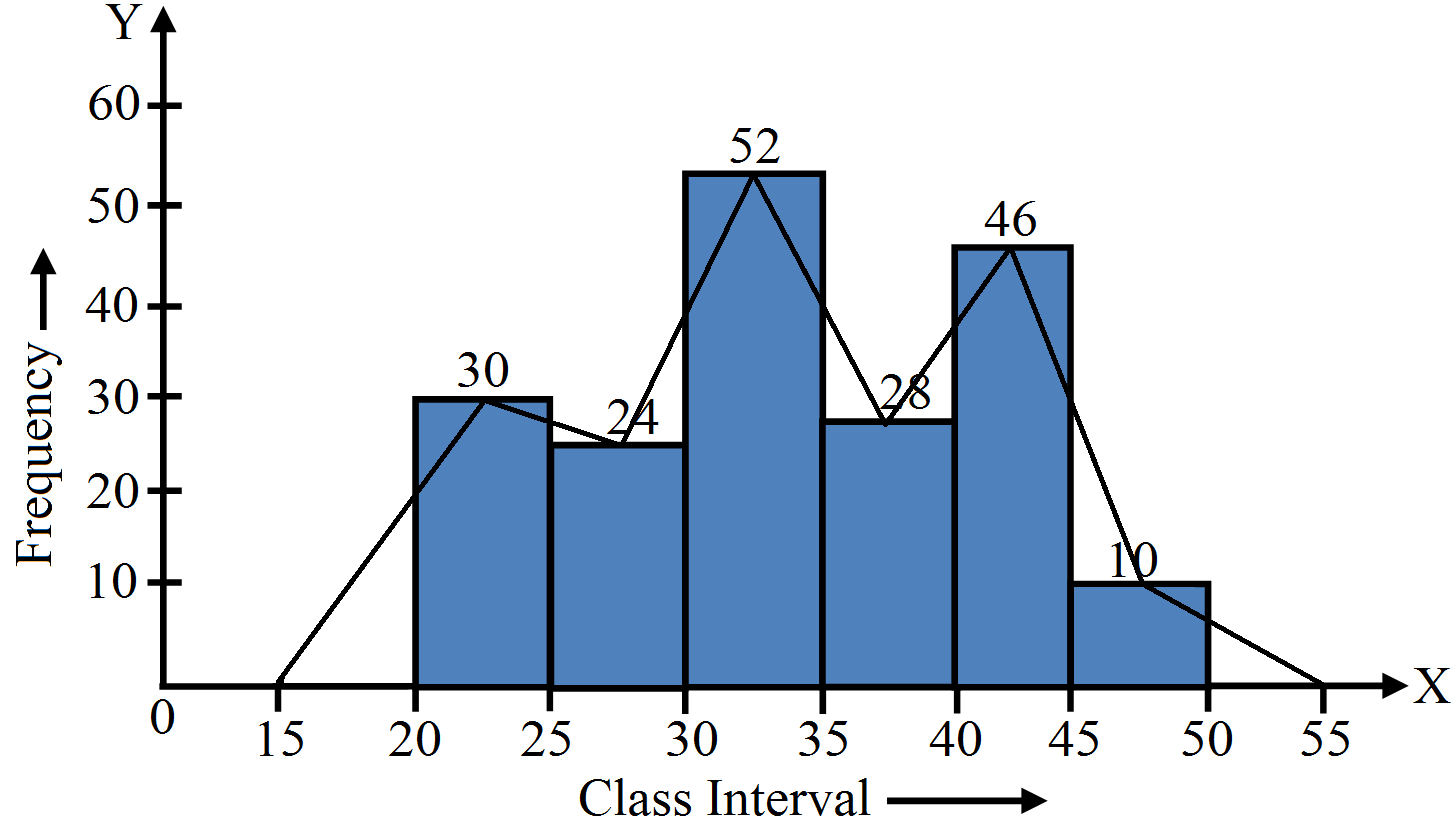
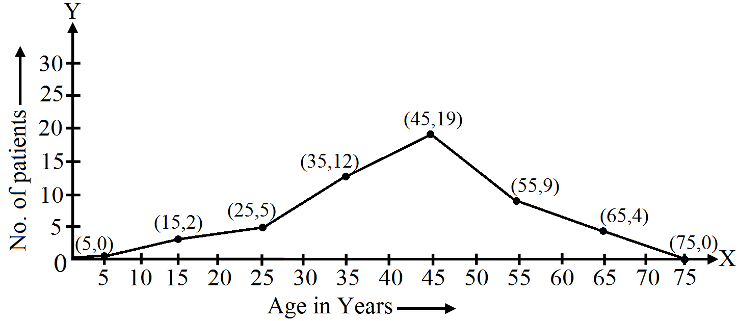
The ages (in years) of $360$ patients treated in a hospital on a particular day are given below:
Draw a histogram and a frequency polygon on the same graph to represent the above data.
|
Age in years
|
$10-20$
|
$20-30$
|
$30-40$
|
$40-50$
|
$50-60$
|
$60-70$
|
|
Number of patients
|
$90$
|
$40$
|
$60$
|
$20$
|
$120$
|
$30$
|
Answer
View full question & answer→The given frequency distribution table is as below:
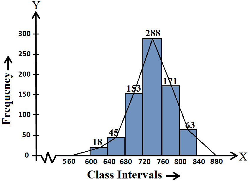
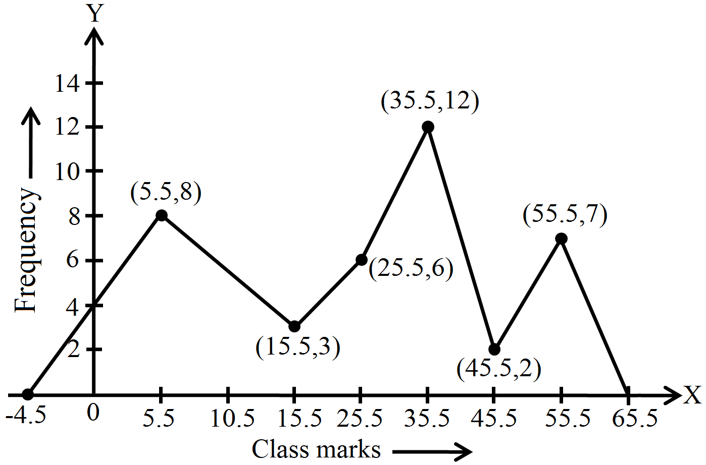
Take class intervals i.e age in years along $x$-axis and number of patients of width equal to the size of the class intervals and height equal to the corrensponding frequencies. Thus we get the required histogram. In order to draw frequency polygon, we take imaginary intervals $0-10$ at the beginning and $70-80$ at the end each with frequency zero and join the mid-points of top of the rectangles. Thus, we obain a complete frequency polygon, shown below: 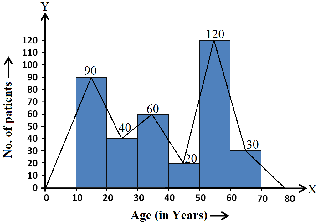
|
Age in years
|
$10-20$
|
$20-30$
|
$30-40$
|
$40-50$
|
$50-60$
|
$60-70$
|
|
Numbers of patients
|
$90$
|
$40$
|
$60$
|
$20$
|
$120$
|
$30$
|