Questions

5 Mark Question

Take a timed test

7 questions · self-marked practice — reveal the answer and mark yourself.

Question 15 Marks
Yashwant gives different amounts of time as shown below, to different exercises he does during the week. Draw a bar graph to show the details of his schedule using an appropriate scale.
Type of exercise Running Yogasanas Cycling Mountaineering Badminton
Time 35 minutes 50 minutes 1 hr 10 min 1(1)/(2) hours 45 minutes
Answer
1 hour $=60$ minutes$\therefore 1$ hour 10 minutes $=1$ hour +10 minutes $=60$ minutes +10 minutes $=70$ minutes and $1 \frac{1}{2}$ hours $=1$ hour $+\frac{1}{2}$ hour $=60$ minutes +30 minutes $=90$ minutes The given table can be written as follows:
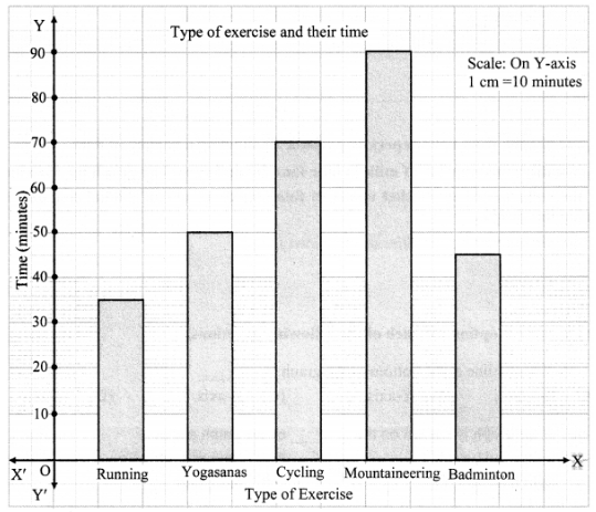
Type of Exercise Running Yogasanas Cycling Moutaineering Badminton
Time 35 minutes 50 minutes 70 minutes 90 minutes 45 minutes
Image
View full question & answer
Question 25 Marks
Students planted trees in 5 villages of Sangli district. Make a bar graph of this data. (Scale: On Y-axis, 1 cm = 100 trees).
Name of PlaceDudhgaonBagniSamdoliAshtaKavathepiran
Number of Trees Planted500350600420540
View full question & answer
Question 35 Marks
The number of customers who came to a juice centre during one week is given in the table below. Make two different bar graphs to show this data.
(On Y-axis, 1 cm = 10 customers, 1 cm = 5 customers)
Type of juiceOrangePineappleAppleMangoPomegranate
Number of customers5030256510
View full question & answer
Question 45 Marks
The table below gives the number of children who took part in the various items of the talent show as part of the annual school gathering. Make a bar graph to show this data.
(Scale: On Y-axis, 1 cm = 4 children)
ProgrammeTheaterDanceVocal musicInstrumental musicOne-act plays
Number of Children24401684
View full question & answer
Question 55 Marks
The names and numbers of animals in a certain zoo are given below. Use the data to make a bar graph. (Scale: On Y axis, 1 cm = 4 animals).
AnimalsDeerTigerMonkeyRabbitPeacock
Number20412168
View full question & answer
Question 65 Marks
The names of the heads of some families in a village and the quantity of drinking water their family consumes in one day are given below. Draw a bar graph for this data.
NameRameshShobhaAyubJulieRahul
Liters of water Used30 L60 L40 L50L55 L
View full question & answer
Question 75 Marks
This bar graph shows the maximum temperatures in degrees Celsius in different cities on a certain day in February. Observe the graph and answer the questions:

Image

  1. What data is shown on the vertical and the horizontal lines?
  2. Which city had the highest temperature?
  3. Which cities had equal maximum temperatures?
  4. Which cities had a maximum temperature of 30 °C?
  5. What is the difference between the maximum temperatures of Panchgani and Chandrapur?
Answer
  1. Temperature is shown on the vertical line and cities are shown on the horizontal line.
  2. The city Chandrapur had the highest temperature.
  3. Pune and Nashik had the equal maximum temperature of 30°C and Panchgani and Matheran had the equal maximum temperature of 25°C.
  4. Pune and Nashik had a maximum temperature of 30 °C.
  5. The difference between the maximum temperatures of Panchgani and Chandrapur can be calculated as Difference in temperature = Temperature of Chandrapur – Temperature of Panchgani
    = 35°C – 25°C
    = 10°C
View full question & answer