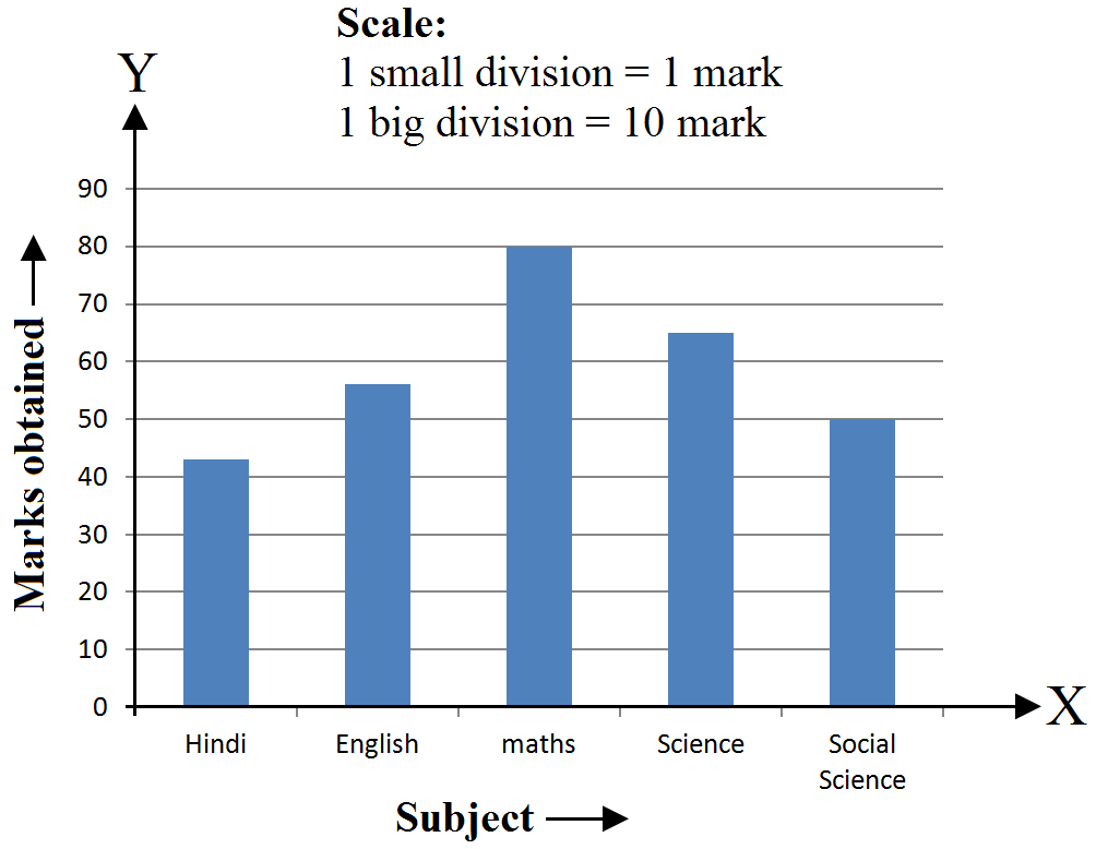
Questions

5 Mark Question

Take a timed test

22 questions · self-marked practice — reveal the answer and mark yourself.

Question 15 Marks
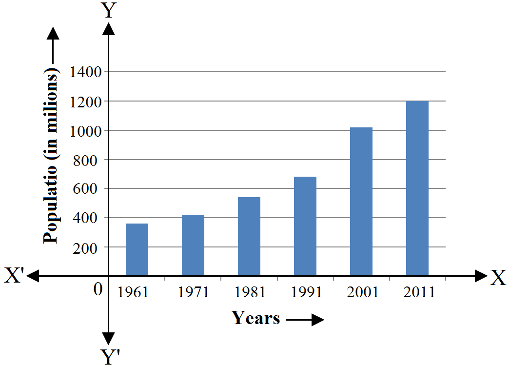
The following data shows India's total population (in millions) from 1961 to 2011.
Year
1961
1971
1981
1991
2001
2011
Population (in millions)
360
420
540
680
1020
1200
Answer
The graph obtained is as follows:
View full question & answer
Question 25 Marks
Gold prices on 4 consecutive Tuesdays were as under:
Week First Second Third Fourth
Rate per 10gm (in Rs.) 8500 8750 9050 9250
Draw a bar graph to show this imformation.
Answer
We can draw the bar graph by following the given steps:
Step I: On a graph paper, draw a horizontal line OX as X-axis and vertical line OY as Y-axis.
Step II: Along OX, write the names of the week at the points that are taken at a uniform gap.
Step III: Choose the scale:
1 big division = Rs 500
1 small division = Rs 50
Step IV: Heights of the various bars:
First week = 170 small divisions = 17 big divisions.
Second week = 175 small divisions = 17 big divisions and 5 small divisions.
Third week = 181 small divisions = 18 big divisions and 1 small division.
Fourth week = 185 small divisions = 18 big divisions and 5 small divisions.
Step V: Draw bars of equal width on the X-axis. The difference between the two bars should also be the same.
We get the following bar graph:
View full question & answer
Question 35 Marks
The following table shows the market position of different brands of soaps. Draw a bar graph to represent this data.
Brand
A
B
C
D
Other
Percentage of buyers
45
25
15
10
5
Answer
We can draw the bar graph by following the given steps:Step I: On a graph paper, draw a horizontal line OX as X-axis and vertical line OY as Y-axis.
Step II: Along OX, write the names of the brands at the points that are taken at a uniform gap.
Step III: Choose the scale:
1 big division = 5%
2 small divisions = 1%
Step IV: Heights of the various bars:
A = 90 small divisions = 9 big divisions.
B = 50 small divisions = 5 big divisions.
C = 30 small divisions = 3 big divisions.
D = 20 small divisions = 2 big divisions.
Others = 10 small divisions = 1 big division.
Step V: Draw bars of equal width on the X-axis. The difference between the two bars should also be the same.
We get the following bar graph:
View full question & answer
Question 45 Marks
Look at the bar graph given below.

Read it care fully and answer the following questions.
  1. What information does the bar graph give?
  2. In which subject is the student very good?
  3. In which subject is the poor?
  4. What is the average of his marks?
Answer
  1. The bar graph shows the marks obtained by a student in an examination in various subjects.
  2. The student is very good in mathematics.
  3. The student is poor in Hindi.
  4. Marks scored in English = 60
Marks scored in Hindi = 35

Marks scored in mathematics = 75

Marks scored in social science = 50

Marks scored in science = 60

$\therefore$ Average marks $=\frac{60+35+75+50+60}{5}=\frac{280}{5}=56$
View full question & answer
Question 55 Marks
The marks of a student in different subjects are given below:
Subject
Hindi
English
Maths
Science
Social science
Marks
43
56
80
65
50
Draw a bar graph from the above information.
Answer

We can draw the bar graph by following the given steps:
Step I: On a graph paper, draw a horizontal line OX as X-axis and vertical line OY as Y-axis.
Step II: Along OX, write the names of the subjects at the points that are taken at a uniform gap.
Step III: Choose the scale:
1 big division = 10 marks
1 small division = 1 mark
Step IV: Heights of the various bars are:
Hindi = 43 small divisions = 4 big divisions and 3 small divisions.
English = 56 small divisions = 5 big divisions and 6 small divisions.
Maths = 80 small divisions = 8 big divisions.
Science = 65 small divisions = 6 big divisions and 5 small divisions.
Social Science = 50 small divisions = 5 big divisions.
Step V: Draw bars of equal width on the X-axis. The difference between the two bars should also be the same.
View full question & answer
Question 65 Marks
The table given below shows the population of four towns over two years:
Towns
A
B
C
D
2016
640000
830000
460000
290000
2017
750000
920000
630000
320000
  1. Draw a double bar graph using approprtate scale to depict the information given above.
  2. In which town was the population growth maximum?
  3. In which town was the population growth least?
Answer
  1.  
  1. Maximum population growth was in Town A.
  2. Least population growth in Town D.
View full question & answer
Question 75 Marks
Study the double bar graph given below and answer the questions that follow:
  1. What has been compared in the given double bar graph?
  2. What is the ratio of minimum temperatures in the year 2015 to the year 2016 in the month of November?
  3. Name the months in which the minimum temperature in 2015 was greater than that in 2016?
  4. Find the average minimum temperature for the year 2016 for the given four months.
  5. In which month is the variation in two temperatures maximum?
Answer
  1. Minimum temperature for the monts of Nov, Dec, Jan and Feb of 2015 and 2016 have been compared.
  2. Ratio of minimum temperature in 2015 to minimum temperature in 2016 during the month of Nov. $=\frac{18}{14}=\frac{9}{7}$
$\Rightarrow\text{Ratio}=9:7$
  1. In November and February the minimum temperature in 2015 was greater than that of 2016.
  2. Average minimum temperature for the year 2016 $=\frac{14+13+8+9}{4}=\frac{44}{4}=11^\circ\text{C}$
  3. November variation = 18 - 14 = 4
December variation = 13 - 11 = 2
January variation = 8 - 5 = 3
February variation = 11 - 9 = 2
During November the variation in two temperatures is maximum.
View full question & answer
Question 85 Marks
Consider the data, showing the average daily hours of sunshine in two cities Aberdeen and Margate for six months of an year.
Month January February March April May June
Number of hours of sunshine in Aberdeen $2$ $3\frac14$ $4$ $4\frac12$ $7\frac34$ $8$
Number of hours of sunshine in Margate $1\frac12$ $3$ $3\frac12$ $6$ $5\frac12$ $6\frac12$
Draw a double bar graph, to depict the above information:
  1. In which month does Aberdeen have maximum sunlight?
  2. In which month does Margate have minimum sunlight?
Answer
  1. Maximum sunlight in Aberdeen is during June (8 hours)
  2. Minimum sunlight in Margate is during January (1.5 hours)
View full question & answer
Question 95 Marks
Given below is a table which shows the year wise strength of a school. Represent this data by a bar graph.
Year
2011-12
2012-13
2013-14
2014-15
2015-16
No. of students
800
975
1100
1400
1625
View full question & answer
Question 105 Marks
The birth rate per thousand in five countries over a period of time is shown below:
Country China India Germany UK Sweden
Birth rate per thousand 42 35 14 28 21
Represent the above data by a bar graph.
Answer
We can draw the bar graph by following the given steps:
Step I: On a graph paper, draw a horizontal line OX as X-axis and vertical line OY as Y-axis.
Step II: Along OX, write the names of the countries at the points that are taken at a uniform gap.
Step III: Choose the scale:
1 big division = 5 unit
2 small division = 1 unit
Step IV: Heights of the various bars:
China = 84 small divisions = 8 big divisions and 4 small divisions.
India = 70 small divisions = 7 big divisions.
Germany = 28 small divisions = 2 big divisions and 8 small divisions.
U.K. = 56 small divisions = 5 big divisions and 6 small divisions.
Sweden = 42 small divisions = 4 big divisions and 2 small divisions.
Step V: Draw bars of equal width on the X-axis. The difference between the two bars should also be the same.
We get the following bar graph:
View full question & answer
Question 115 Marks
The following table shows the number of scooters produced by a company during six consecutive years. Draw a bar graph to represent this data.
Year 2011 2012 2013 2014 2015 2016
No. of scooters 11000 14000 12500 17500 15000 24000
Answer
We can draw the bar graph by following the given steps:
Step I: On a graph paper, draw a horizontal line OX as X-axis and vertical line OY as Y-axis.
Step II: Along OX, write the years at the points that are taken at a uniform gap.
Step III: Choose the scale:
1 big division = 2000 scooters
1 small division = 200 scooters
Step IV: Heights of the various bars:
2011 = 55 small divisions = 5 big divisions and 5 small divisions.
2012 = 70 small divisions = 7 big divisions.
2013 = 62.5 small divisions = 6 big divisions 2.5 small divisions.
2014 = 87.5 small divisions = 8 big divisions and 7.5 small divisions.
2015 = 75 small divisions = 7 big divisions and 5 small divisions.
2016 = 120 small divisions = 12 big divisions.
Step V: Draw bars of equal width on the X-axis. The difference between the two bars should also be the same.
We get the following bar graph:
View full question & answer
Question 125 Marks
The following table shows the imports (in thousand crore rupees) made by India over the last five years. Draw a bar graph to represent this data.
Year
2001-02
2002-03
2003-04
2004-05
2005-06
Imports (in thousand crore rupees)
148
176
204
232
180
Answer
We can draw the bar graph by following steps:
Step I: On a graph paper, draw a horizontal line OX as X-axis and vertical line OY as Y-axis.
Step II: Along OX, write the years at the points that are taken at a uniform gap.
Step III: Choose the scale:
1 big division = 20 thousand crore rupees
1 small division = 2 thousand crore rupees
Step IV: Heights of the various bars:
2001-02 = 74 small divisions = 7 big divisions and 4 small divisions.
2002-03 = 88 small divisions = 8 big divisions and 8 small divisions.
2003-04 = 102 small divisions = 10 big divisions and 2 small divisions.
2004-05 = 116 small divisions = 11 big divisions and 6 small divisions.
2005-06 = 90 small divisions = 9 big divisions.
Step V: Draw bars of equal width on the X-axis. The difference between the two bars should also be the same.
We get the following bar graph:
View full question & answer
Question 135 Marks
Various modes of transport used by 1850 students of a school are given below:
School bus
Private bus
Bicycle
Rickshaw
By foot
640
360
490
210
150
Draw a bar graph to represent the above data.
Answer
We can draw the bar graph by following the given steps:
Step I: On a graph paper, draw a horizontal line OX as X-axis and vertical line OY as Y-axis.
Step II: Along OX, write the names of the modes of transport at the points taken at a uniform gap.
Step III: Choose the scale:
1 big division = 50 students
1 small division = 5 student
Step IV: Heights of the various bars:
School bus = 128 small divisions = 12 big divisions and 8 small divisions.
Private bus = 72 small divisions = 7 big divisions and 2 small divisions.
Bicycle = 98 small divisions = 9 big divisions and 8 small divisions.
Rickshaw = 42 small divisions = 4 big divisions and 2 small divisions.
By foot = 30 small divisions = 3 big divisions.
Step V: Draw the bars of equal width on X-axis. The difference between the two bars should also be the same.
We get the following bar graph:
View full question & answer
Question 145 Marks
The following table shows the life expectancy (average age to which people live) in various countries in a particular year. Represent this data by a bar graph.
Country
Japan
India
Britain
Ethiopia
Cambodia
Life expectancy (in years)
76
57
70
43
36
Answer
We can draw the bar graph by following the given steps:
Step I: On a graph paper, draw a horizontal line OX as X-axis and vertical line OY as Y-axis.
Step II: Along OX, write the names of the countries at the points that are taken at a uniform gap.
Step III: Choose the scale:
1 big division = 10 years
1 small division = 1 year
Step IV: Heights of the various bars:
Japan = 76 small divisions = 7 big divisions and 6 small divisions.
India = 57 small divisions = 5 big divisions and 7 small divisions.
Britain = 70 small divisions = 7 big divisions.
Ethiopia = 43 small divisions = 4 big divisions and 3 small divisions.
Cambodia = 36 small divisions = 3 big divisions and 6 small divisions.
Step V: Draw bars of equal width on the X-axis. The difference between the two bars should also be the same.
We get the following bar graph:
View full question & answer
Question 155 Marks
In a public library, the librarian made the following observations in a particular week.
Days
Mon.
Tues.
Wed.
Thurs.
Fri.
Sat.
Newspaper readers
350
400
500
450
550
450
Magazine readers
200
450
300
250
100
50
  1. Draw a double bar graph choosing an appropriate scale.
  2. On which day, the number of readers in the library was maximum?
  3. What is the mean number of magazine readers per day?
Answer
  1.  
  1. On Tuesday the number or readers in the library were maximum = 400 + 450 = 850
  2. Mean number of magazine readers $=\frac{200+450+300+250+100+50}{6}=\frac{1350}{6}=225$
View full question & answer
Question 165 Marks
The following table shows the favourite sports of 250 students of a school. Represent the data by a bar graph.
Sports Cricket Football Tennis Badminton Swimming
No. of students 75 35 50 25 65
Answer

We can draw the bar graph by following the given steps:
Step I: On a graph paper, draw a horizontal line OX as X-axis and vertical line OY as Y-axis.
Step II: Along OX, write the names of the sports at the points that are taken at a uniform gap.
Step III: Choose the scale:
1 big division = 10 students.
1 small division = 1 student.
Step IV: Heights of the various bars:
Cricket = 75 small divisions = 7 big divisions and 5 small divisions.
Football = 35 small divisions = 3 big divisions and 5 small divisions.
Tennis = 50 small divisions = 5 big divisions.
Badminton = 25 small divisions = 2 big divisions and 5 small divisions.
Swimming = 65 small divisions = 6 big divisions and 5 small divisions.
Step V: Draw bars of equal width on the X-axis. The difference between the two bars should also be the same.
View full question & answer
Question 175 Marks
The data given below shows the average rainfall in Udaipur from June to November of a certain year. Draw a bar graph to represent this information.
Month
June
July
Aug.
Sept.
Oct.
Nov.
Average rainfall
25cm
30cm
40cm
20cm
10cm
5cm
Answer
We can draw the bar graph by following the given steps:
Step I: On a graph paper, draw a horizontal line OX as X-axis and vertical line OY as Y-axis.
Step II: Along OX, write the names of the months at the points taken at a uniform gap.
Step III: Choose the scale:
1 big division = 5cm
2 small divisions = 1cm
Step IV: Heights of the various bars:
June = 50 small divisions = 5 big divisions.
July = 60 small divisions = 6 big divisions.
August = 80 small divisions = 8 big divisions.
September = 40 small divisions = 4 big divisions.
October = 20 small divisions = 2 big divisions.
November = 10 small divisions = 1 big division.
Step V: Draw bars of equal width on the X-axis. The difference between the two bars should also be the same.
We get the following bar graph:
View full question & answer
Question 185 Marks
The following table shows the interest paid by India (in thousand crore rupees) on external debts during the period 1998-99 to 2002-03. Represent the data by a bar graph.
Year
1998-99
1999-2000
2000-01
2001-02
2002-03
Interest (in thousand crore rupees)
70
84
98
106
120
Answer
We can draw the bar graph by following the given steps:
Step I: On a graph paper, draw a horizontal line OX as X-axis and vertical line OY as Y-axis.
Step II: Along OX, write the years at the points that are taken at a uniform gap.
Step III: Choose the scale:
1 big division = 10 thousand crore rupees
1 small division = 1 thousand crore rupees
Step IV: Heights of the various bars:
1998-99 = 70 small divisions = 7 big divisions.
1999-2000 = 84 small divisions = 8 big divisions and 4 small divisions.
2000-2001 = 98 small divisions = 9 big divisions and 8 small divisions.
2001-2002 = 106 small divisions = 10 big divisions and 6 small divisions.
2002-2003 = 120 small divisions = 12 big divisions.
Step V: Draw bars of equal width on the X-axis. The difference between the two bars should also be the same.
We get the following bar graph:
View full question & answer
Question 195 Marks
Given below is a bar graph showing the heights of five mountain peaks.

Read the bar graph carefully and answer the following questions:
  1. Which is the highest peak and what is its height?
  2. What is the ratio of the heights of the highest peak and the next highest peak?
  3. Arrange the heights of the given peaks in descending order.
Answer
  1. Mount Everest is the highest peak and it's height is 8800m.
  2. Height of the highest peak, Mount Everest = 8800m
Height of the second highest peak, Kanchenjunga = 8200m

$\text{Ratio}=\frac{8800}{8200}=\frac{44}{41}=44:41$
  1. Heights of the peaks are 6000m, 8000m, 7500m, 8200m and 8800m.
Heights in descending order:

8200m, 8000m, 7500m, 6000m
View full question & answer
Question 205 Marks
On a particular day in a school, the attendance in each of the classes from VI to X has been recorded as under.
Class
VI
VII
VIII
IX
X
Total no. of students
95
90
82
75
68
Number of students present on that day
92
85
78
69
62
Draw a double bar graph, choosing an appropriate scale.
Using the bar graph, answer the questions given below:
  1. Which class has the maximum number of students?
  2. Find the ratio of number of students present to the total number of students in Class VII.
  3. What per cent of Class IX students were absent?
Answer
  1. Maximum number of student are in Class VI.
  2. $\text{Ratio}=\frac{85}{90}=\frac{17}{18}$
  3. Percentage of class IX absent $=\frac{6}{75}\times100=8\%$
View full question & answer
Question 215 Marks
The air distances of four cities from Delhi (in km) are given below:
City
Kolkata
Mumbai
Chennai
Hyderabad
Distance from Delhi (in km)
1340
1100
1700
1220
Draw a bar graph to represent the above data.
Answer
We can draw the bar graph by following steps:Step I: On a graph paper, draw a horizontal line OX as X-axis and vertical line OY as Y-axis.
Step II: Along OX, write the names of the cities at the points that are taken at a uniform gap.
Step III: Choose the scale:
1 big division = 100 km
1 small division = 10 km
Step IV: Heights of the various bars:
Kolkata = 134 small divisions = 13 big divisions and 4 small divisions.
Mumbai = 110 small divisions = 11 big divisions.
Chennai = 170 small divisions = 17 big divisions.
Hyderabad = 122 small divisions = 12 big divisions and 2 small divisions.
Step V: Draw bars of equal width on the X-axis. The difference between the two bars should also be the same.
We get the following bar graph:
View full question & answer
Question 225 Marks
In a survey or 85 families of a colony, the number of members in each family was recorded, and the data has been represented by the following bar graph:

Read the bar graph carefully and answer the questions given below:
  1. What information does the bar graph give?
  2. How many families have 3 members?
  3. How many people live alone?
  4. Which type of family is the most common? How many members are there in each family of this kind?
Answer
  1. The bar graph shows the number of members in each of the 85 families.
  2. 40 families have three members each.
  3. Number of people living alone = 85 - (5 + 40 + 25 + 15)
= 85 - 85

= 0
  1. The most common family is that with three members. Each such family has three members .
View full question & answer