Question 14 Marks
Read the following bar graph and answer the following questions:
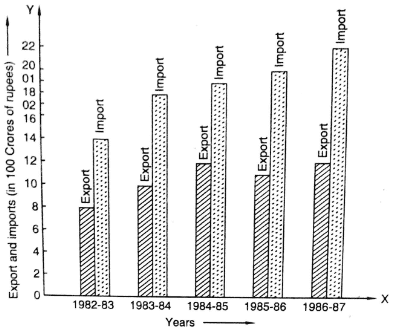
- What information is given by the bar graph?
- In which year the export is minimum?
- In which year the import is maximum?
- In which year the difference of the values of export and import is maximum?
Answer
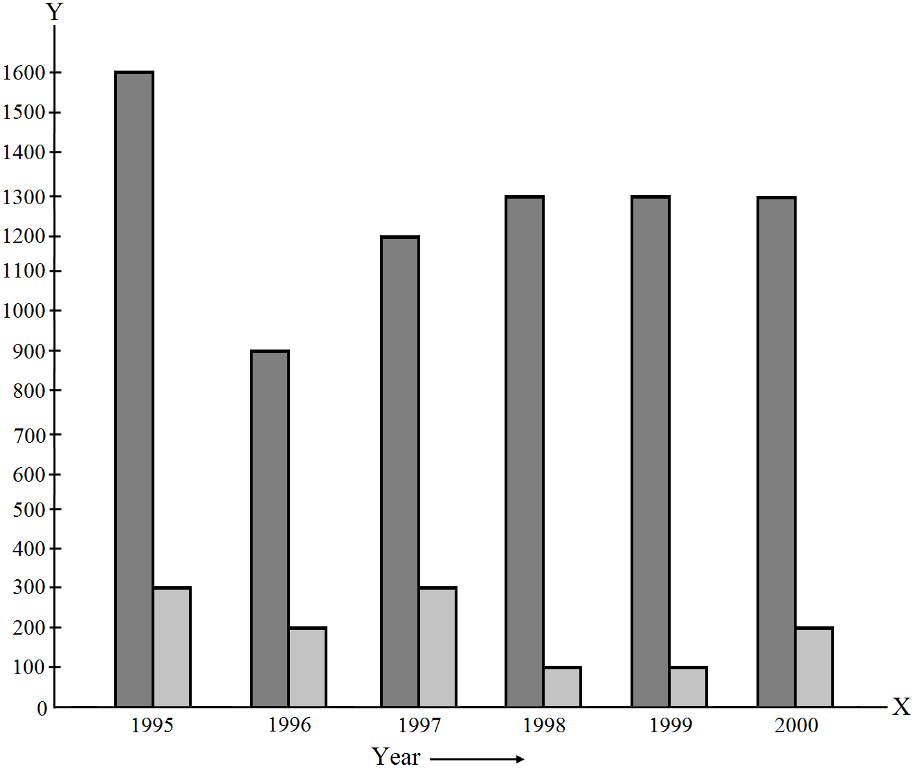
View full question & answer→- The bar graph represents the import and export (in 100 Crores of rupees) from 1982–83 to 1986–87.
- The export is minimum in the year 1982-83 at the height of the bar corresponding to export is minimum in the year 1982–83.
- The import is maximum in the year 1986-87 as the height of the bar corresponding to import is maximum in the year 1986–87.
- The bars of export and import are side by side. Clearly, it is seen from the bar graph that the difference between the values of export and import is maximum in the year 1986–87.
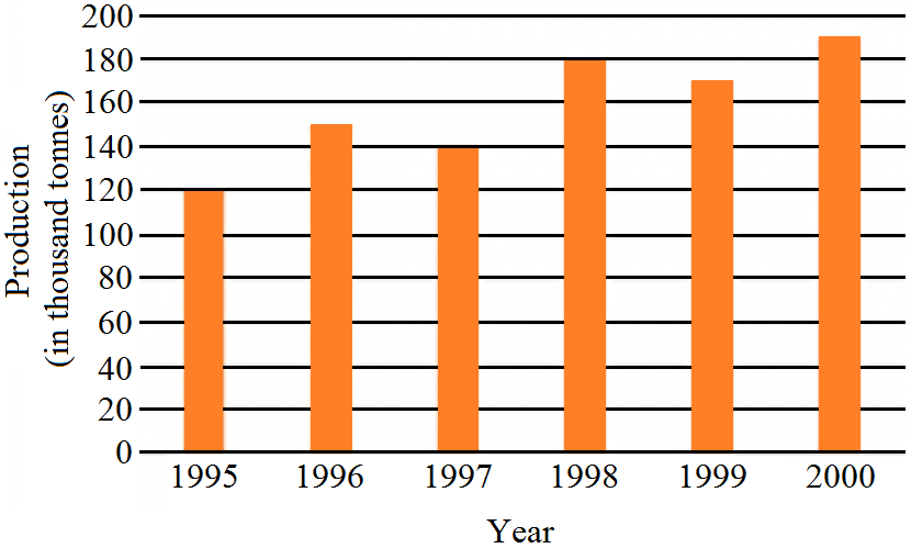
 Note that one big division in the vertical axis is equivalent to 20 thousand tones.
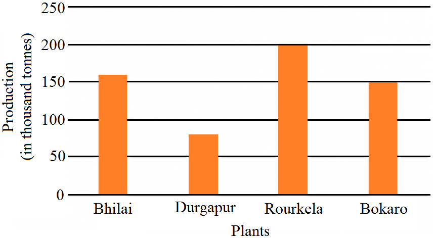