Matplotlib is an inbuilt Library with python environment.
Question types
Data Visualisation question types
45 questions across 6 question groups — pick any mix to generate a Computer Science paper with step-by-step answer keys.
45
Questions
6
Question groups
5
Question types
01
True-False
5 Q→02M.C.Q
11 Q→031 Marks Each
12 Q→042 Marks Each
7 Q→053 Marks Each
6 Q→064 Marks Each
4 Q→Sample Questions
Data Visualisation questions
One sample from each question group in this chapter. Select any group above to see the full set with answer keys.
View full solution →
Pyplot is the sub library of matplotlib library.
We cannot draw the horizontal bar chart using Matplotlib.
We cannot change the marker style in Plot:
Plots may also be adorned with error bars or tables.
Which color are available with Matplotlib:
- ABlue
- BBrown
- ✓Magenta
- DTan
Answer: C.
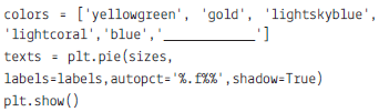
View full solution →Which of the following is not used with pie diagram:
- Aexplode
- Bautopct
- Cstrangle
- ✓None
Answer: D.
View full solution →Choose the right answer for the given fill ups in the program:
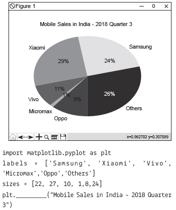
- ASubplot and Title
- BTitle and Blue
- ✓Title and green
- DPie and title
Answer: C.
View full solution →Choose the right answer for the given fill ups in the program: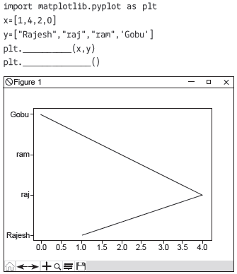
- Ashow and plot
- ✓plot and show
- Cplot and display
- Ddisplay and show
Answer: B.
View full solution →Which type of chart we cannot make using pyplot library:
- ABar
- ✓Text
- CSub Plot
- DPie
Answer: B.
View full solution →What is code for the colour black?
What is the purpose of Matplotlib Library?
Name the function used to make the Horizontal bar graph.
Complete the code:
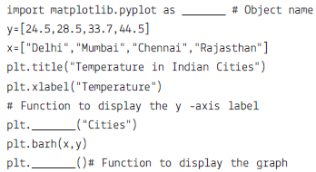
Write the purpose of plot() function.
Write a python program to make the pie chart from the given data:
labels = ['Oxygen','Hydrogen','Carbon_Dioxide','Nitrogen']
values = [4500,2500,1053,500]
Write a python program to draw the bar chart for the given data: month = ['January', 'February', 'March', 'April', 'May',
'June', 'July', 'August', 'September', 'October', 'November', 'December']
'June', 'July', 'August', 'September', 'October', 'November', 'December']
Avetmp=[9.0,15.0,22.0,30.4,36.7,40.8,42.7,45.6,44.7,42.8,38.5,30.7,7.0]
Write a python program to accept a list for the user and create another list which will double of x list. Create the line
chart for the same.
Write a Python programming to display a bar chart on the popularity of Programming Languages.
Sample data:
Programming languages: Java, Python, PHP, JavaScript, C#, C++ Popularity: 22.2, 17.6, 8.8, 8, 7.7, 6.7
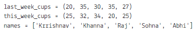
Mr Sharma is working with a Marketing company, and his boss wants to do a comparative study that the sales target done by all males and all females in one week. Write a python program to prepare a line chart. The program will read the combine sales of males and females from the user in a list.
Write a Python program to draw a line chart with the suitable label in the x-axis, y-axis and a title. Value of X must be entered by the user as the list from the user and Y should be twice of X.
Write a python program to create the pie chart use a different colour for the different countries.
Title: Carbon emission of the coutries 1990-2011
values=[27, 11, 25, 8, 1, 3, 25]
countres= [ "US", "China", "European Union", "Russian Federation", "Brazil","India","Rest of World"]
Write a python program to draw the line chart for the following:
x_data = [2001, 2002, 2003, 2004, 2005, 2006, 2007, 2008, 2009, 2010, 2011, 2013]
y_data = [18, 21, 18, 21, 16, 14, 13, 18, 17, 16, 19, 23]
The data is about Time devoted by a student in various subject subjects = 'English', 'Physics', 'Chemistry', 'Mathematics', 'Comp. Sci.' time (in hours) = 0.3, 1.5, 1.5, 2, 0.4 Write a python program to draw the PIE chart for the above data. Use hexadecimal colour code, and subject chemistry is exploded value.
The data is about Time devoted by a student in various subject = 'English', 'Physics', 'Chemistry', 'Mathematics', 'Comp. Sci.' time (in hours) = 0.3, 1.5, 1.5, 2, 0.4. Write a python program to draw PIE chart for the above data.
Write a python program to plot the grouped bar chart for the given data:
The program is to be implemented to sub plot
Answer the following question based on the given dataset download from data.gov.in:
![]()
data name : Percentage of Schools with Computers from 2013-14 to 2015-16
Screen shot of the data:
Assuming that we have saved the file with name: "computer_data" in python default folder.
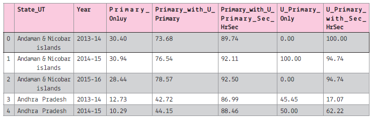
Assuming that all the required libraries are imported once:
![]()
(i) To create the data frame of the above file.
(ii) To display all the column names of the data frame.
(iii) To plot the line graph for the first 5 record of the Primary Only column on y-axis and 'State_UT' on x-axis.
The line colour should be red and marker as 'x'. The graph will display only 2013-14
(iv) To display the histogram of the 2013-14, primary_only column.
(v) To display bar graph of the last 7 record of the year 2013-14 use the title and required label. Also write the statement to create the data frame.
(vi) To display the pie chart of the first 10 records of the 2013-14. Also create the data frame.
(vii) To display the boxplot for the Sec with higher secondary and All India data.
(viii) To display the scatter diagram of the 2014-15
WAPssuming the given dataset answer the questions below:
https://data.gov.in/catalog/statistical-hand-book-2009-education?filters%5Bfield_catalog_reference%5D=6690578& format=json&offset=6&limit=6&sort%5Bcreated%5D=desc
Schools for Professional Education 2007-08 : SHB 2009
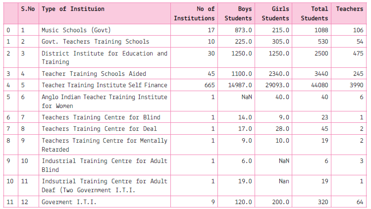
(i) Write a python / statement to read the data frame.
(ii) Write a python code to plot the pie chart of all the institutions which have more than hundred teachers. Also display the values of portion.
(iii) Write a python code to plot the horizontal bar chart to plot the Type of institution and Total students.
(iv) Write a python code to plot the scatter diagram boys vs girls students.
(v) Write a python code to plot the histogram for no. of institution.
Write a menu driven program using the function that asks the user which type chart, they want to make with given data: Sample data: Programming languages: Java, Python, R, JavaScript, C#, C++ Popularity: 22.2, 17.6, 8.8, 8, 7.7, 6.7
Generate a Data Visualisation paper free
Pick question groups from the list above, set marks and difficulty, and export a branded PDF with step-by-step answer keys. First 3 chapters free — no signup.