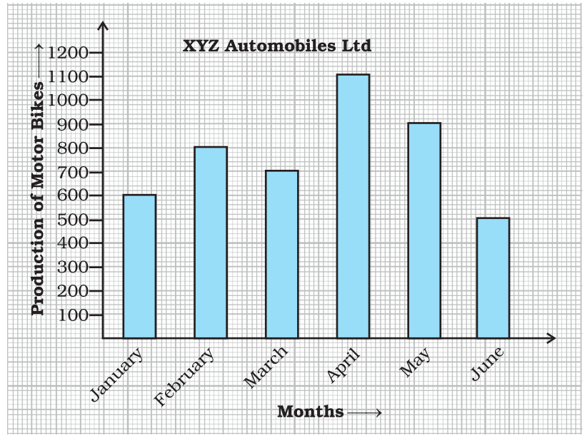
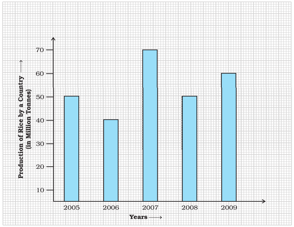
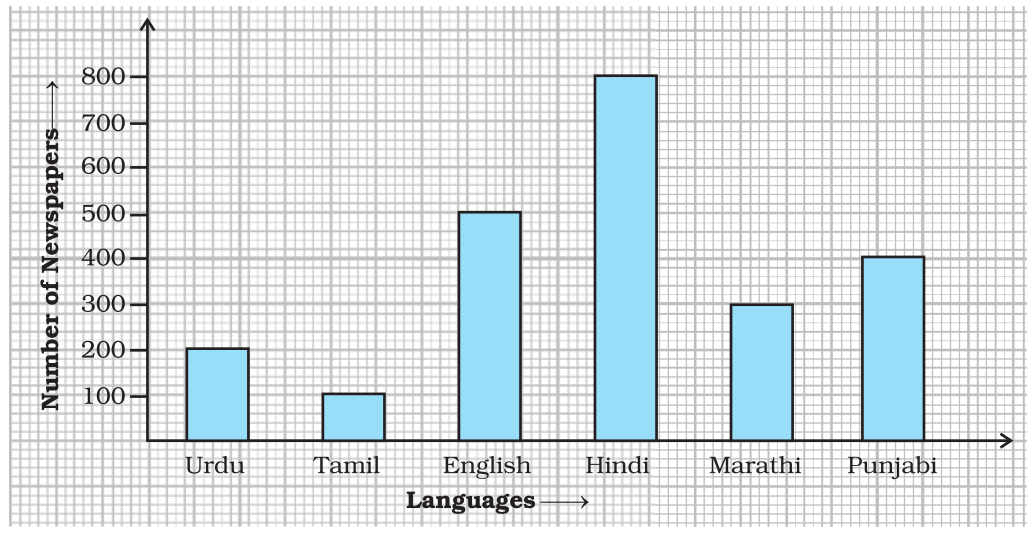
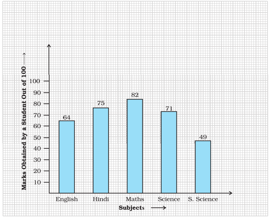
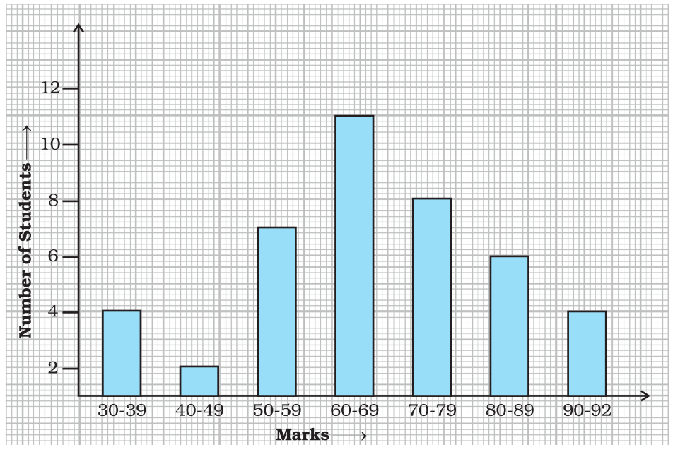
Questions

5 Marks Questions

Take a timed test

20 questions · self-marked practice — reveal the answer and mark yourself.

Question 15 Marks
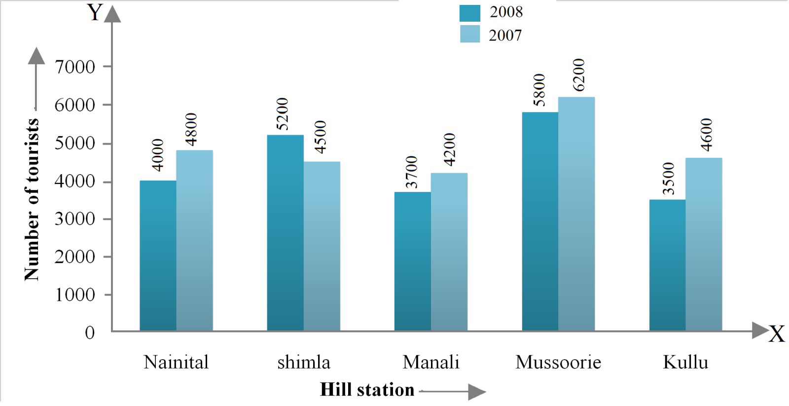
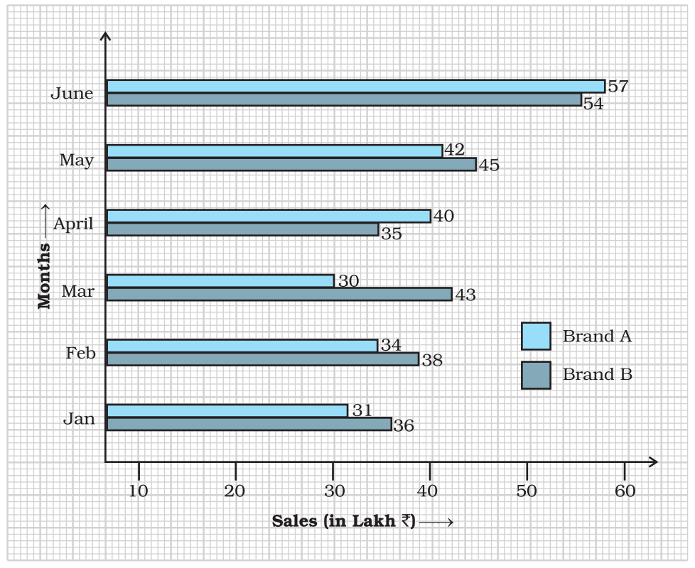
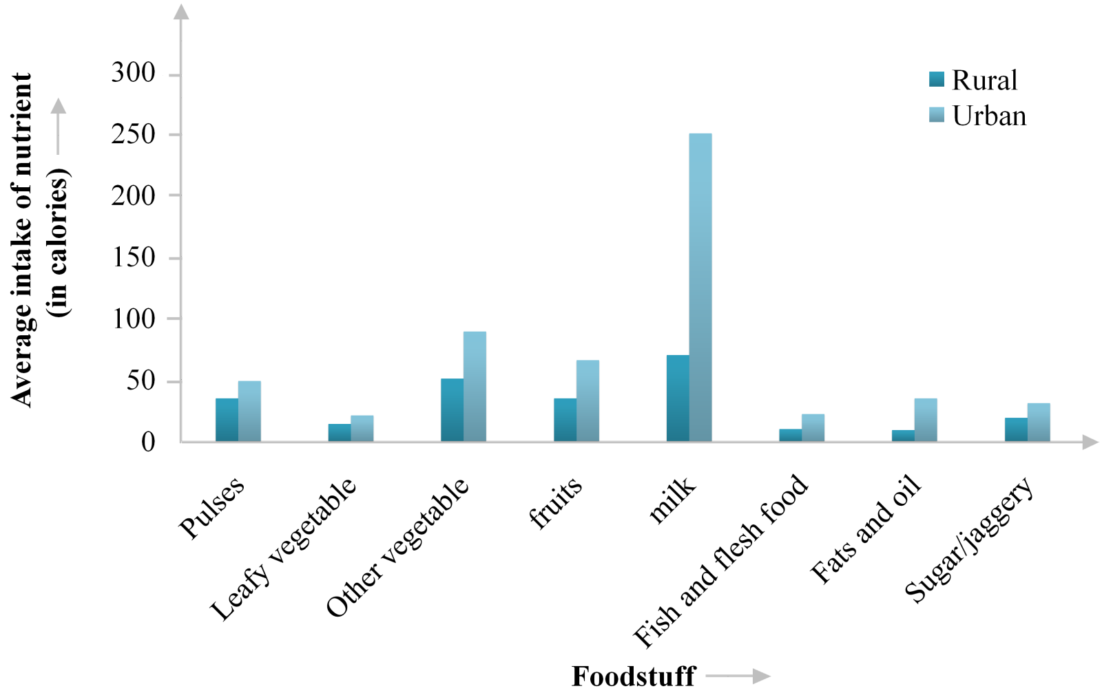
The following table shows the average intake of nutrients in calories by rural and urban groups in a particular year. Using a suitable scale for the given data, draw a double bar graph to compare the data.
Foodstuff
Rural
Urban
Pulses
$35$
$49$
Leafy vegetables
$14$
$21$
Other vegetables
$51$
$89$
Fruits
$35$
$66$
Milk
$70$
$250$
Fish and flesh foods
$10$
$22$
Fats and Oils
$9$
$35$
Sugar/ Jaggery
$19$
$31$
Answer
Steps to construct the bar graphs are as follows:Step I Firstly, we draw two lines perpendicular to each other on a graph paper and call them horizontal and vertical axes.
Step II Along the horizontal axis, we mark the foodstuff and along the vertical axis, we mark the intake of nutrients (calories).
Step III We choose a suitable scale to determine the heights of bars. Here, we choose the scale as $1$ small division to represent 20.
Step IV First, we draw the bars for rural and then bars of urban for different foodstuff.
Bars for rural and urban are shaded separately and the shading is shown at the top right corner of the graph paper.
View full question & answer
Question 25 Marks
Observe the given bar graph carefully and answer the questions that follow.

$a.$ What information does the bar graph depict?
$b.$ How many motor bikes were produced in the first three months?
$c.$ Calculate the increase in production in May over the production in January.
$d.$ In which month the production was minimum and what was it?
$e.$ Calculate the average $($mean$)$ production of bikes in $6$ months.
Answer
$a.$ The given bar graph shows the production of motor bikes by $\ce{XYZ}$ automobiles $Ltd.$ during January to June.
$b.$ Total number of motor bikes produced in first three months
$=$ Motor bikes produced in January $+$ Motor bikes produced in February $+$ Motor bikes produced in March.
$= 600 + 800 + 700$
$= 2100$
$c.$ Increase in production in May over the production in January.
$=$ Production in May $–$ Production in January
$= 900 - 600$
$= 300$
$d.$ By observing the graph, we can say that the production was minimum in the month of June, $ i.e. 500.$
$e.$ Average production $=\frac{\text{Total production}}{\text{Number of months}}$
$=\frac{600+800+700+1100+900+500}{6}$
$=\frac{4600}{6}$
$=767$ bikes $($approx$.)$
View full question & answer
Question 35 Marks
Study the bar graph given below and answer the questions that follow.

$a.$ What information does the above bar graph represent?
$b.$ In which year was production the least?
$c.$ After which year was the maximum rise in the production?
$d.$ Find the average production of rice during the $5$ years.
$e.$ Find difference of rice production between years $2006$ and $2008.$
Answer
After studying the bar graph, we have
Production of rice in $2005 = 50$ million tonne
Production of rice in $2006 = 40$ million tonne
Production of rice in $2007 = 70$ million tonne
Production of rice in $2008 = 50$ million tonne
Production of rice in $2009 = 60$ million tonne
$a.$ The bar graph shows the production of rice in million tonne by a country during years $2005$ to $2009.$
$b.$ The production of rice was the least in $2006,  i.e. 40$ million tonne.
$c.$ The maximum production of rice was in $2007$. The production rose after $2006.$
$d.$ For average production,
Sum of productions $= 50 + 40 + 70 + 50 + 60 = 270$
Average production $=\frac{\text{Sum of observations}}{\text{Number of observations}}$
Average production $=\frac{270}{5}=54$ million tonne
$e.$ Production in $2006 = 40$ million tonne and production in $2008 = 50$ million tonne
Difference $= 50 - 40 = 10$ million tonne.
View full question & answer
Question 45 Marks
The bar graph given below represents the circulation of newspapers $($dailies$)$ in a town in six languages $($the figures are approximated to hundreds$).$

Study the bar graph and answer the following questions:
$a.$ Find the total number of newspapers read in Hindi, Punjabi, Urdu, Marathi and Tamil.
$b.$ Find the excess number of newspapers read in Hindi than those in English.
$c.$ Name the language in which the least number of newspapers are read.
$d.$ Write the total circulation of newspapers in the town.
Answer
Number of newspapers in Urdu $= 200$
Number of newspapers in Tamil $= 100$
Number of newspapers in English $= 500$
Number of newspapers in Hindi $= 800$
Number of newspapers in Marathi $= 300$
Number of newspapers in Punjabi $= 400$
$a.$ Total number of newspaper read in Hindi, Punjabi, Urdu, Marathi and Tamil
$= 800 + 400 + 200 + 300 + 100$
$= 1800$
$b.$ Excess number of newspapers read in Hindi than those in English
$=$ Number of newspapers read in Hindi $-$ Number of newspaper read in English
$= 800 - 500 $
$= 300$
$c. $ Out of all newspapers, least number of newspapers in Tamil $, i.e.100$ newspapers are read
$d.$ Total circulation of newspapers in the town
$=$ Number of newspapers in six different languages
$= 200 + 100 + 500 + 800 + 300 + 400$
$= 2300$
View full question & answer
Question 55 Marks
The table below gives the data of tourists visiting $5$ hill stations over two consecutive years. Study the table and answer questions that follow:
Hills
Nanital
Shimla
Manali
Mussorie
Kullu
$2008$
$4000$
$5200$
$3700$
$5800$
$3500$
$2009$
$4800$
$4500$
$4200$
$6200$
$4600$
$a.$ Draw a double bar graph to depict the above information using appropriate scale.
$b.$ Which hill station was visited by the maximum number of tourists in $2008?$
$c.$ Which hill station was visited by least number of tourists in $2009?$
$d.$ In which hill stations was there increase in number of tourists in $2009?$
Answer
$a.$ Steps to construct the bar graph as follows:
Step $I$ We draw two lines perpendicular to each other on a graph paper and call them horizontal and vertical axes.
Step $II$ Along the horizontal axis, $OX$ mark the hill stations and along the vertical axis, $OY$ mark the tourist visitors.
Step $III$ We choose a suitable scale to determine the heights of bars. Here, we choose the scale as $1$ small division to represent $400$ tourists.
Step $IV$ First, we draw the bars for year $2008$ and then bars for year $2009$ for different hill stations.
Bars for years $2008$ and $2009$ are shaded separately and the shading is shown in the top right corner of the graph paper,

$b.$ It is clear from the given data that in year $2008$ tourists visit Mussoorie the most maximum.
$c.$ It is clear from the given data that in year $2009$ tourists visit Manali the least.
$d.$ From the graph, we can say that in $2009$, there is increase in tourist visitors in the places; Manali, Nainital, Mussoorie and Kullu.
View full question & answer
Question 65 Marks
Study the bar graph given below and answer the questions that follow.

$a.$ What information is depicted from the bar graph?
$b.$ In which subject is the student very good?
$c.$ Calculate the average marks of the student.
$d.$ If $75$ and above marks denote a distinction, then name the subjects in which the student got distinction.
$e.$ Calculate the percentage of marks the student got out of $500.$
Answer
$a.$ he given bar graph shows marks obtained by a student in different subjects out of $100.$
$b.$ Subject in which student is very good, Maths as he scored highest marks $, i.e. 82$
$c.$ Average marks $=\frac{\text{Sum of all matks obtained in various subjects}}{\text{Total subjects}}$
$=\frac{64+75+82+71+49}{5}$
$=\frac{341}{5}$
$=68.2\%$
$d.$ In Hindi and maths, student got $75$ and $82$ marks, respectively. Since the marks equal to $75$ or above denote a distinction. Hence student got distinction in Hindi and Maths.
$e.$ Percentage marks $=\frac{\text{Total marks scored}}{\text{Total marks}}\times100\%$
$=\frac{341}{500}\times100\%$
$=68.2\%$
View full question & answer
Question 75 Marks

$a.$ What information does the double bar graph represent?
$b.$ Find the total number of boys in all sections of Class $\text{VII}.$
$c.$ In which sections, the number of girls is greater than the number of boys?
$d.$ In which section, the number of boys is the maximum?
$e.$ In which section, the number of girls is the least?
Answer
$a.$ The above graphs shows the number of students $($boys and girls$)$ in different sections of class $\text{VII}.$
$b.$ It is clear from the graph, total number of boys in all sections of class $\text{VII} =$ Sum of heights of all the bars corresponding to boys in different sections $= 15 + 30 + 20 + 20 + 25 = 110$
$c.$ It is clear from the graph that in sections $\text{VII A}$ and $\text{VII D},$the number of girls are greater than the number of boys.
$d.$ From the graph, it is clear that in section $\text{VII B},$ number of boys is maximum.
$e.$ From the graph, it is clear that in section $\text{VII C},$ number of girls is minimum.
View full question & answer
Question 85 Marks
The table below compares the population $($in hundreds$)$ of $4$ towns over two years:
Towns
$A$ $B$ $C$ $D$
$2007$
$2900$
$6400$
$8300$
$4600$
$2009$
$3200$
$7500$
$9200$
$6300$
Study the table and answer the following questions:
$a.$ Draw a double bar graph using appropriate scale to depict the above information.
$b.$ In which town was the population growth maximum?
$c.$ In which town was the population growth least?
Answer
Steps to construct the bar graph are as follows :
Step $I$ We draw two lines perpendicular to each other on a graph paper and call them horizontal and vertical axes.
Step $II$ Along the horizontal axis, $OX$ mark the towns and along the vertical axis, $OY$ mark the population.
Step $III$ We choose a suitable scale to determine the heights of bars. Here, we choose the scale as $1$ small division to represent $500,$
Step $IV$ First, we draw the bars for year $2007$ and then bars for year $2009$ for different towns.
Bars for year $2007$ and $2009$ are shaded separately and the shading is shown in the top right corner of the graph paper.


$b.$ It is clear from the graph, the population growth of town $D$ was maximum.
$c.$ It is clear from the graph, the population growth of town $A$ was minimum.
View full question & answer
Question 95 Marks
Observe the following data:
Government School, Chandpur
Daily Attendance
Date $: 15.4.2009$
Class
Total Students
Number of Students Present on that Day
$VI$
$90$
$81$
$VII$
$82$
$76$
$VIII$
$95$
$91$
$IX$
$70$
$65$
$X$
$63$
$62$
$a.$ Draw a double bar graph choosing an appropriate scale. What do you infer from the bar graph?
$b.$ Which class has the maximum number of students?
$c.$ In which class, the difference of total students and number of students present is minimum?
$d.$ Find the ratio of numts of Clasber of students present to the total number of studens $IX$.
$e.$ What per cent of Class $VI$ students were absent?
Answer
$a.$ A double bar graph is shown below:

We infer from the bar graph that maximum number of students were absent in class $VI$ on $15.04.2009,$ whereas minimum number of students were absent in class $X.$
$b.$ Clearly, class $VIII$ has maximum number of students $, i.e. 95.$
$c.$ The difference of total number of students and number of students present is minimum for class $X  \ i.e. 63 - 62 = 1$
$d.$ Number of students present in class $IX = 65$
Total number of students in class $IX = 70$
Hence, required ratio $=\frac{65}{70}=\frac{13}{14}$ or $13:14$
$e.$ Total number of students in class $VI = 90$
Number of students present in class $VI = 81$
Number of absent students $= 90 - 81 = 9$
$\therefore$ Percentage of absent students of class $VI=\Big(\frac{\text{Number of absent students}}{\text{Total number of students}}\times100\Big)\%$
$=\Big(\frac{9}{90}\times100\Big)\%$
$=10\%$
View full question & answer
Question 105 Marks
Observe the following data:
Days of the week
Mon
Tues
Wed
Thurs
Fri
Sat
Number of Mobile Phone Sets Sold
$50$
$45$
$30$
$55$
$27$
$60$
$a.$ Draw a bar graph to represent the above given information.
$b.$ On which day of the week was the sales maximum?
$c.$ Find the total sales during the week.
$d.$ Find the ratio of the minimum sale to the maximum sale.
$e.$ Calculate the average sale during the week.
$f.$ On how many days of the week was the sale above the average sales?
Answer
$a.$ In order to construct a bar graph representing the above data, we follow the following steps:
Step $I$ Take a graph paper and draw two mutually perpendicular lines $OX$ and $OY$. Call $OX$ as the horizontal axis and $OY$ as the vertical axis.
Step $II$ Along $OX,$ mark days and along $OY,$ mark number of mobile phone sets sold.
Step $III$ Along $OX,$ choose the uniform $($equal$)$ width of the bars and the uniform gap between them, according to the space available for the graph,
Step $IV$ Choose a suitable scale to determine the heights of the bars, according to the availability of space. Here, we choose $1$ small division to represent $5$ mobile sets.

$b.$ It is clear from graph that on Saturday the sales was maximum.
$c.$ Total sale during the week $=$ Sum of all the sales on each day.
$= 50 + 45 + 30 + 55 + 27 + 60 = 267$
$d.$ Minimum sale on Friday $= 27$
Maximum sale on Saturday $= 60$
$\therefore$ Required ratio $= 27 : 60 = 9 : 20$
$e.$ Average sale $=\frac{\text{Total sale}}{6}$
$=\frac{267}{6}$
$=44.5$
$f.$ On Monday, Tuesday, Thursday and Saturday $, i.e. 4$ days the sale was above the average sale.
View full question & answer
Question 115 Marks
Study the double bar graph given below and answer the questions that follow
:
$a.$ What information is compared in the above given double bar graph?
$b.$ Calculate the ratio of minimum temperatures in the year $2008$ to the year $2009$ for the month of November.
$c.$ For how many months was the minimum temperature in the year $2008$ greater than that of year $2009$? Name those months.
$d.$ Find the average minimum temperature for the year $2008$ for the four months.
$e.$ In which month is the variation in the two temperatures maximum?
Answer
$a.$ The above double bar graph compares the minimum temperature during the month November to February for the years $2008$ and $2009$.
$b.$ Minimum temperature of November in year $2008 = 18^\circ C$
Minimum temperature of November in year $2009 = 15^\circ C$
$\therefore$ Required ratio $=\frac{18}{15}=18:15=6:5$
$c.$ We can clearly see from the double bar graph that the minimum temperature in the year $2008$ greater than that of the year $2009$ for the month of February and November.
$d.$ Average minimum temperature for year $2008$
$=\frac{\text{Total temperature for year $2008$ in four months}}{4}$
$=\frac{18+11+4+12}{4}$
$=\frac{45}{4}$
$=11.25$
$e.$ Difference of temperature for different months can be shown by following table:
Month
Difference of tempreature
November
$18 - 15 = 3$
December
$12 - 11 = 1$
January
$5 - 4 = 1$
February
$12 - 8 = 4$
From the above table, it is clear that for the month of February variation in two temperatures is maximum.
View full question & answer
Question 125 Marks
In a public library, the following observations were recorded by the librarian in a particular week:
Days
Mon
Tues
Wed
Thurs
Fri
Sat
Newspaper Readers
$400$
$600$
$350$
$550$
$500$
$350$
Magazine Readers
$150$
$100$
$200$
$300$
$250$
$200$
$a.$ Draw a double bar graph choosing an appropriate scale.
$b.$ On which day, the number of readers in the library was maximum?
$c.$ What is the mean number of magazine readers?
Answer
Steps to construct the bar graphs are as follows:
Step $I$ We draw two lines perpendicular to each other on a graph paper and call them horizontal and vertical axes.
Step $II$ Along the horizontal axis, we mark the days and along the vertical axis, we mark the readers.
Step $III$ We choose a suitable scale to determine the heights of bars. Here, we choose the scale as $1$ small division to represent $50.$
Step $IV$ First, we draw the bars for newspaper readers and then bars for magazine readers for different days.
$a.$ Bars for newspapers and magazine readers are shaded separately and the shading is shown in the top right corner of the graph paper.

$b.$ Total number of both readers on different days are
Day
Readers
Mon
$400 + 150 = 550$
Tue
$600 + 100 = 700$
Wed
$350 + 200 = 850$
Thur
$550 + 300 = 850$
Fri
$500 + 250 = 750$
Sat
$350 + 200 = 550$
$c.$ Hence, it is clear that the number of readers was maximum on Thursday.
Mean of readers $=\frac{\text{Sum of all the magazine readers on six days}}{6}$
$=\frac{150+100+200+300+250+200}{6}$
$=\frac{1200}{6}$
$=200$
View full question & answer
Question 135 Marks
The table below gives the flavours of ice$-$cream liked by children $($boys and girls$)$ of a society.
Flavours
Vanilla
Chocolate
Strawberry
Mango
Butterscotch
Boys
$4$
$9$
$3$
$8$
$13$
Girls
$8$
$12$
$7$
$9$
$10$
Study the table and answer the following questions:
$a.$ Draw a double bar graph using appropriate scale to represent the above information.
$b.$ Which flavour is liked the most by the boys?
$c.$ How many girls are there in all?
$d.$ How many children liked chocolate flavour of ice$-$cream?
$e.$ Find the ratio of children who liked strawberry flavour to vanilla flavour of ice$-$cream.
Answer

$b.$ On observing the bar graph, we can say that boys like butterscotch the most because the bar for butterscotch in case of boys is of highest length$, i.e. 13.$
$c.$ Total number of girls $=$ Sum of heights of bars corresponding to girls
$= 8 +12 + 7 + 9 + 10 = 46$
$d.$ Number of children who like chocolate flavour $=$ Sum of heights of bars for both boys and girls corresponding to chocolate
$= 9 + 12 = 21$
$e.$ Total number of children who like strawberry $= 3 + 7 = 10$
Total number of children who like vanilla $= 4 + 8 = 12$
$\therefore$ Ratio of children who like strawberry flavour to vanilla flavour of ice$-$cream
$= 10 : 12 = 5 : 6$
View full question & answer
Question 145 Marks
The bar graph given below shows the marks of students of a class in a particular subject:

Study the bar graph and answer the following questions:
$a.$ If $40$ is the pass mark, then how many students have failed?
$b.$ How many students got marks from $50$ to $69?$
$c.$ How many students scored $90$ marks and above?
$d.$ If students who scored marks above $80$ are given merits then how many merit holders are there?
$e.$ What is the strength of the class?
Answer
$a.$ If $40$ is the pass marks, then students who got marks less than $40$ will be failed.
$\therefore$ Number of students who failed $= 4$
$b.$ Number of students who got marks from $50$ to $69$
$=$ Number of students who got marks from $50$ to $59$
$= 7 + 11 $
$= 18$​​​​​​​
$c.$ Number of students scored $90$ marks and above
$=$ Number of students who scored marks $90$ to $92$
$= 4$​​​​​​​
$d.$ Number of students who scored mark above $80$
​​​​​​​$=$ Number of students who scored marks $90$ to $92$
$= 6 + 4$
Since students who scored marks above $80$ are given merits.
$\therefore$ Number of students who are merit holders $= 10$​​​​​​​
$e.$ Strength of the class $=$ Total number of students who scored different marks
$= 4 + 2 + 7 + 11 + 8 + 6 + 4$
$= 42$
View full question & answer
Question 155 Marks
Study the double bar graphs given below and answer the following questions:

$a.$ What information is represented by the above double bar graph?
$b.$ In which month sales of brand $A$ decreased as compared to the previous month?
$c.$ What is the difference in sales of both the brands for the month of June?
$d.$ Find the average sales of brand $B$ for the six months.
$e.$ List all months for which the sales of brand $B$ was less than that of brand.
$f.$ Find the ratio of sales of brand $A$ as compared to brand $B$ for the month of January.
Answer
$a.$ The above double bar graph compares the sale of brands $A$ and $6$ during the months of January to June.
$b.$ We can clearly see from the double bar graph that sales for brand $A$ reduced in the month of March compared to that of February.
$c.$ Sales of brand $A$ in June $= 157$ lakh and sales of brand $6$ in June $= Rs. 54$ lakh
Difference in sales $= 57 - 54 = Rs. 3$ lakh
$d.$ Average sales of brand $B$
$=\frac{\text{Total sales of brand $B$ in six months from January to June}}{6}$
$=\frac{36+38+43+35+45+54}{6}$
$=\frac{251}{6}$
$=41.83$ lakh
$e.$ We can clearly see from the double bar graph that sales of brand $S$ is less than sales of brand $A$ in the month of April and June.
$f.$ Sales of brand $A$ in January $= 31$ and sales of brand $S$ in January $= 36$
$\therefore$ Required ratio $=\frac{31}{36}$ or $31 : 366$
View full question & answer
Question 165 Marks
Study the double bar graphs given below and answer the following questions:

$a.$ Which sport is liked the most by Class $VIII$ students?
$b.$ How many students of Class $VII$ like Hockey and Tennis in all?
$c.$ How many students are there in Class $VII$?
$d.$ For which sport is the number of students of Class $VII$ less than that of Class $VIII?$
$e.$ For how many sports students of Class $VIII$ are less than Class $VII?$
$f.$ Find the ratio of students who like Badminton in Class $VII$ to students who like Tennis in Class $VIII.$
Answer
$a.$ By observing the graph, we can say that the height of the bar corresponding to cricket for class $VIII$ student is largest. Hence, cricket is liked the most by class $VIII$ students.
$b.$ Height of bar corresponding to hockey and tennis for class $VII$ are $ 7$ and $10$ respectively. So, total students of class $VII$ who like hockey and tennis $= 7 + 10 = 17$
$c.$ Total number of students in class $VII =$ Sum of heights of all the bars for class $VII$
$= 7 + 16 + 18 + 10 + 14 = 65$
$d.$ The sport for which number of students of class $VII$ is less than that of class $VIII$ will be that for which height of bar is less.
By observing the graph in case of cricket height of bar is less for class $VII$ as compared to class $VIII.$
$e.$ We can clearly see from the double bar graph for Hockey, Football, Tennis and Badminton, the number of students are less for class $VIII$ as compared to class $VII.$
$f.$ Number of students who like badminton in class $VII = 14$ and number of students who like tennis in class $VIII = 7$
$\therefore$ Required ratio $= 14 : 7 = 2 : 1$
View full question & answer
Question 175 Marks
The data given below shows the production of motor bikes in a factory for some months of two consecutive years.
Months
Feb
May
August
October
December
2008
$2700$
$3200$
$6000$
$5000$
$4200$
2007
$2800$
$4500$
$4800$
$4800$
$5200$
Study the table given above and answer the following questions:
$a.$ Draw a double bar graph using appropriate scale to depict the above information and compare them.
$b.$ In which year was the total output the maximum?
$c.$ Find the mean production for the year $2007.$
$d.$ For which month was the difference between the production for the two years the maximum?
$e.$ In which month for the year $2008$, the production was the maximum?
$f.$ In which month for the year $2007$, the production was the least?
Answer
$a.$ Steps to construct the bar graphs are as follows:
Step $I$ We draw two lines perpendicular to each other on a graph paper and call them horizontal and vertical axes.
Step $II$ Along the horizontal axis, $OX$ mark the months and along the vertical axis, $OY$ mark the production of motor bikes.
Step $III$ We choose a suitable scale to determine the heights of bars.
Here, we choose the scale as $1$ big division to represent $400.$
Step $IV$ First, we draw the bars for Year $2008$ and then bars for Year $2007$ for different months.
Bars for year $2008$ and year $2007$ months are shaded separately and the shading is shown in the top right corner of the graph paper.

$b.$ Total output in year $ 2008 = 2700 + 3200 + 6000 + 5000 + 4200 = 21100$
Total output in year $2007 = 2800 + 4500 + 4800 + 5200 = 22100$
$\therefore$ Total output in year $2007$ is more than year $2008.$
$c.$ Mean production for the year $2007$
$=\frac{\text{Total production in year 2007 for 5 month}}{5}$
$=\frac{22100}{5}$
$=4420$
$d.$ It is clear from the given data in May the difference between the production for the two years in maximum $, i.e. 1300.$
$e.$ In August the production was maximum $, i.e. 6000$ as compared to other months of year $2008.$
$f.$ In February the production was minimum $, i.e. 2800$ as compared to other months of year $2007.$
View full question & answer
Question 185 Marks
The students of class $VII$ have to choose one club from Music, Dance, Yoga, Dramatics, Fine arts and Electronics clubs. The data given below shows the choices made by girls and boys of the class. Study the table and answer the questions that follow:
Clubs
Music
Dance
Yoga
Dramatics
Fine Arts
Electronics
Girls
$15$
$24$
$10$
$19$
$27$
$21$
Boys
$12$
$16$
$8$
$17$
$11$
$30$
$a.$ Draw a double bar graph using appropriate scale to depict the above data.
$b.$ How many students are there in Class $VII?$
$c.$ Which is the most preferred club by boys?
$d.$ Which is the least preferred club by girls?
$e.$ For which club the difference between boys and girls is the least?
$f.$ For which club is the difference between boys and girls the maximum?
Answer
$a.$ Steps to construct the bar graph are as follows :
Step $I$ We draw two lines perpendicular to each other on a graph paper and call them horizontal and vertical axes.
Step $II$ Along the horizontal axis, $OX$ mark the clubs and along the vertical axis, $OY$ mark the number of boys and girls.
Step $III$ We choose a suitable scale to determine the heights of bars.
Here, we choose the scale as $1$ small division to represent $2.$
Step $IV$ First, we draw the bars for girls and then bars for boys for different years. Bars for girls and boys are shaded separately and the shading is shown in the top right corner of the graph paper.

$b.$ Total students in class $VII$
$= 15 + 12 + 24 + 16 + 10 + 8 + 19 + 17 + 27 + 11 + 21 + 30 = 210$
$c.$ From the given data, we can say that most preferred club by boys is Electronics.
$d.$ From the given data, we can say that least preferred club by girls is Yoga.
$e.$ It is clear from the given data in Yoga and Dramatics, the difference between boys and girls is the least $, i.e. (19 - 17) = 2$
$f.$ It is clear from the given data in Fine Arts the difference between boys and girls is maximum $, i.e. (27 - 11) = 16$
View full question & answer
Question 195 Marks
Below is a list of $10$ tallest buildings in India. This list ranks buildings in India that stand at least $150m  ( 492 \ ft.)$ tall, based on standard height measurement. This includes spires and architectural details but does not include antenna marks. Following data is given as per the available information till $2009$. Since new buildings are always under construction, go on$-$line to check new taller buildings. Use the information given in the table about sky scrapers to answer
the following questions:
Name City Height Floors Year
Planet Mumbai $181m$ $51$ $2009$
$\text{UB}$ Tower Bengalaru $184m$ $20$ $2006$
Ashok Towers Mumbai $193m$ $49$ $2009$
The Imperial $I$ Mumbai $249m$ $60$ $2009$
The imperial $II$ Mumbai $249m$ $60$ $2009$
$\text{RNA}$ Mirage Mumbai $180m$ $40$ $2009$
Oberoi Woods Tower $I$ Mumbai $170m$ $40$ $2009$
Oberoi Woods Tower $II$ Mumbai $170m$ $40$ $2009$
Oberoi Woods Tower $III$ Mumbai $170m$ $40$ $2009$
$\text{MVRDC}$ Mumbai $156m$ $35$ $2002$
$a.$ Find the height of each storey of the three tallest buildings and write them in the following table:
Building Height Number of Storeys Height of Each Storey


$b$. The average height of one storey for the buildings given in $(a)$ is $..........$
$c.$ Which city in this list has the largest percentage of skyscrappers? What is the percentage?
$d.$ What is the range of data?
$e.$ Find the median of the data.
$f.$ Draw a bar graph for given data.
Answer
$a.$ Clearly, Imperial $I$, Imperial $II$ and Ashok Towers are three tallest buildings.
Building Height Number of Storeys Height of Each Storey
Imperial $I$ $249m$ $60$ $\frac{249}{60}=4.15$
Imperial $II$ $249m$ $60$ $\frac{249}{60}=4.15$
Ashok Towers $193m$ $49$ $\frac{193}{49}=3.94$
$b.$ Average height of each storey of the buildings given in $(a)$
$=\frac{[\text{Sum of heights of each storey of three tallest buildings}]}{3}$
$=\frac{4.15+4.15+3.94}{3}$
$=\frac{12.24}{3}$
$=4.08$
$c.$ We can clearly see from the data. Mumbai has maximum number of skyscapers from the list given. It has $9$ skyscrapers out of the list of $10$ buildings given.
$\therefore$ Required percentage $=\frac{9}{10}\times100=90\%$
$d.$ Range of data $=$ Maximum height $-$ Minimum height $= 249 - 156 = 93$
$e.$ arranging the data in aacending order, we get $156, 170, 170, 180, 181, 184, 193, 249, 249$, Since, there are ten observations, median will be the mean if $5^{th}$ and $6^{th}$ observations.
$n = 10($even$)$
$\therefore\text{ Median}=\frac{\frac{\text{n}}{2}^{th} \ \text{observation}+\Big(\frac{\text{n}}{2}+1\Big)^{th} \ \text{observation}}{2}$
$=\frac{\Big(\frac{10}{2}\Big)^{th} \ \text{observation}+\Big(\frac{10}{2}+1\Big)^{th} \ \text{observation}}{2}$
$=\frac{5^{th} \ \text{observation} + 6^{th} \ \text{observation}}{2}$
$=\frac{180+181}{2}$
$=1805$
$f.$ A bar graph is as shown below:
View full question & answer
Question 205 Marks
The marks out of $100$ obtained by Kunal and Soni in the half yearly examination are given below:
Subjects English Hindi Maths Science S.Science Sanskrit
Kunal $72$ $81$ $92$ $96$ $64$ $85$
Soni $86$ $89$ $90$ $82$ $75$ $82$
$a.$ Draw a double bar graph by choosing appropriate scale.
$b.$ Calculate the total percentage of marks obtained by Soni.
$c.$ Calculate the total percentage of marks obtained by Kunal.
$d.$ Compare the percentages of marks obtained by Kunal and Soni.
$e.$ In how many subjects did Soni get more marks than Kunal? Which are those subjects?
$f.$ Who got more marks in $S.$ Science and what was the difference of marks?
$g.$ In which subject the difference of marks was maximum and by how much?
Answer
$a.$ Steps to construct the bar graphs are as follows:
Step $I$ We draw two lines perpendicular to each other on a graph paper and call them horizontal and vertical axes.
Step $II$ Along the horizontal axis, $OX$ mark the subjects and along vertical axis, $OY$ mark the marks obtained.
Step $III$ We choose a suitable scale to determine the heights of bars. Here, we choose the scale as $1$ small division to represent $5$ marks.
Step $IV$ First, we draw the bars for Kunal and then bars for Soni for different years.
Bars for Kunal and Soni shaded separately and the shading is shown in the top right corner of the graph paper.

$b.$ Total percentage of mark obtained by soni
$=\bigg(\frac{\text{Total marks obtained by soni in six subjects}}{600}\times100\bigg)\%$
$=\Big(\frac{86+89+90+82+75+82}{600}\times100\Big)\%$
$=\Big(\frac{504}{600}\times100\Big)\%$
$=84\%$
$c.$ Total percentage of marks obtained by Kunal.
$=\bigg(\frac{\text{Total marks obtained by kunal in six subjects}}{600}\times100\bigg)\%$
$=\bigg(\frac{72+81+92+96+64+85}{600}\times100\bigg)\%$
$=\bigg(\frac{490}{600}\times100\bigg)\%$
$=81.6\%$
$d.$ Ratio percentage of marks obtained by Kunal and Soni
$= 81.6 : 84$
$= 34 : 35$
$e.$ In English, Hindi and $S.$ Science, soni get more marks than kunal.
$f.$ Marks obtained by kunal and soni is $S.$ Science are $64$ and $75$, respectively. Therefore, Soni got more marks than kunal by $11$ marks.
$g.$ In English and Science, the difference of marks was maximum $= (504 - 490) . i.e. 14$ marks.
View full question & answer