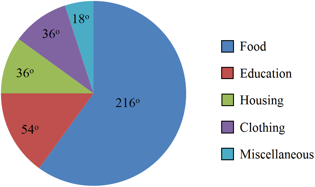
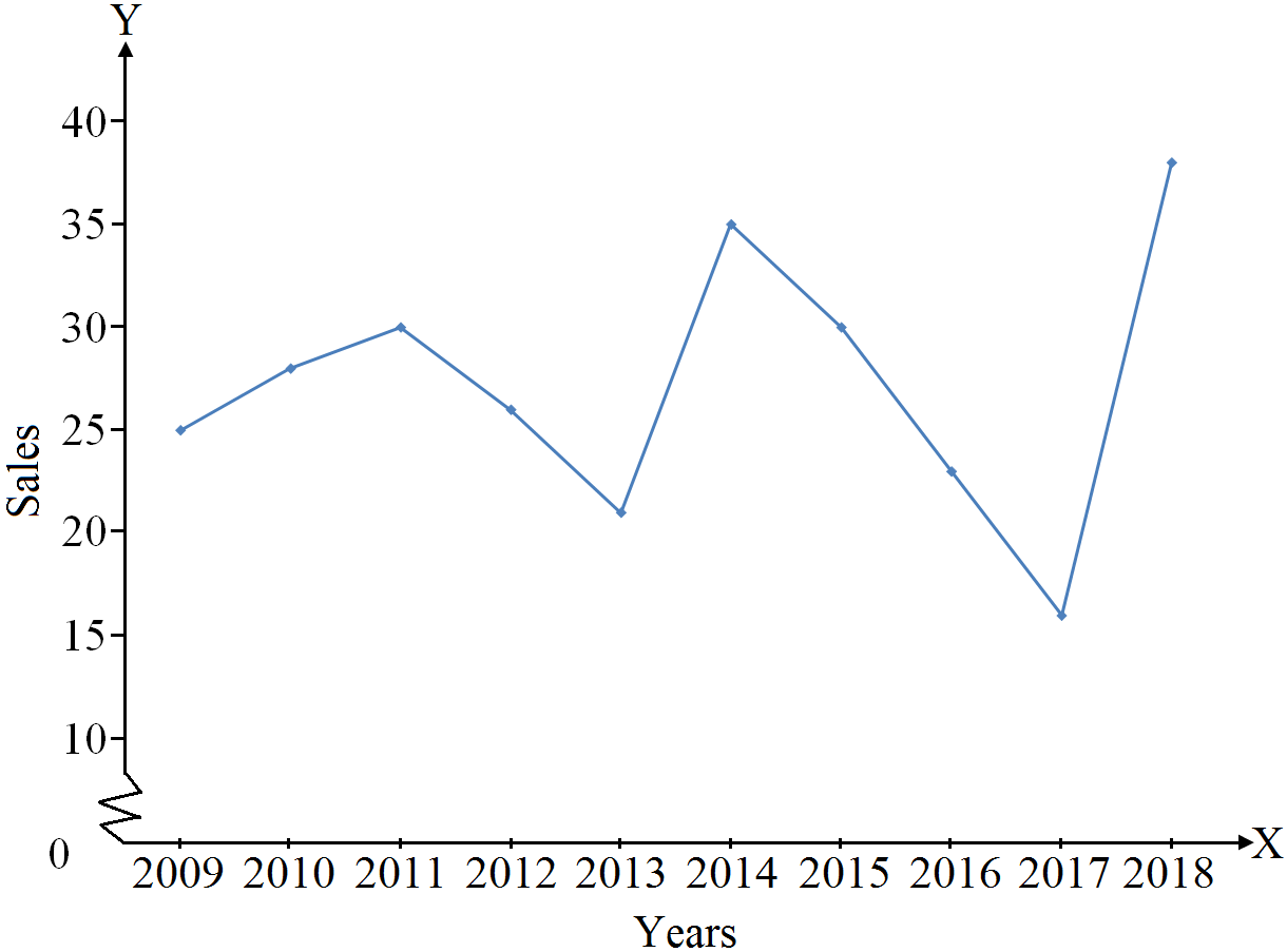
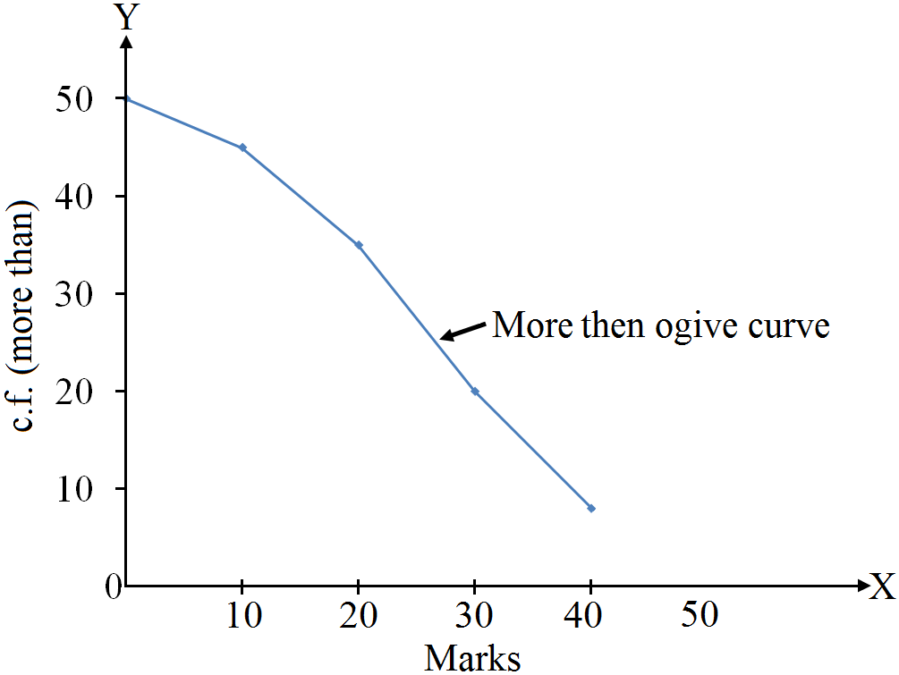
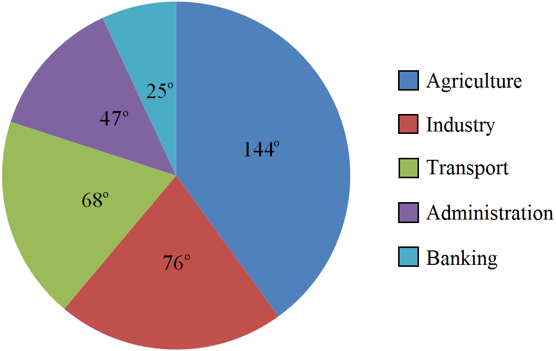
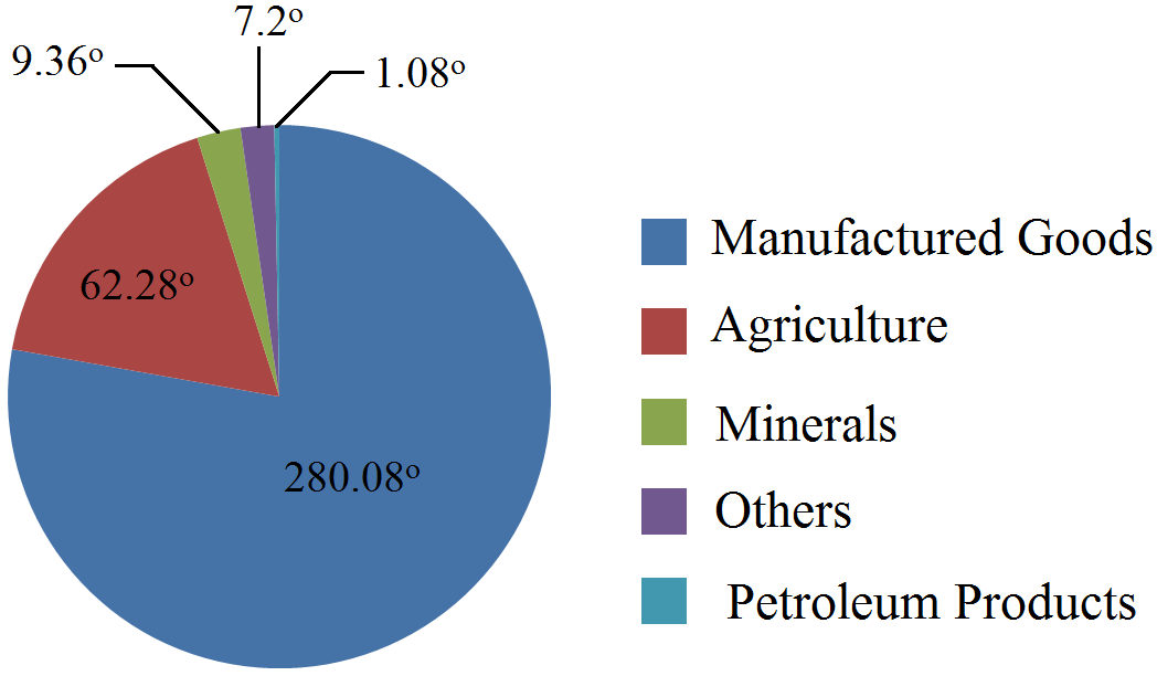
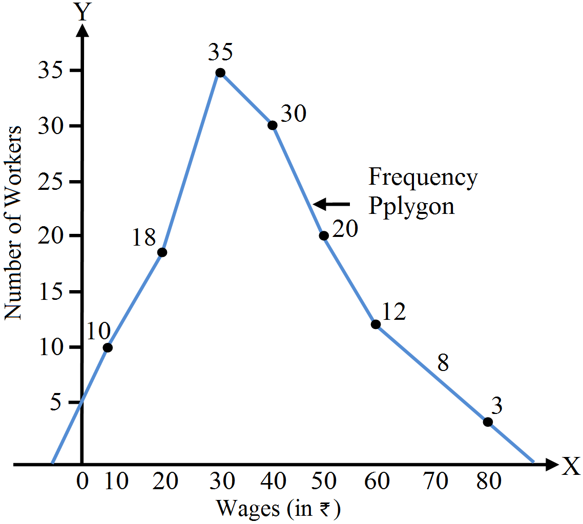
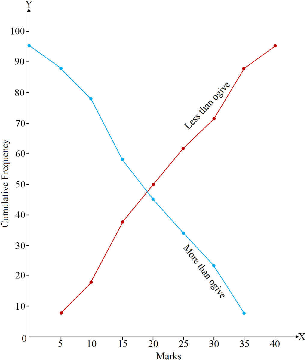
Question 16 Marks
Draw a less than ogive curve on the basis of the given data:
|
Marks
|
0-5
|
5-10
|
10-15
|
15-20
|
20-25
|
25-30
|
30-35
|
35-40
|
|
No. of Students
|
3
|
10
|
20
|
30
|
20
|
9
|
5
|
3
|
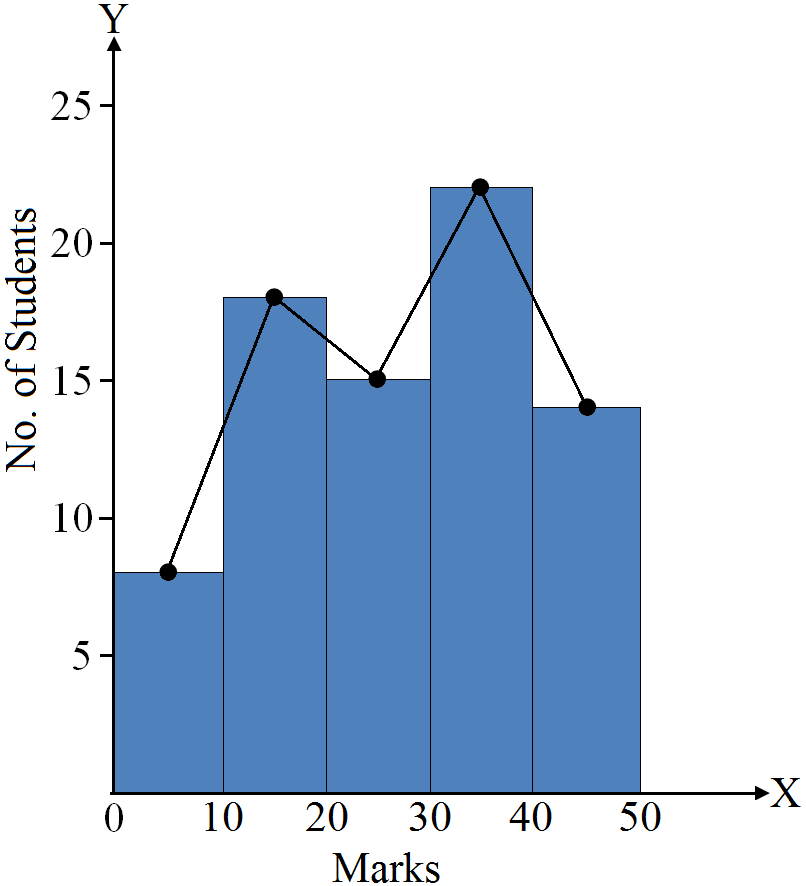
Answer
View full question & answer→Firstly, we will convert the given data into less than frequency distribution.

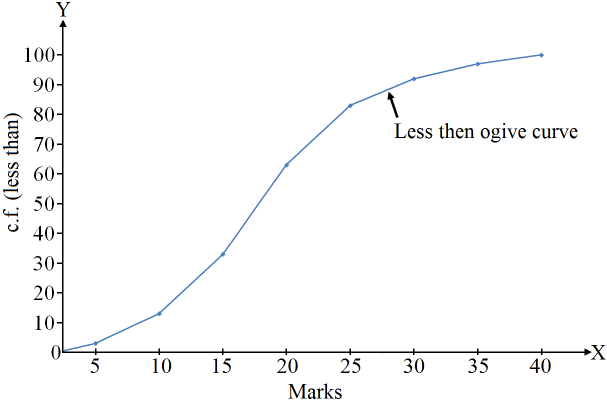
|
Marks
|
c.f. (Less than)
|
|
Less than 5
|
3
|
|
Less than 10
|
13
|
|
Less than 15
|
33
|
|
Less than 20
|
63
|
|
Less than 25
|
83
|
|
Less than 30
|
92
|
|
Less than 35
|
97
|
|
Less than 40
|
100
|


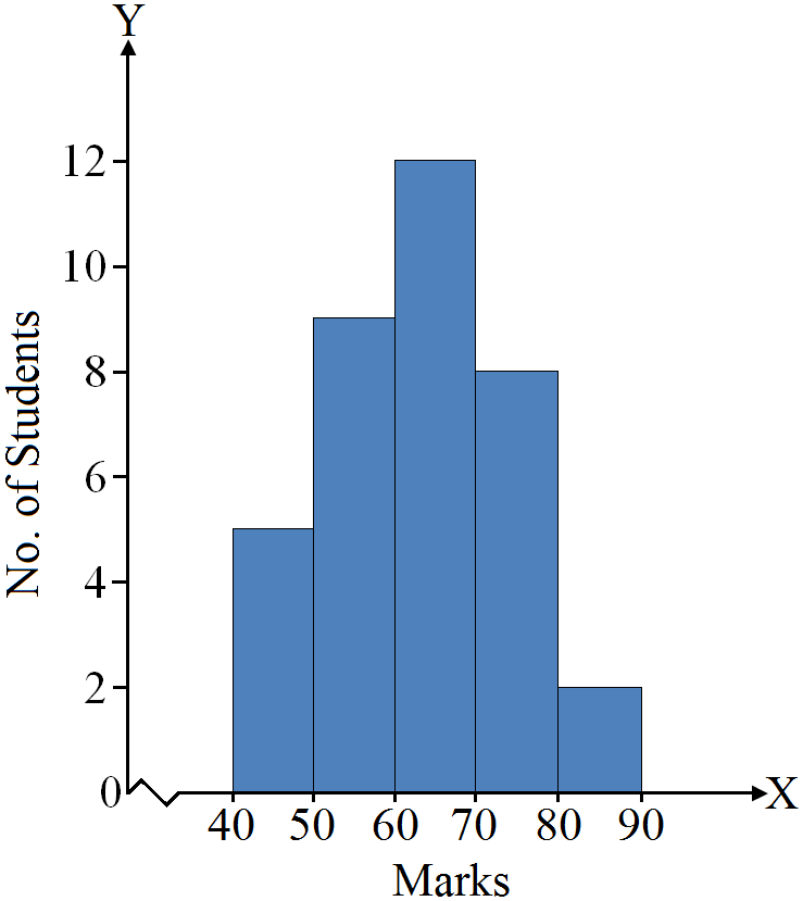


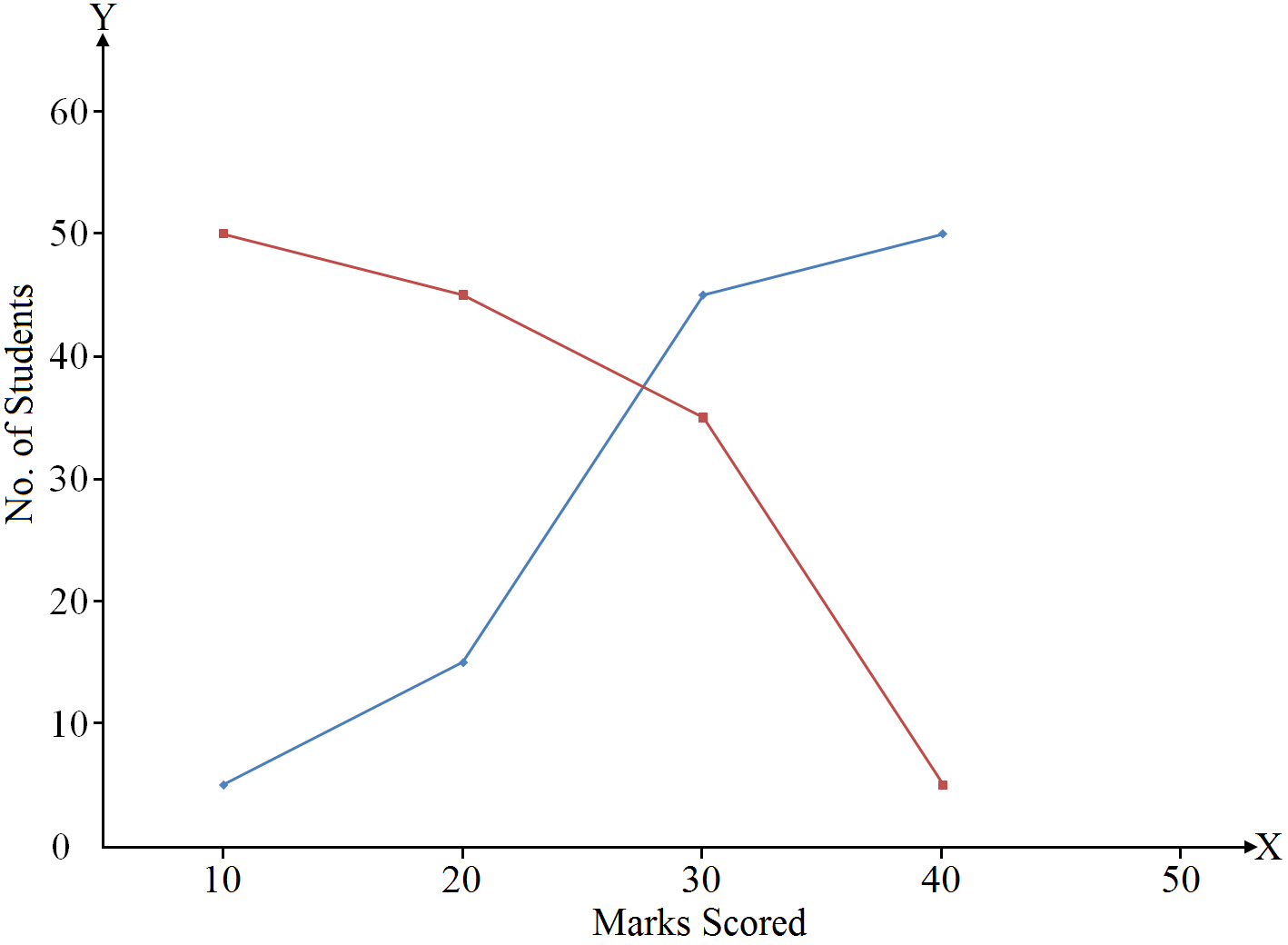
.png)